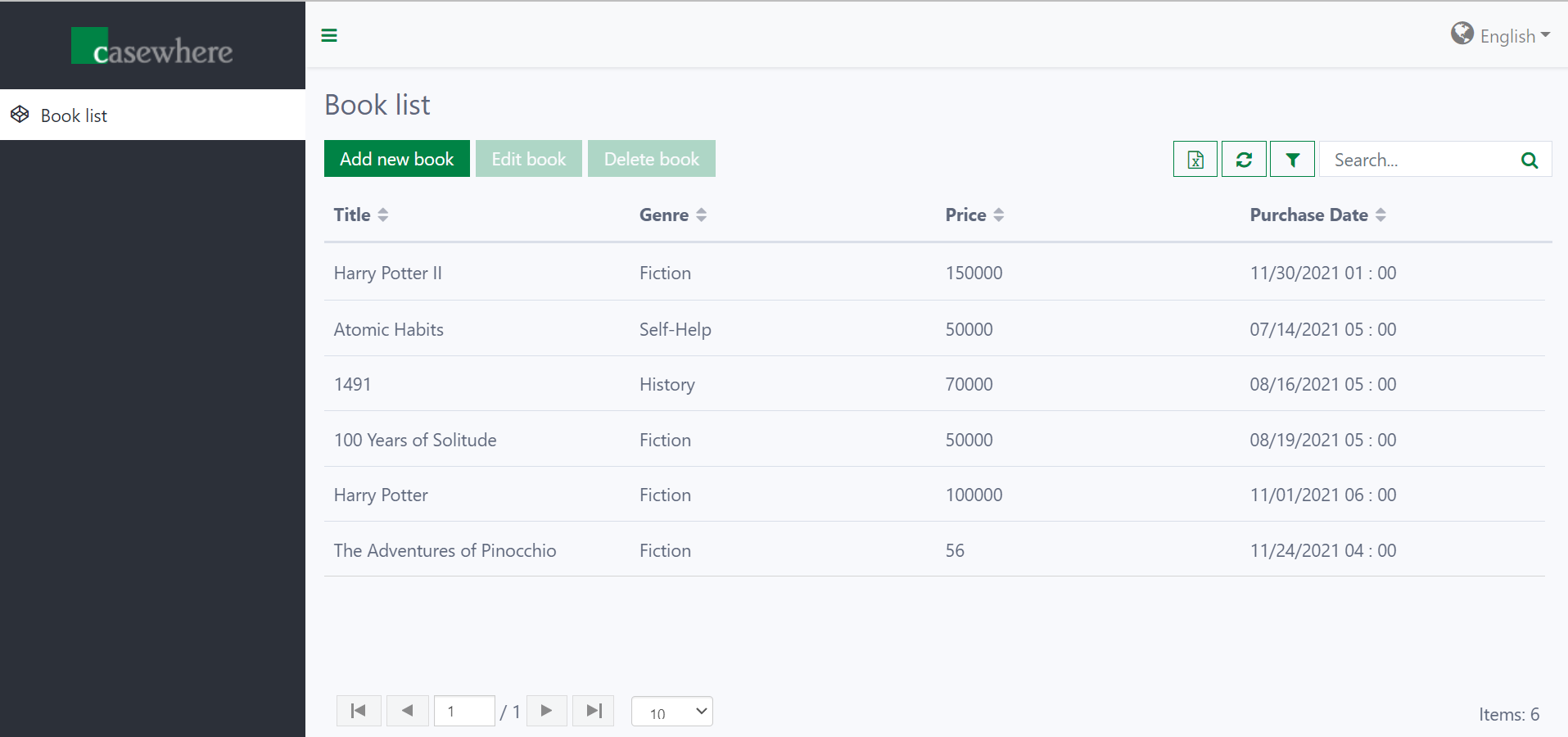
Grid widget
Grid widgets display tabular data fetched from a data source. Each row represents a record, and each column can display one or more fields.
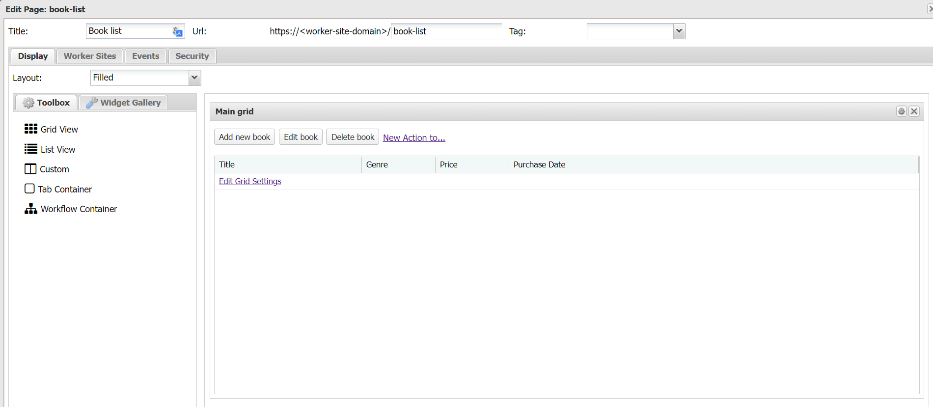
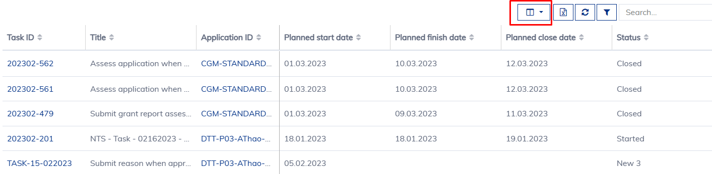
Below is how a grid widget looks in the worker site and in Casewhere Admin.
Configure grid widget
General settings
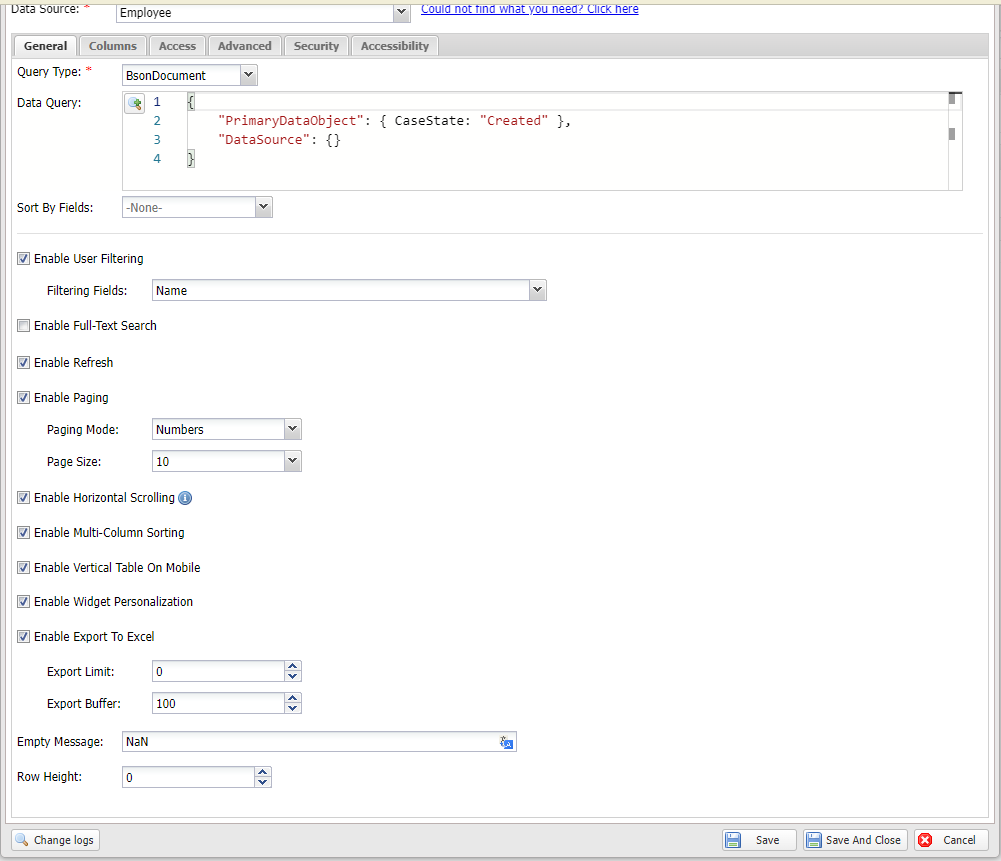
All data-source widgets share the same general settings:
Data Source: The data source the widget will display.
Sort By Fields: Fields used for default sorting before data is rendered.
Enable User Filtering: Allows end-users to filter data on the worker site.
Enable Full-Text Search: Allows end-users to perform full-text search on the worker site.
Minimum Search Word Length: The minimum number of characters a user must type before the search is triggered. Useful for preventing overly broad queries on large data sets.
Enable Search Field Collapsible: When enabled, the search/filter panel can be collapsed by end-users to save screen space.
Enable Refresh: Allows end-users to refresh widget data without refreshing the entire page.
Enable Paging: Loads data page by page with a paging control at the bottom. For custom widgets, you must handle paging yourself.
Enable Horizontal Scrolling: Enables horizontal scrolling when column min-widths are set.
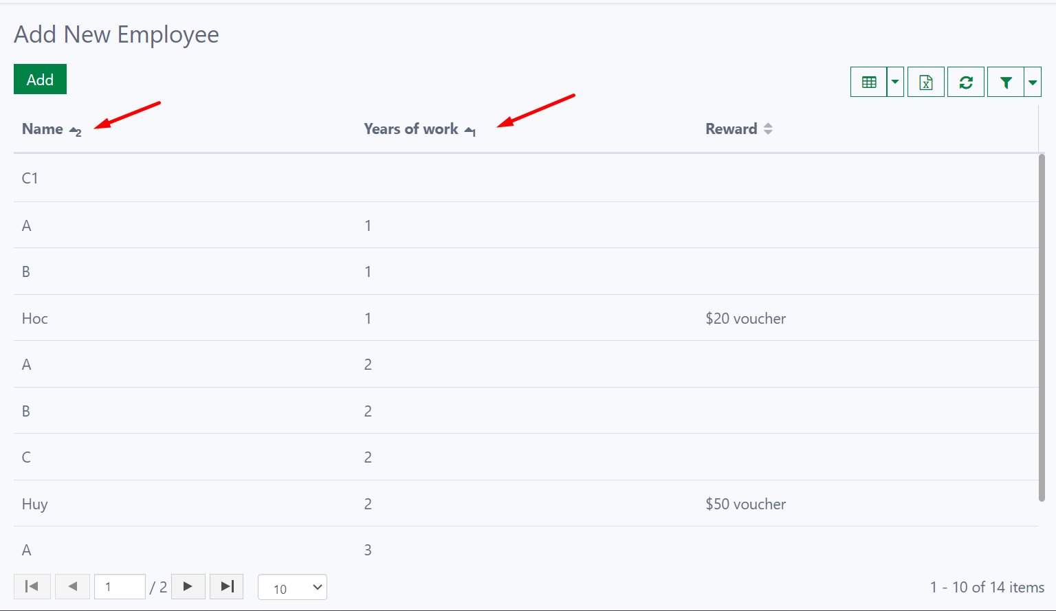
Enable Multi-Column Sorting: Allows sorting by multiple columns simultaneously with configurable priority.
To use multi-column sorting, hold Shift and click the column headers to define sort priority.
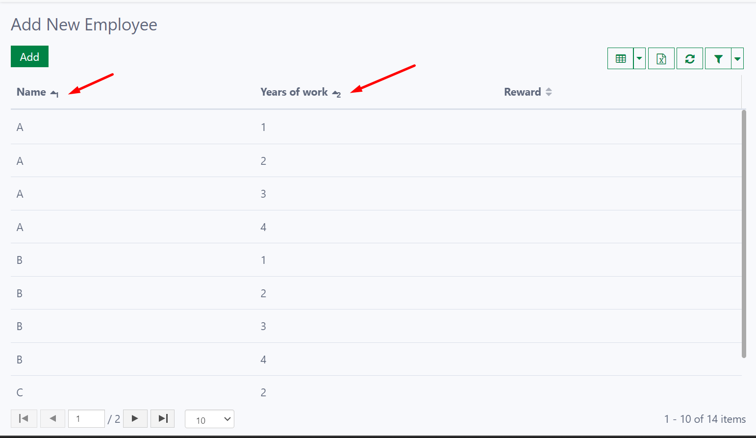
In the example above, the list is sorted by “Name” first, then “Year of Work”. You can reverse the priority by clicking in a different order.
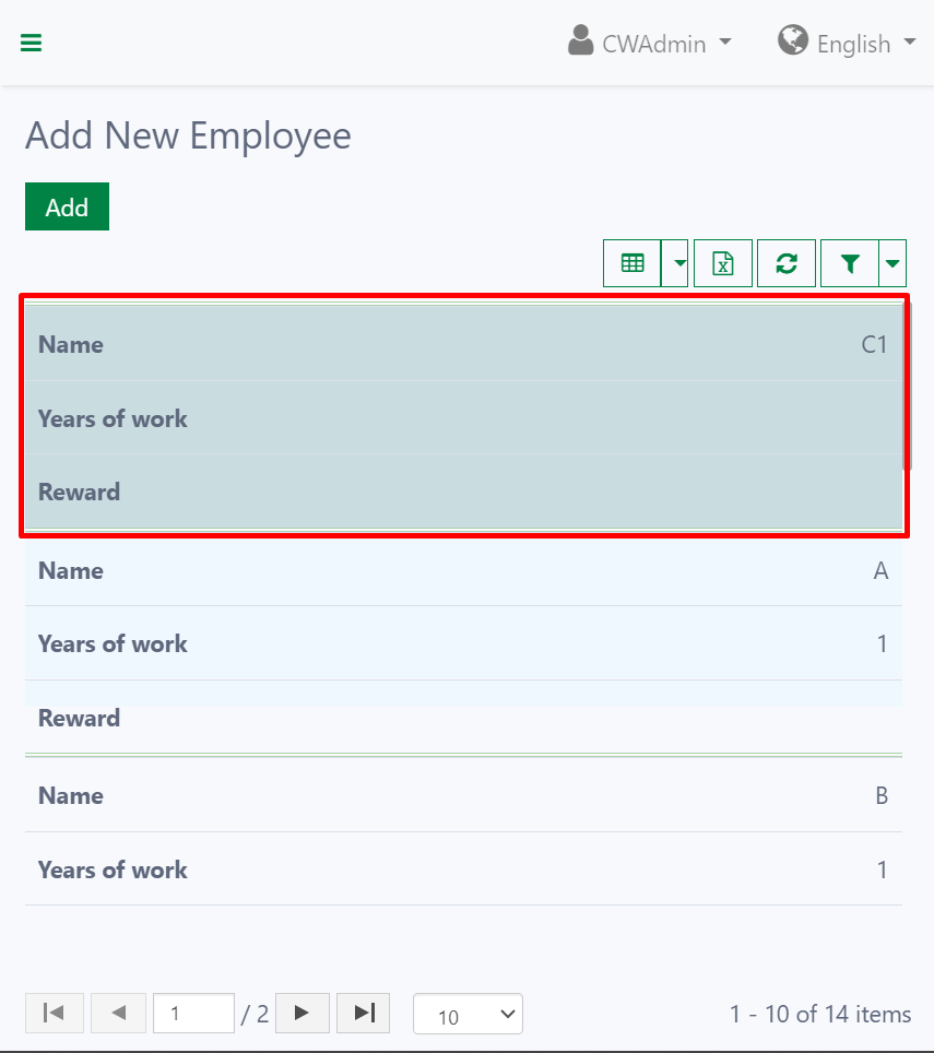
Enable Vertical Table On Mobile: Converts the grid to a vertical layout optimized for smaller screens and mobile devices.
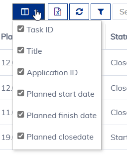
Enable Widget Personalization: The end-users can change the view of the grid based on their preferences. This includes:
- Visible columns: Choose which columns to display.
- Column size: Adjust individual column widths.
- Column position: Rearrange the order of columns.
Export to Excel: Allows end-users to export data to an Excel file.
- Export Limit: Maximum number of records to export. Avoid exporting more than 100,000 records.
- Export Buffer: Number of records loaded at a time. Increase for faster export of small data objects.
Row Height: Sets a fixed row height in pixels. Leave empty for the default height.
Empty Message: The message displayed when no data is available.
Columns
You can drag and drop fields from the left-panel to add columns for the widget.
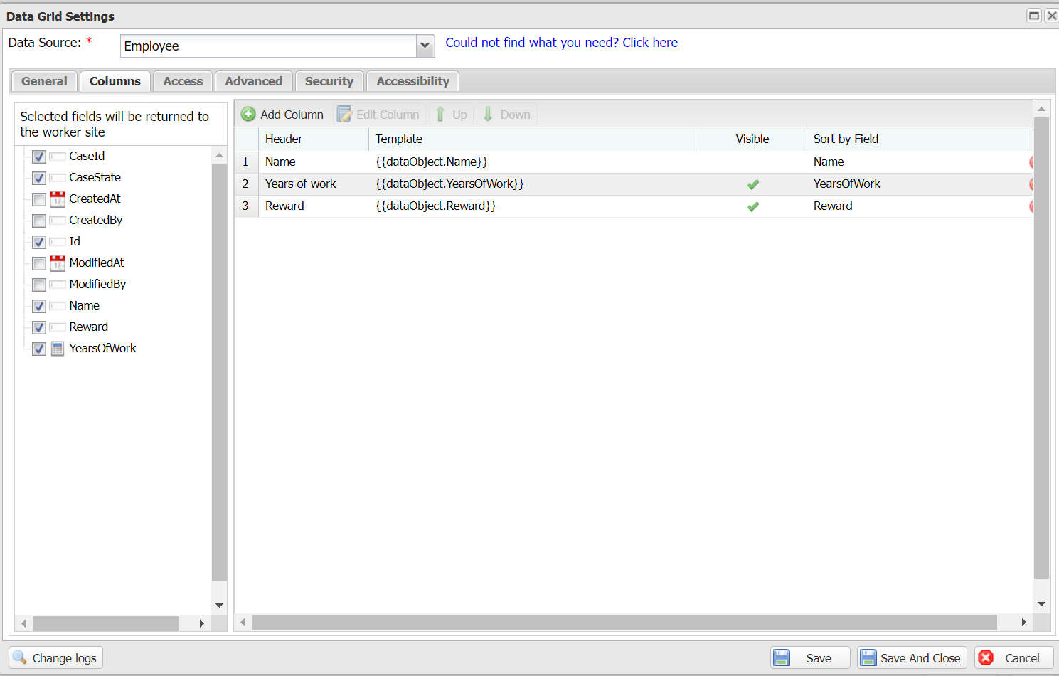
If you have a grid column showing more than one field, make sure you select them in the field list so Casewhere will return them to the worker site.
Below are the settings for a column:
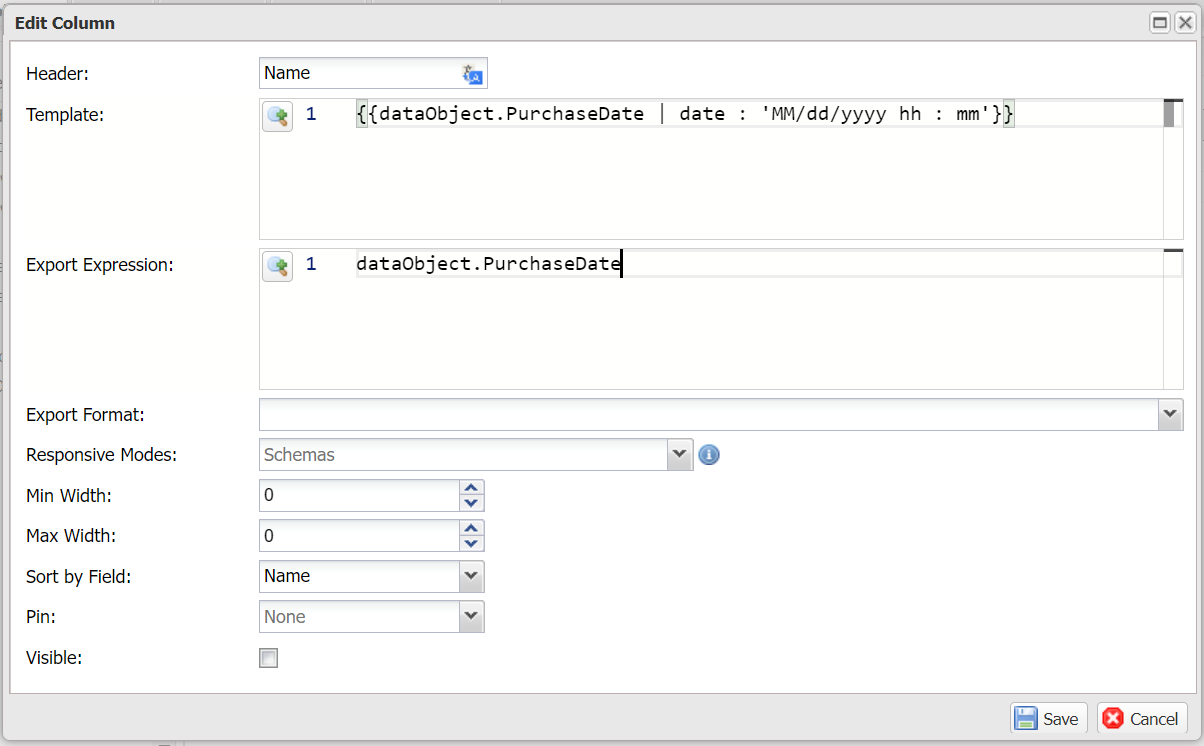
Header: The column header. Accepts a text resource key.
Template: The display template. Example: {{dataObject.PurchaseDate | date : 'MM/dd/yyyy hh : mm'}}.
Export Expression: A JavaScript expression to compute data for export. Example: dataObject.Price - dataObject.Cost.
C# Export Expression: A C# expression for server-side export computation. This is used when the Export Method is set to Server.
Export Format: The format applied when exporting. You can select a built-in format or define a custom one.
Data Type: Specifies the column data type (e.g., string, number, date). This helps Casewhere apply appropriate formatting and sorting behavior.
Responsive Modes: The screen sizes on which the column is displayed. By default, the column appears in all modes.
Min Width: Minimum column width in pixels.
Max Width: Maximum column width in pixels.
Sort by Field: The field to sort when users click the column header. Usually the same as the display field, but can differ when a column shows multiple fields.
Pin: Pin the column to the left or right. Useful for grids with many columns.
Visible: Whether the column is visible on the UI.
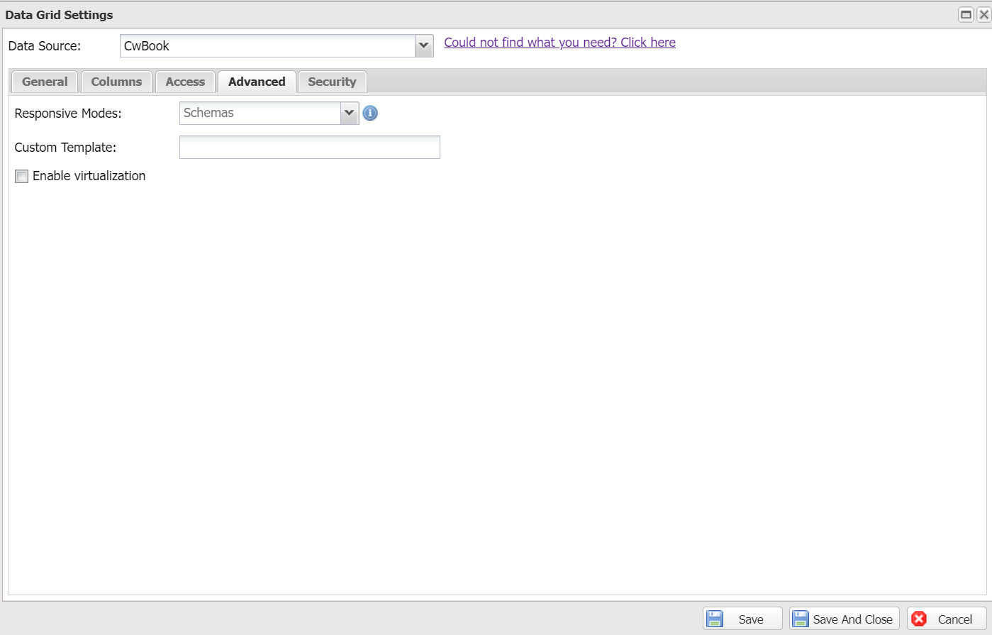
Advanced settings
The following settings are available for advanced use cases:
Responsive Modes: The screen sizes on which the widget will appear. None means all screen sizes.
Custom template: Customize the grid row template. Define the template in a worker site component and reference its ID here. Below is the default template:
<div ng-dblclick="grid.appScope.$parent.model.doubleClickHandler(row)"
     ng-repeat="col in colContainer.renderedColumns track by col.colDef.name"
     ng-mouseover="grid.appScope.hoveredIndex = rowRenderIndex"
     ng-mouseleave="grid.appScope.hoveredIndex = null"
     ui-grid-cell
     ng-class="grid.options.rowStyle(row, grid, rowRenderIndex)">
</div>
- Enable virtualization: Renders thousands of records at once without paging. Best for large datasets where paging is disabled.
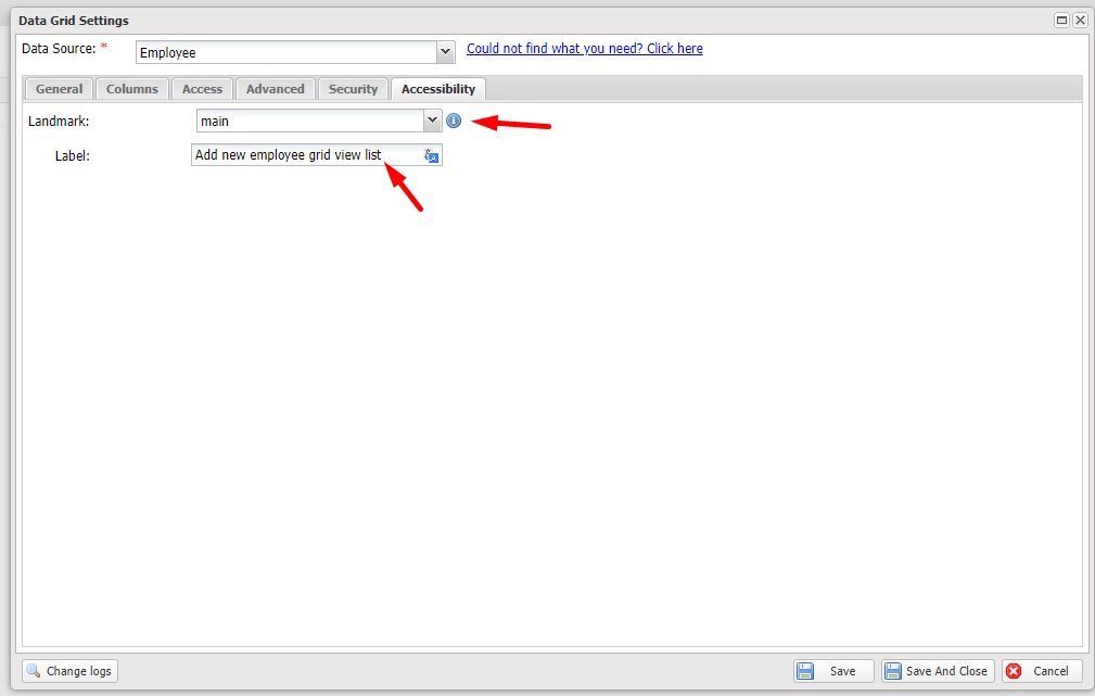
Accessibility
- Landmark: Assigns a landmark type so the grid can be detected by screen readers (e.g., Narrator).
- Label: A short description of the grid for screen reader users.