List widget
For design scenarios where you want to display data in a compact layout rather than a table, the list widget is the best choice. It provides flexible options to customize the widget's appearance and behavior.
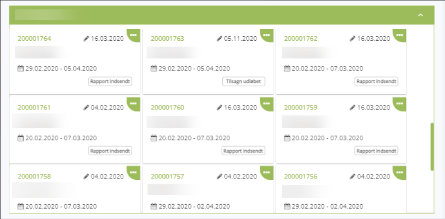
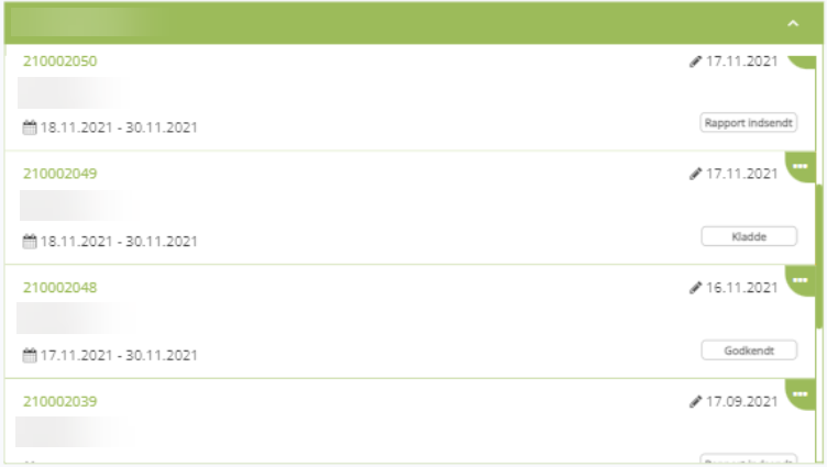
Below is how list widgets look on the worker site:
- Card layout
- Row layout
Configure list widget
General
All data-source widgets share the same general settings for loading data. Learn more in Widget management.
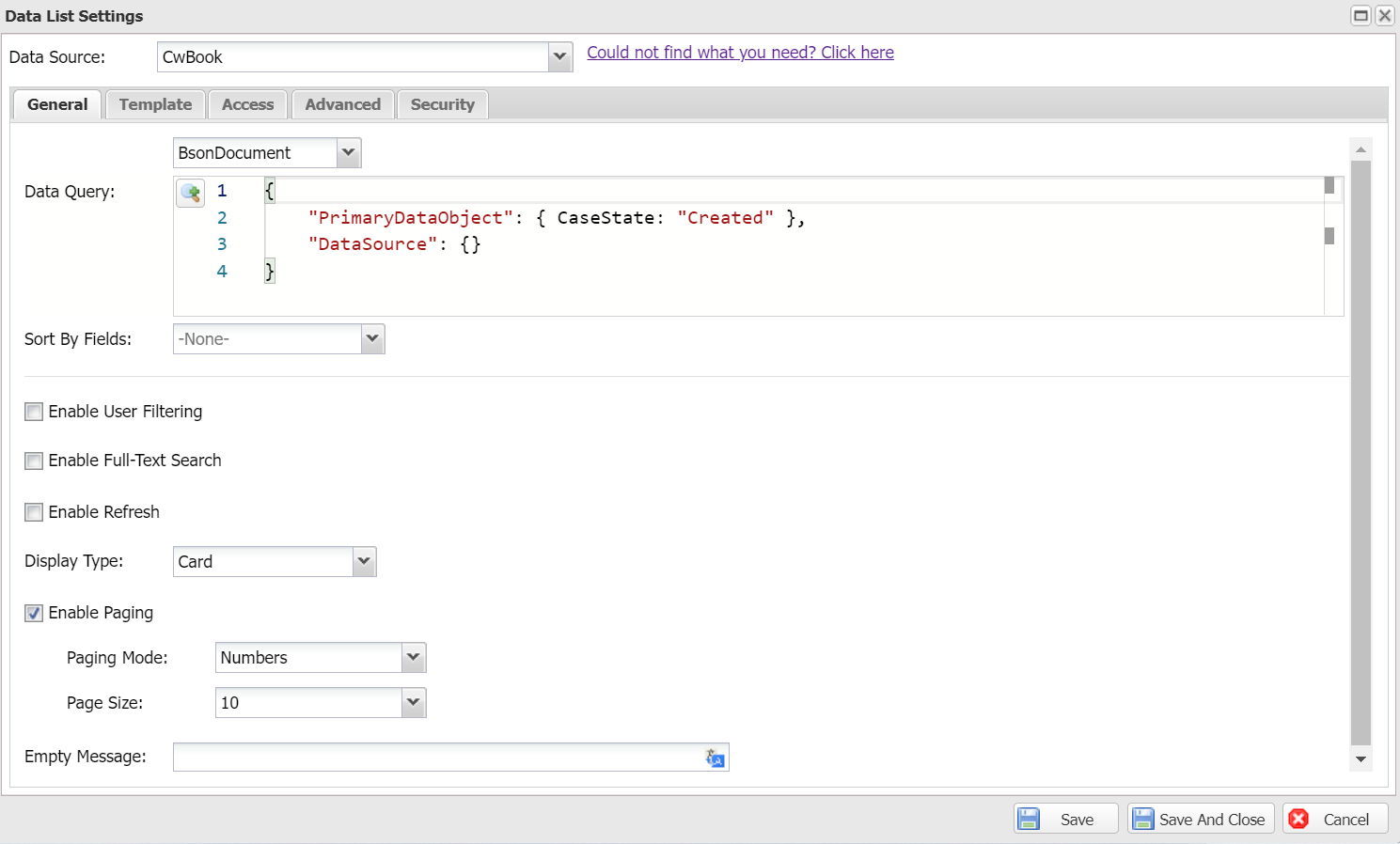
Below are the settings specific to the list widget:
- Display Type:
- Card: Multiple items per row.
- Row: One item per row.
- Sorting Fields: Define which fields are available for end-users to sort by on the worker site. This is different from the default Sort By Fields in general settings, which controls the initial sort order.
- Enable Search Field Collapsible: When enabled, the search/filter panel can be collapsed by end-users to save screen space.
- Empty Message: The message displayed when no data is available.
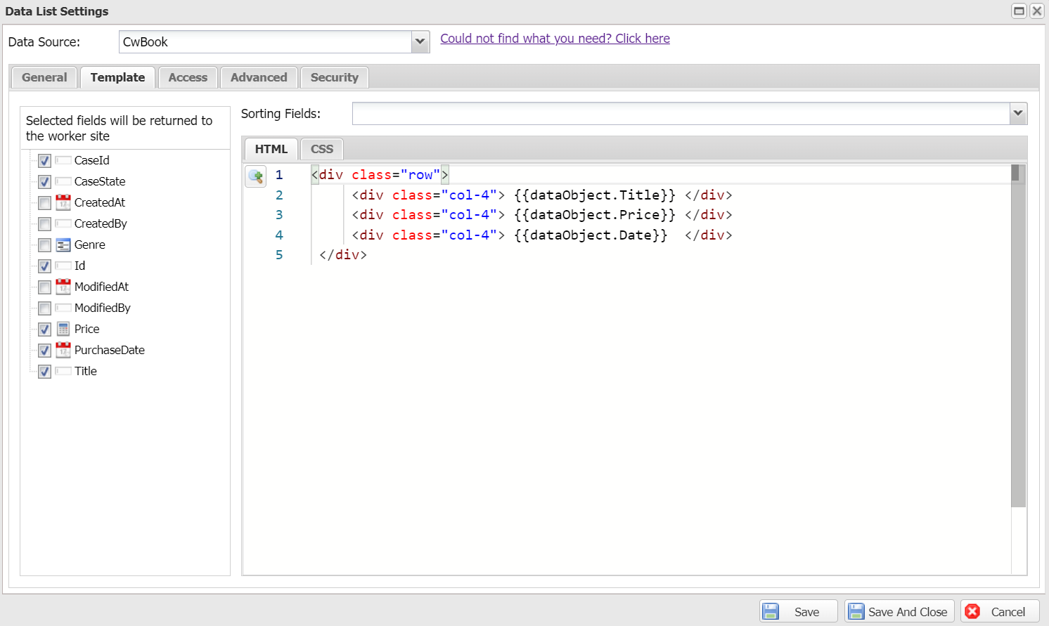
Template
Design the list item template using the editor below. Make sure you select the fields used in your template from the field list so Casewhere returns them to the worker site.
Advanced settings
The following settings are available for advanced use cases:
- Responsive Modes: The screen sizes on which the widget will appear. None means all screen sizes.