Tab container
A Tab Container widget organizes content into tabs, where each tab can contain one or more widgets.
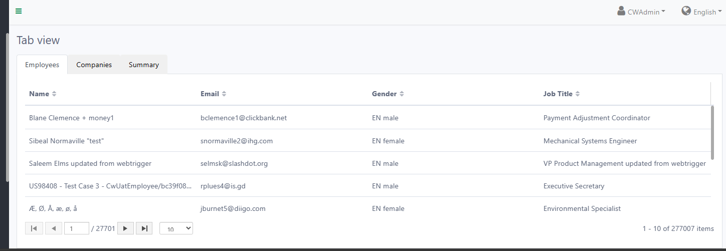
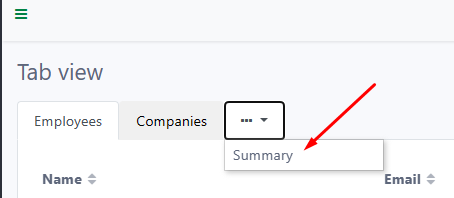
Below is how a Tab Container looks on the worker site and in Casewhere Admin.
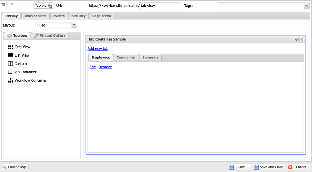
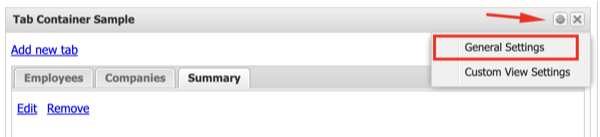
Configure tab container
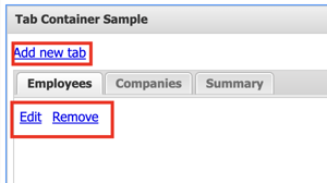
In the Tab Container configuration interface, you can add, edit, or remove tabs via the action links.
Tab content
When adding or editing a tab, configure the following settings:
Title: The display text shown on the worker site. Accepts a text resource key for multi-language support.
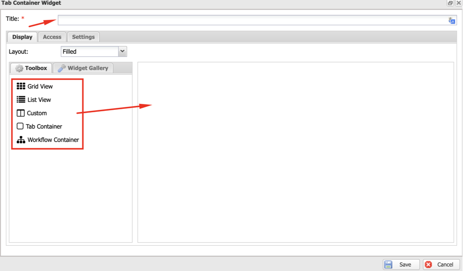
Display: Configure the layout type for rendering the tab content. You can drag and drop widgets from the toolbox into the content area, arranged according to the selected layout.
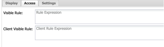
Access: Write a rule to control tab visibility on both the client side and server side.
Settings:

- Always in menu: Forces this tab into the overflow dropdown menu. When checked, Show in menu when is disabled.
Show in menu when: Moves the tab to the dropdown menu when the device matches the specified responsive modes.
Tab icon: A CSS class for the icon displayed before the tab Title.
Display Count For: When set, the tab header displays a count badge showing the number of records from the referenced widget. This is useful for showing item counts (e.g., "Tasks (5)") without the user having to click on the tab.
Other settings
General settings
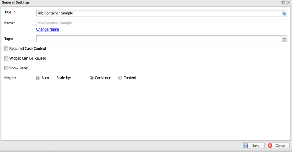
In the general settings, you can configure Title, Name, and other options:
Require Case Context: Enable if the widget should only be active when it receives a case from an external source.
Reusable: Enable to share this widget across multiple pages. The widget will appear in the Widget Gallery.
Show Panel: Enable to display the panel containing the widget.
Height:
- Auto: Automatically scales the widget height by Container or Content.
- Number: Specify a fixed height in pixels.
Custom view settings
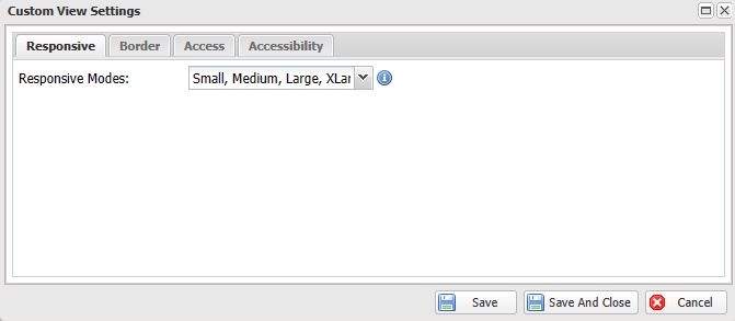
The following settings are available for custom view use cases:
Responsive Modes: The screen sizes on which the widget will appear. None means all screen sizes.
Border: Renders the widget with a border.
Access: Only renders the widget when the user has access via an Access Rule.
Accessibility:
- Label: A short description to make the widget accessible to screen readers.
- Landmark: A landmark role to make the widget detectable by screen readers.