Widget action
While viewing data in Casewhere widgets, end-users may need to interact with the data — editing a draft, submitting an application, or approving a budget. These interactions are implemented as widget actions in Casewhere.
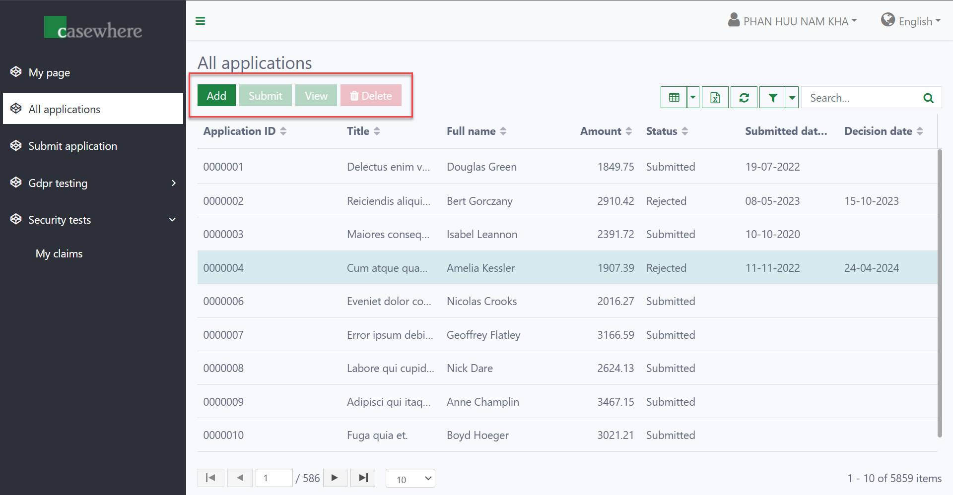
The screenshot below shows how widget actions appear to end-users on worker sites.
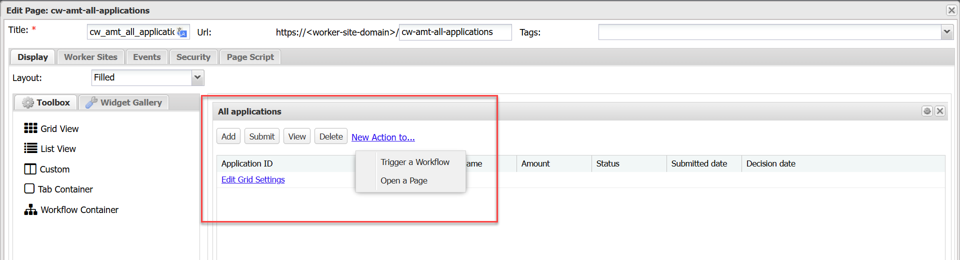
In Casewhere Admin, widget actions are displayed as shown below. There are two types: Trigger a Workflow and Open a Page.
Settings for widget actions are organized into three areas:
- General: Key attributes, triggered workflows, appearance, and other general settings.
- Advanced: Advanced behaviors and rules, often requiring scripting.
- Security: Security policies that determine who can view and execute the actions.
Trigger-workflow action
This action triggers a workflow and opens it in a dialog.
The action settings are shown below.
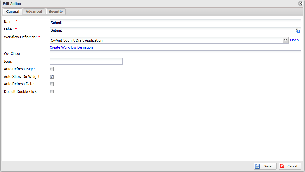
| Name | Mandatory | Description |
|---|---|---|
| Name | Yes | The unique name of the action. |
| Label | Yes | The button label displayed to end-users. Accepts a text resource key. |
| Workflow Definition | Yes | The workflow triggered when the action is executed. If the workflow type is Case Creation, a process is also required. |
| Supported Process Ids | No | Restricts the action to specific processes. When set, the action button is only visible for data belonging to the specified processes. |
| Button Group | No | Groups multiple actions under a single dropdown button for a cleaner toolbar. |
| Css Class | No | CSS class to style the button — e.g., btn-danger to highlight a "Delete" button. |
| Icon | No | Icon class for the button — e.g., fa fa-trash for a "Delete" button. |
| Auto Refresh Page | No | Automatically refreshes the entire page (all widgets) after the action completes. |
| Auto Show on Widget | No | When unchecked, the button is hidden but can still be triggered via scripting. Checked by default. |
| Force Reload Data | No | Automatically refreshes the widget's data after the action completes. |
| Default Double Click | No | Triggers the action when the user double-clicks a data item. |
| Confirm Unsaved Change | No | When enabled, prompts the user to confirm before leaving a form with unsaved changes. |
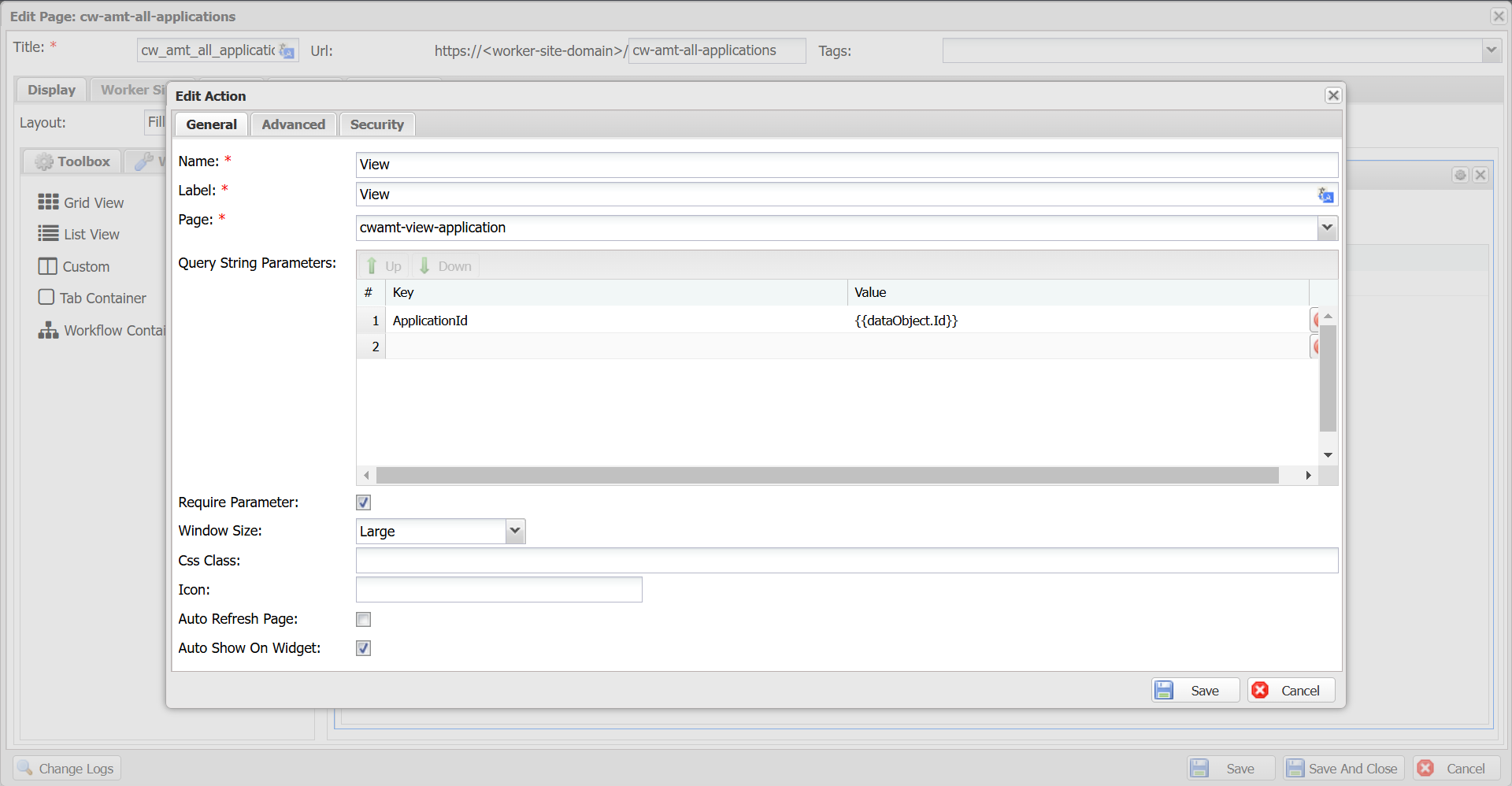
Open-page action
This action opens a page inside a dialog.
| Name | Mandatory | Description |
|---|---|---|
| Name | Yes | The unique name of the action. |
| Label | Yes | The button label displayed to end-users. Accepts a text resource key. |
| Page | Yes | The page to be opened. |
| Query String Parameters | No | Key-value pairs sent to the page for data loading. The key is used to access the parameters in widget data queries. The value supports a JavaScript expression, such as dataObject.Id. |
| Require Parameter | No | When selected, end-users must select a data item to activate the action. The selected data is passed as context to the target page. |
| Window Size | No | Large, Medium, or Small. |
| Button Group | No | Groups multiple actions under a single dropdown button. |
| Css Class | No | CSS class to style the button — e.g., btn-danger to highlight a "Delete" button. |
| Icon | No | Icon class for the button — e.g., fa fa-trash for a "Delete" button. |
| Auto Refresh Page | No | Automatically refreshes the entire page (all widgets) after the dialog closes. |
| Auto Show on Widget | No | When unchecked, the button is hidden but can still be triggered via scripting. Checked by default. |
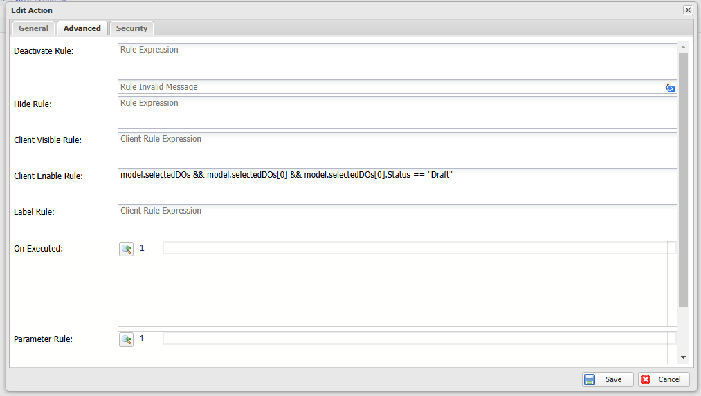
Advanced settings
| Name | Description |
|---|---|
Deactivate Rule deprecated |
Controls whether the action is enabled. Deprecated — use Security instead. |
Hide Rule deprecated |
Controls whether the action is visible. Deprecated — use Security instead. |
| Client Visible Rule | A JavaScript expression that determines whether the action is visible. |
| Client Enable Rule | A JavaScript expression that determines whether the action is enabled. |
| Label Rule | A JavaScript expression that dynamically sets the button label. |
| On Executed | A callback triggered when the workflow finishes or the dialog closes. |
| Parameter Rule | Sends additional data to the triggered workflow or page. |
Example 1: The button will be visible when users select a data object.
Use the following expression for the Client Visible Rule.
model.selectedDOs && model.selectedDOs.length > 0
Example 2: The "Delete" button will be enabled when users select a "Draft" application.
Use the following expression for the Client Enable Rule.
model.selectedDOs && model.selectedDOs[0] && model.selectedDOs[0].Status == "Draft"
Example 3: Open a viewing-data page after the creation workflow is completed.
Use the following expression for the On Executed.
dataObjects && dataObjects.length && $scope.widgetApi.runWidgetAction("View", dataObjects)
Example 4: Set parameters for widget action, for example, add an item to a parent object.
Use the following expression for the Parameter Rule.
return { parentId: model.selectedDOs[0].Id };
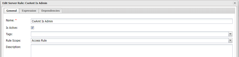
Security
You can manage who can view and trigger widget actions by assigning the appropriate security rules, similar to how rules are applied to protect pages and widgets.
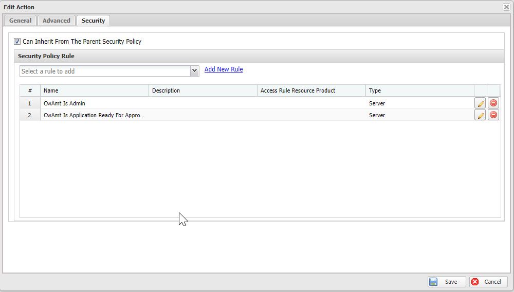
Typically, a widget action should inherit security rules from its parent elements, such as the widget and the page. This is achieved by selecting "Can Inherit From The Parent Security Policy", which is also enabled by default.
Security rules for widget actions have two scopes. The following examples will demonstrate how each scope can be used:
Example 1: Access rules to determine if the widget action should be visible or not.
#predicate
return @user.Contains("Roles", "Administrator");
Example 2: Widget action rules to determine if the widget action can be executed or not.
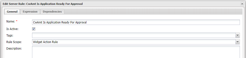
#predicate

var dataApi = @apiFactory.Get<IDataApi>();
var applicationId = @parameters["DOIds"][0];
var application = dataApi.Load(applicationId);

return application["Status"] == "Submitted";