Themes management
Introduction
Theme is a package of customized files that define the appearance of worker sites. This includes styling of form controls, buttons, text formats, modals, utilities,.. basically everything that your users will see and feel.
Theme components
Theme components uses HTML, CSS and JavaScript together to form the front-end design of a worker site.
Theme components depends on its purpose can be designed to manipulate content, style or interactivity of the site.
There are two type of theme components in Casewhere:
- Casewhere components
- Custom components
Both could be edited and managed by Casewhere admin site.
Casewhere components
Casewhere theme component is a default package.
This package includes all necessary components that create a working worker site.
Check below for a walk through all this default components and how they work.
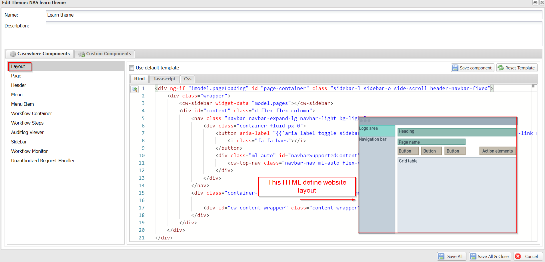
Layout
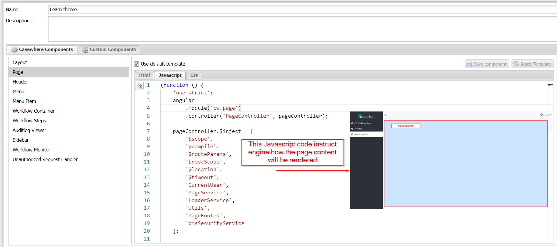
Page

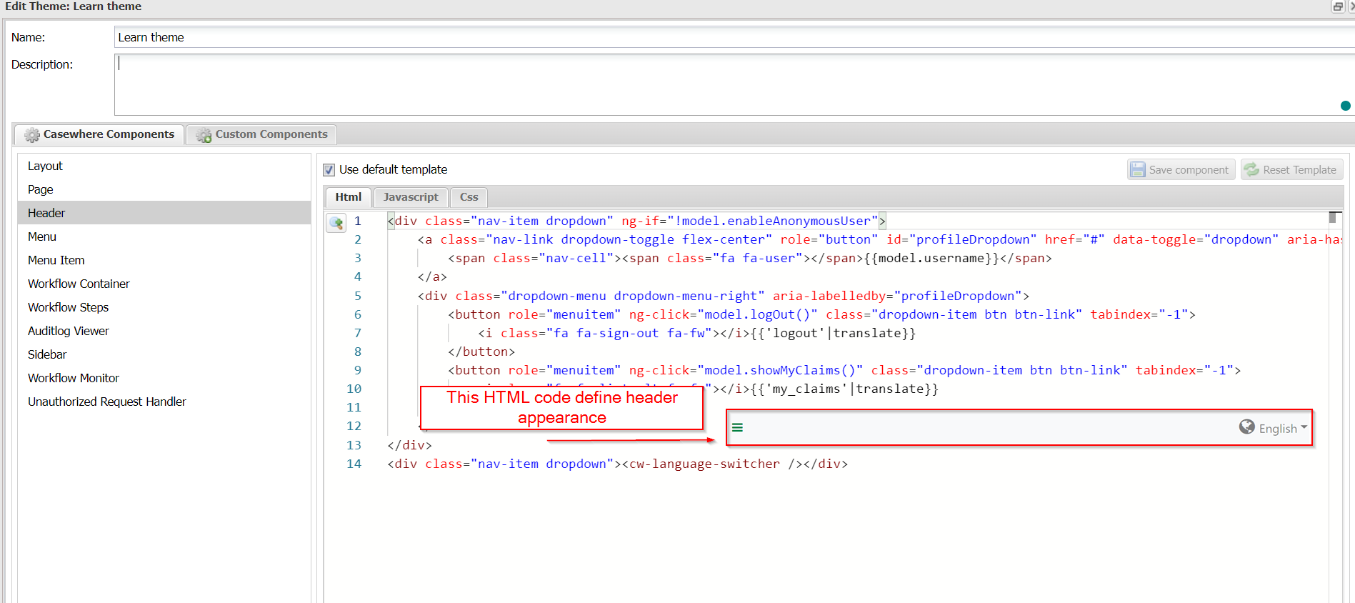
Header
Menu
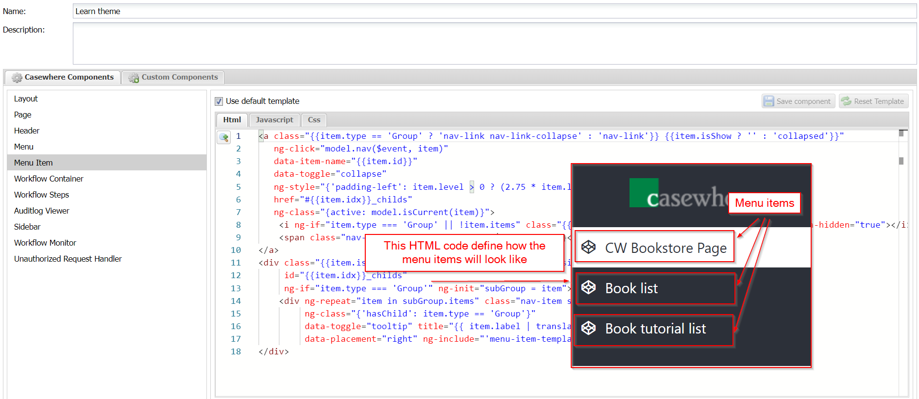
Menu items
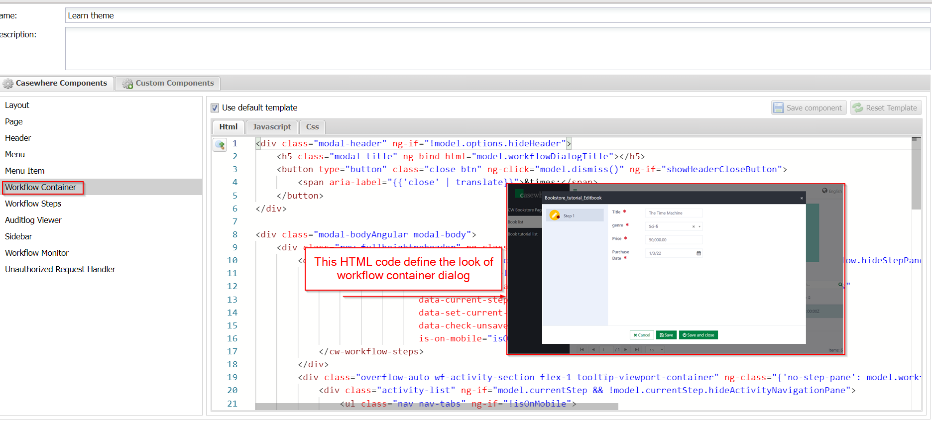
Workflow Container
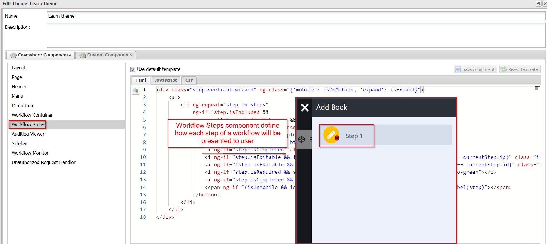
Workflow Steps
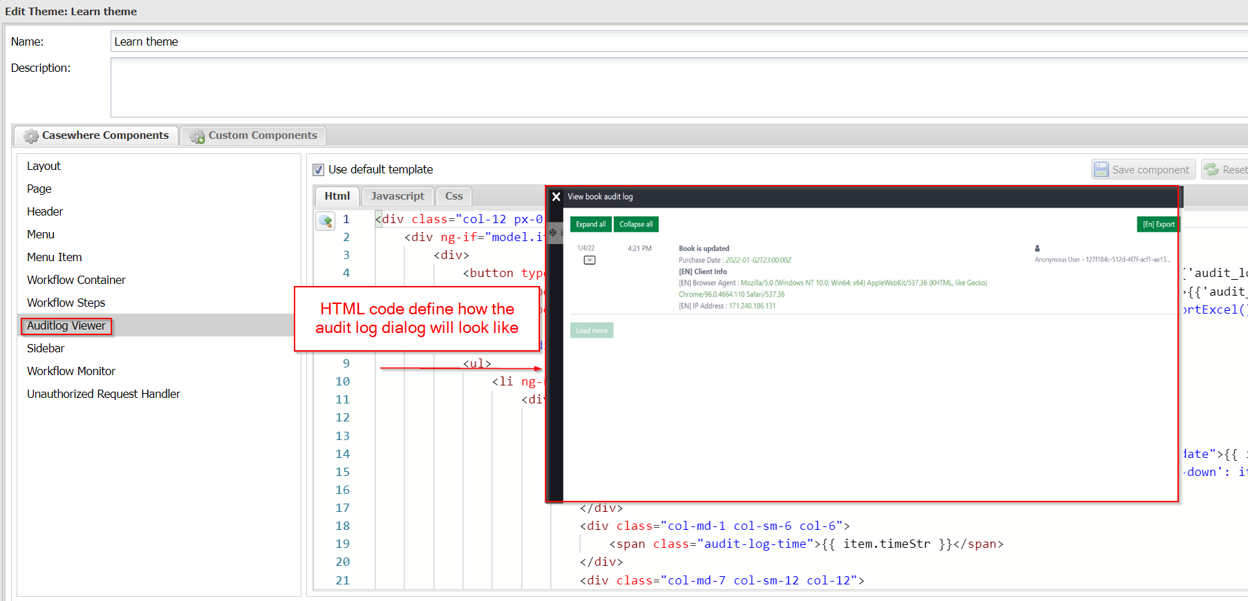
Auditlog Viewer
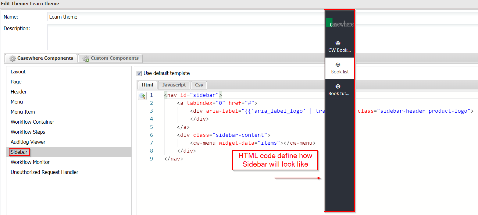
Sidebar
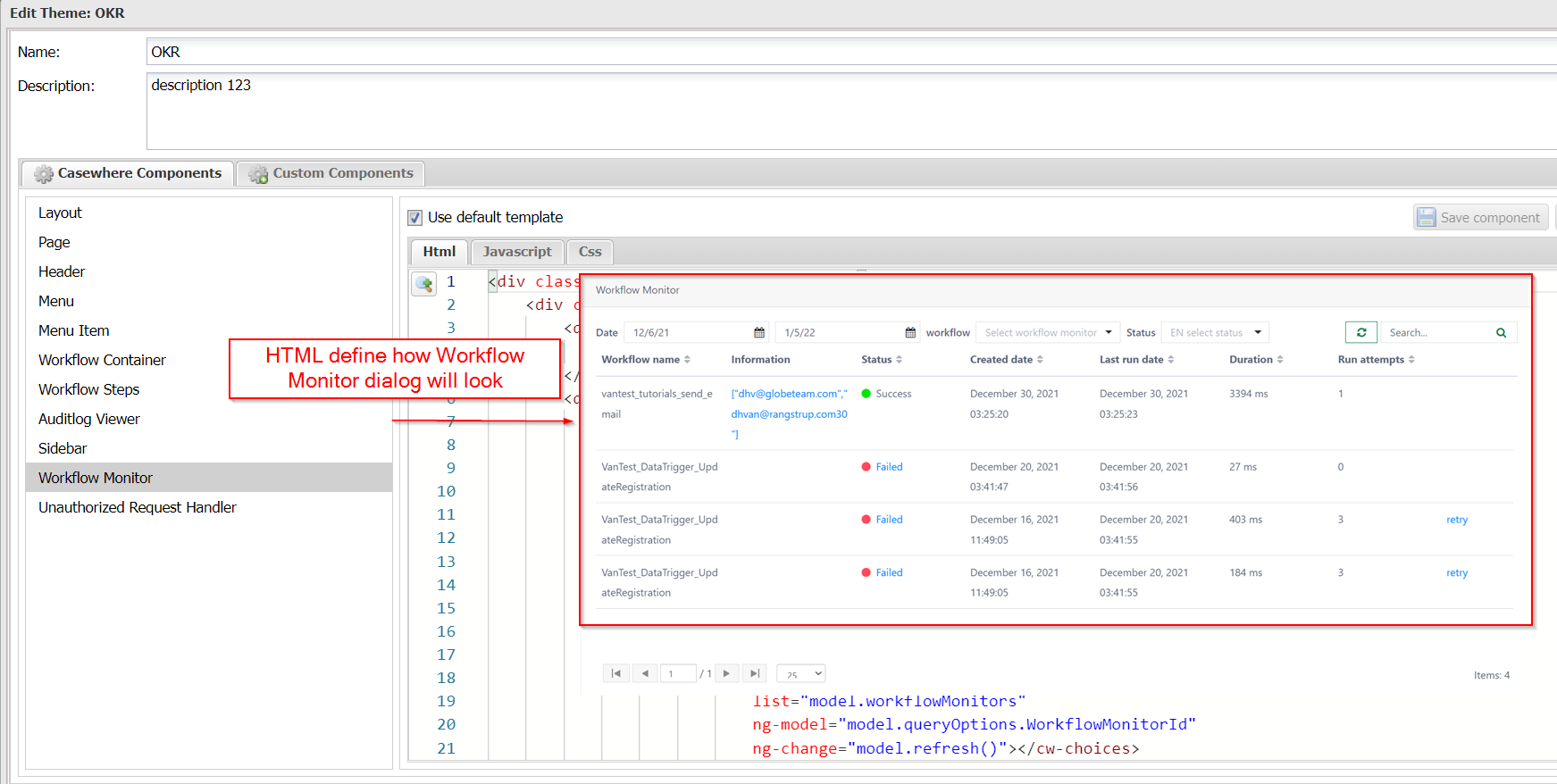
Workflow Monitor
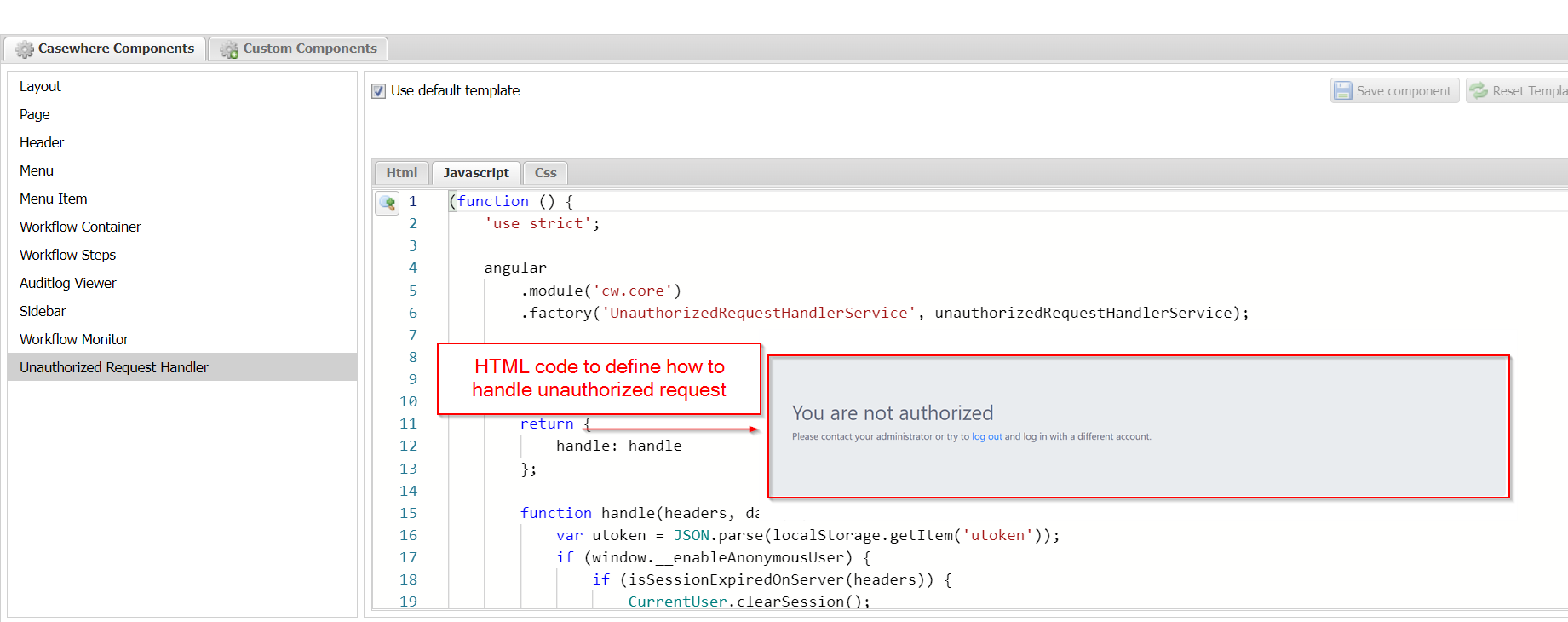
Unauthorized Request Handler
Custom component
Casewhere has a built in editor, allow developer to create theme custom components.
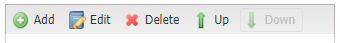
The editor support Add/ Edit/Delete and re-ordered the component list with Up and Down buttons.
Custom component guide
- Step 1. Navigate to Custom Components tab
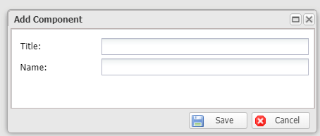
- Step 2. Click Add button, fill in component Title, the field Name will be auto generated
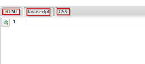
- Step 3. Fill in HTML/Javascript/CSS code
Click **Save component **button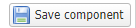
Click Save All & Close
Custom component example
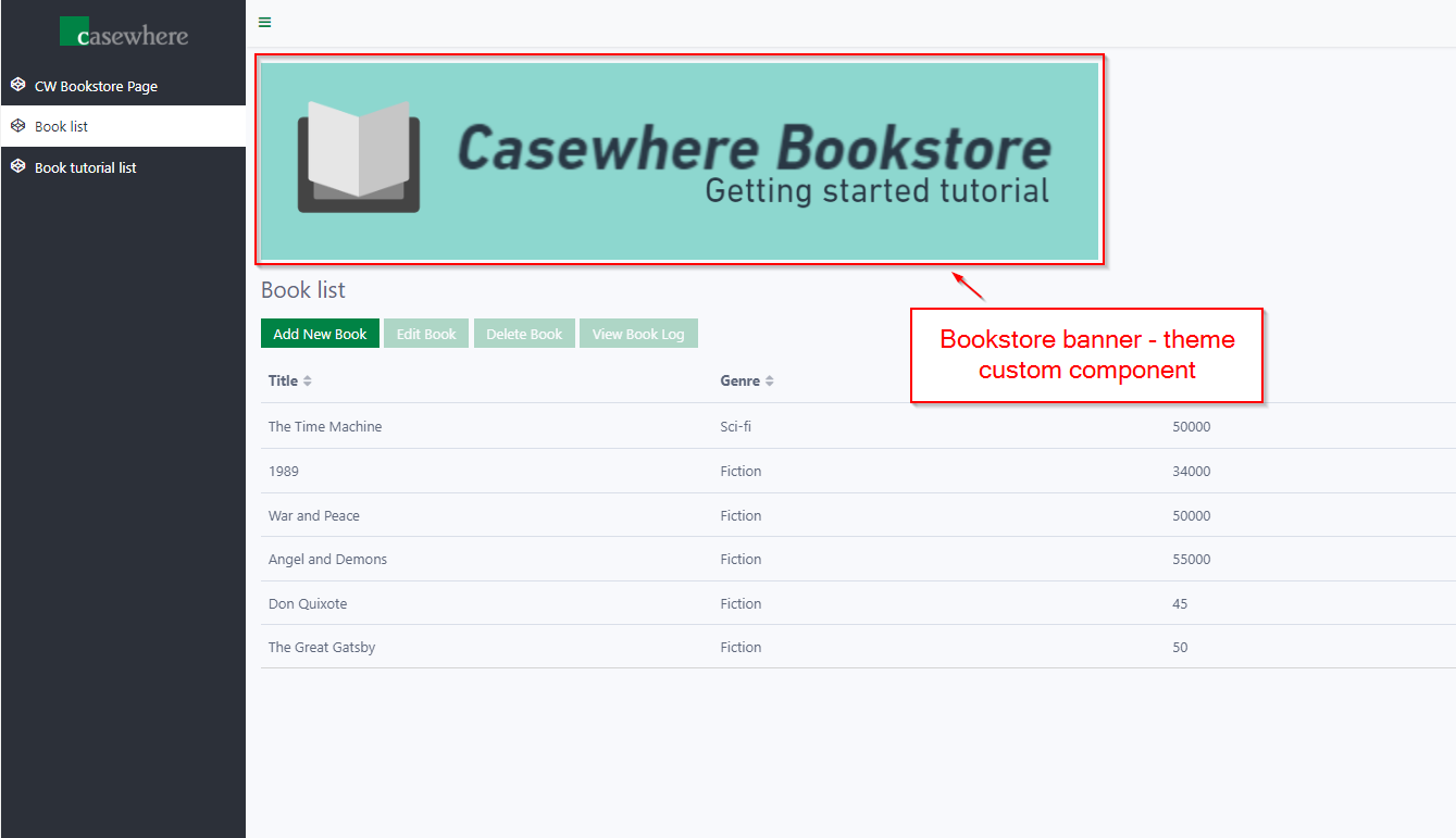
Says you want to make a banner for your bookstore tutorial site.
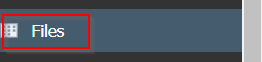
- Step 1. In Casewhere instance, navigate to Files
Click Create button to open Create file dialog
Fill in "book-store-banner" in Name field
Click Browse to browse to the banner image file
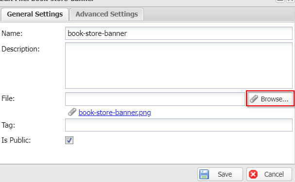
Click Save
- Step 2. Follow the Custom component guide in the above section. For the codes, please copy and paste the following:
HTML
<div class="bookstore-banner__container">
    <img class="bookstore-banner__img" src="[[ApiEndPoint]]system-documents/book-store-banner" alt="Book store banner" />
</div>
Javascript
(function () {
    'use strict';
    angular
        .module('app.layout')
        .directive('bookstoreBanner', bookstoreBannerDirective);
    function bookstoreBannerDirective() {
        return {
            restrict: 'E',
            scope: {
            },
            templateUrl: 'bookstore-banner.html',
            controller: bookstoreBannerController,
            controllerAs: 'model'
        };
    }
    function bookstoreBannerController() {
    }
})();
CSS
.bookstore-banner__container {
    margin-bottom: 1rem;
}
- Step 3. Navigate to Layout in Casewhere component
Find the following div:
<div class="container-fluid flex-grow d-flex flex-column">
Add this 1 line of code into div:
<bookstore-banner></bookstore-banner>
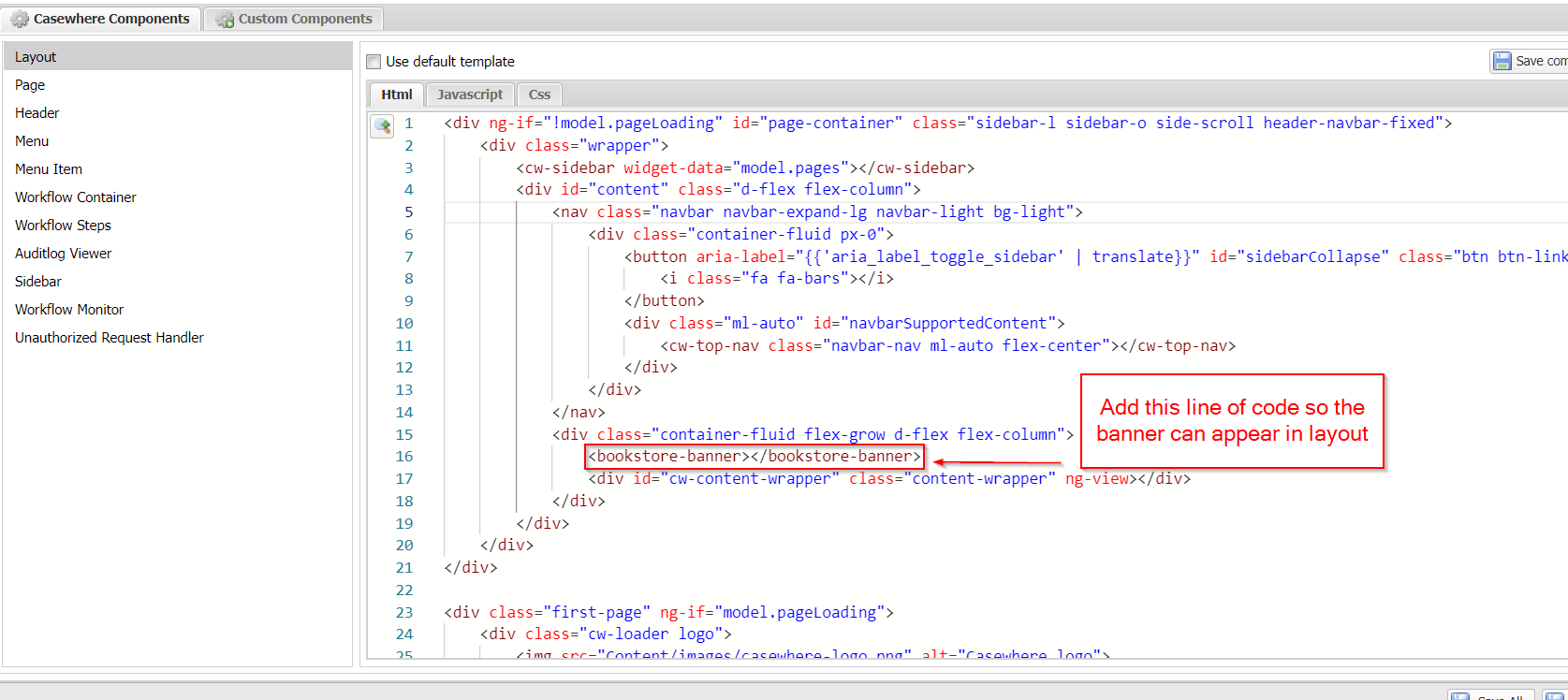
Click Save component
Click Save All & Close