Form Activity
Introduction
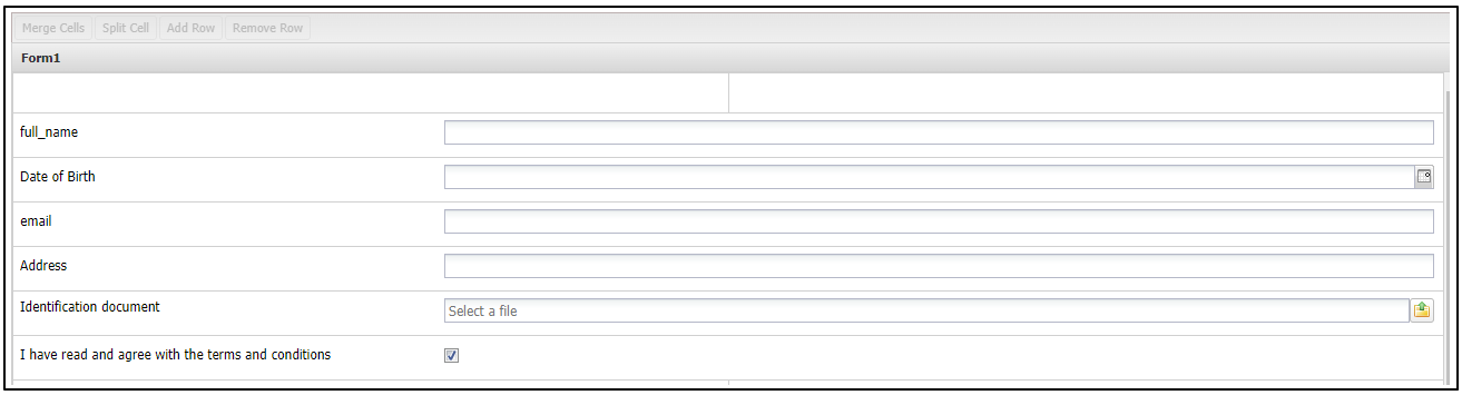
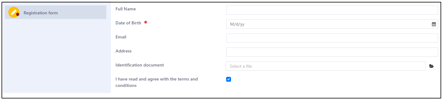
Form Activity is designed to collect data from users. When a workflow reaches a Form Activity, it becomes idle until the user submits the form. Casewhere offers a visual editor for seamless form design and configuration. The following screenshots illustrate how the form appears in Casewhere Admin and how it is displayed to end-users on the worker sites:
- In Casewhere Admin:
- In Worker site
Add a new Form Activity
In the Edit Workflow Definition step, click on the Form icon in the Add Activity Definitions section and drag it into the Step panel you added.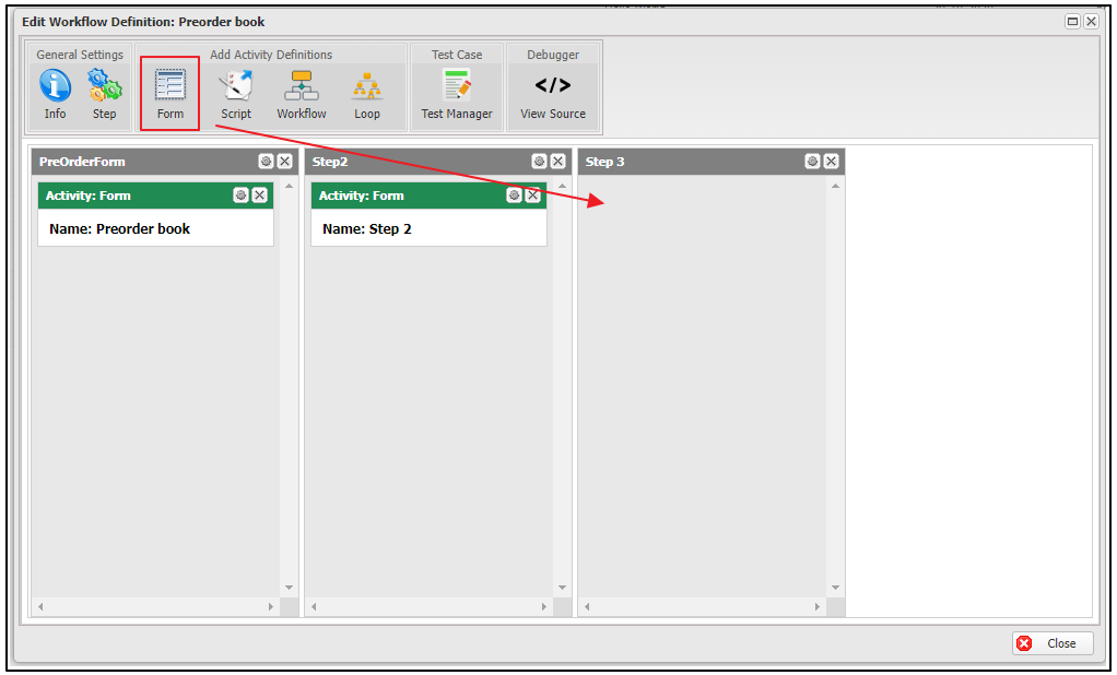
After the drag-and-drop step, the Form Activity creation dialog will open. There are two required fields in this dialog: Name and Display Name. You must fill in both fields to save the form.
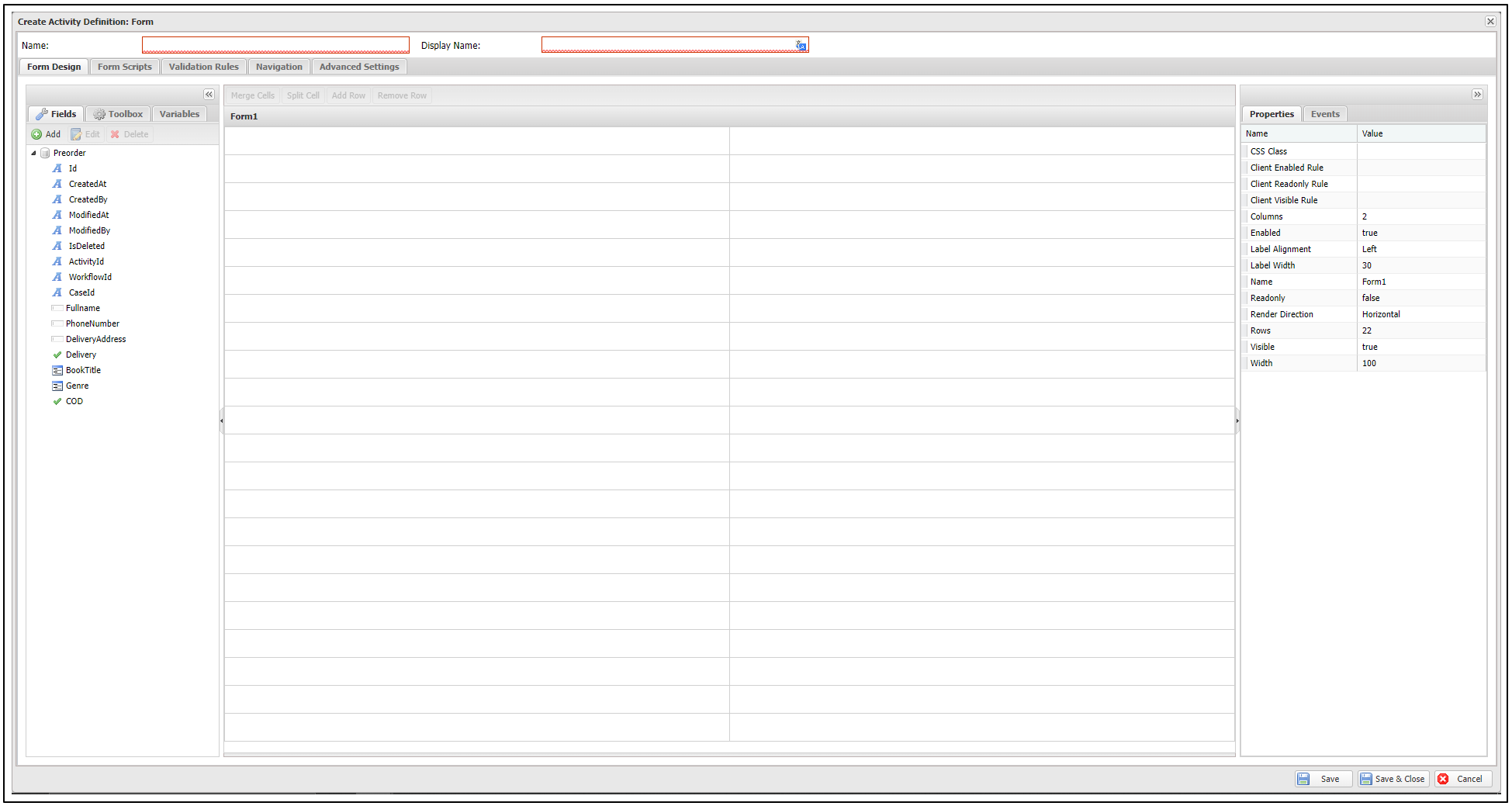
Other configurations for the form are optional and can be completed either during the creation step or later in the editing step.
Form Design
Form Design is the section where you can configure the user interface of a form. In this section, you can add fields to the form from either a data source or the toolbox. Additionally, you can configure the properties and events of each field, as well as add variables for a field in the form.
Layout types
A form has a Layout Type that controls how its fields are arranged. Select the form Canvas (the empty form area) and open its Properties to switch the layout type and set canvas-level options such as Rows, Columns, Render Direction, Label Alignment, and Label Width. Switching the layout type rearranges the existing fields, so Casewhere asks you to confirm.
Grid
Grid is the default layout: a table of Rows and Columns (up to 12 columns). You drop fields into cells, and you can Merge Cells / Split Cell to create wider or narrower areas (see Add fields from Data Source below). The Render Direction property (Horizontal or Vertical) controls the order in which cells flow.
At runtime the grid maps onto the Bootstrap 12-column system: on large screens the cells of a row share the 12 columns (for example, two cells render as col-lg-6 each, and a merged two-cell span becomes col-lg-12), and on smaller screens the cells stack full-width.
Flex
Flex arranges the form with CSS flexbox instead of a fixed grid. Its building block is the Frame (from the Toolbox) — a container you drop fields into. Select a frame to configure how it lays out its children:
| Frame property | Description |
|---|---|
| Direction | Lay children out in a column (Vertical) or a row (Horizontal). |
| Gap (px) | The spacing between children. |
| Padding | Inner padding (a CSS value). |
| Align Items | Cross-axis alignment: Start, Center, End, Stretch, or Baseline. |
| Justify Content | Main-axis distribution: Start, Center, End, Space Between, Space Around, or Space Evenly. |
| Wrap | Allow children to wrap onto multiple lines. |
| Flex | The grow factor of the frame within its parent. |
| Width / Width Unit | The frame width, in percent or pixels. |
| CSS Class | A custom CSS class for the frame. |
Flex is well suited to responsive, content-driven layouts — toolbars, cards, or side-by-side panels — where a fixed grid is too rigid.
Add fields from Data Source
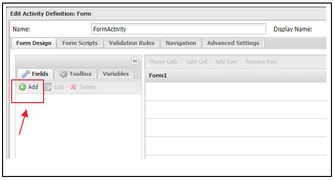
Step 1: Add a data source.
- In the Fields tab of the left menu, click on the Add button:
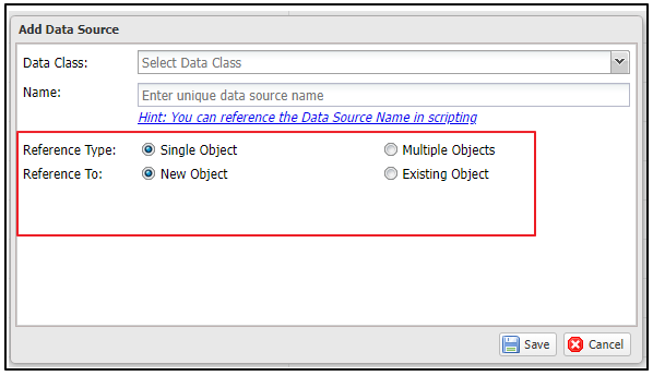
- Then, the Add Data Source dialog will open, allowing you to configure the necessary fields.
- Data Class: This field is required. You must specify the data class with which your form will interact. If you do not see any data classes listed, you will need to enable them in your workflow definition. For more information, see here.
- Name: This field is required. The data source name must be unique. By default, Casewhere uses the data class name, but you can modify it. You can reference the data source by its name in scripting.
- Reference Type: This field is required. Currently, Casewhere only supports Single Object.
- Single Object: Only one data object will be created after the form is submitted on the worker site.
- Reference To: This field is required. You need to select one of the following two options:
- New Object: Use this option if you want to create a new data object.
- Existing Object: Use this option if you want to edit an existing data object.
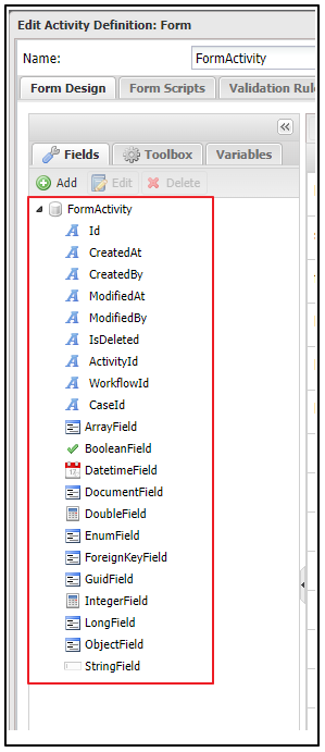
- After filling in all required fields and clicking the Save button, the list of fields for the data source will be displayed in the left menu. You can also add multiple data sources if needed.
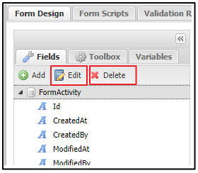
- You can also edit or delete the added data source by selecting a data source and clicking the Edit or Delete button.
Step 2 : Add fields to the form and configure them.
- In the data source list, click on the field you want to add to the form. Then, drag the field to the form area and drop it into the desired cell. You can also reposition the field by dragging and dropping it into another cell. Additionally, multiple fields can be added to a single cell.
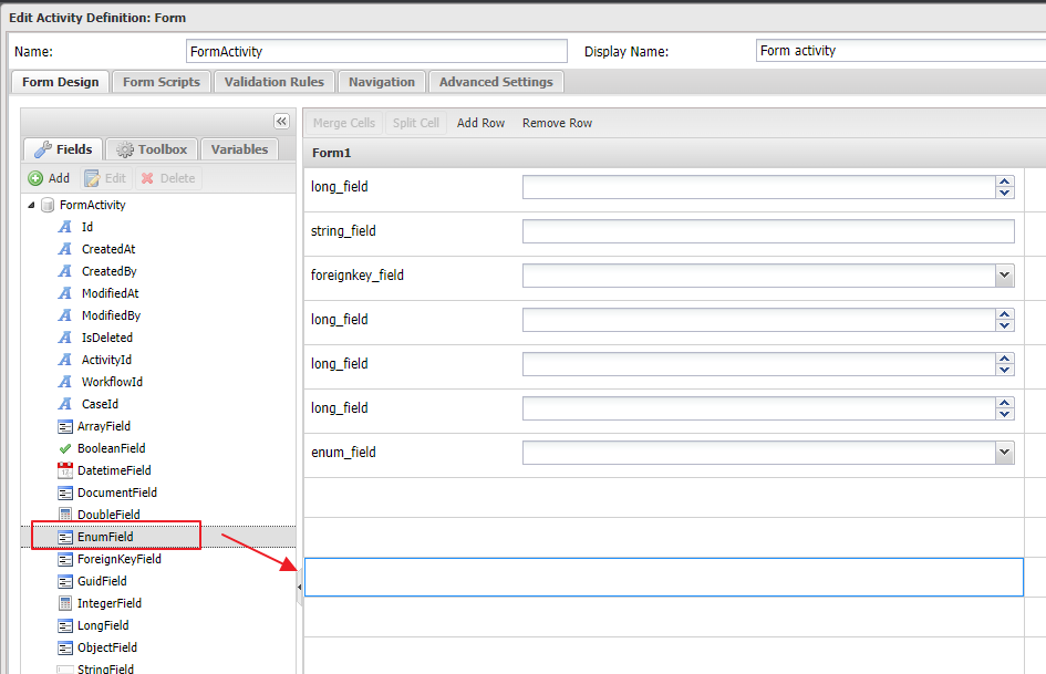
To delete an added field from the form, click on the field and press the Delete key on your keyboard. To delete all fields in a row, click on a cell in the row and select Remove row.
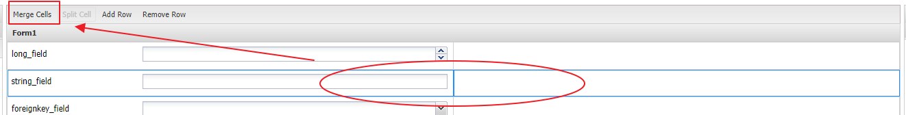
You can also merge two cells horizontally by selecting them in a row and clicking on Merge Cells. To select two cells, hold the Shift key while clicking.
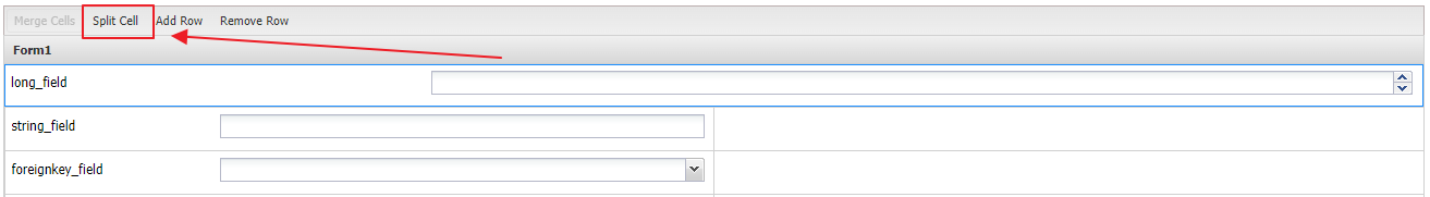
- To split a merged cell, select it and click on Split Cell.
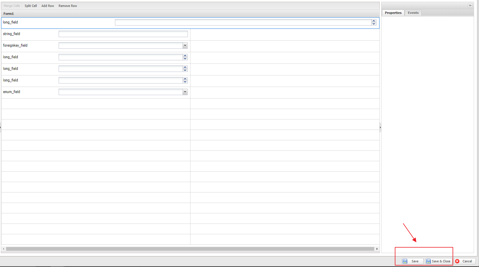
Step 3 : Save the form by clicking the Save or Save and Close button. Your changes will be saved.
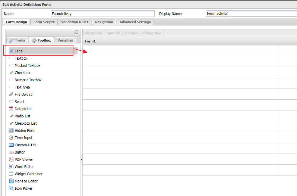
Add fields from toolbox
In addition to adding fields from the data source, you can also add fields from the Toolbox. The Toolbox is a list of components that you can directly add to the form.
Step 1: Open Toolbox list.
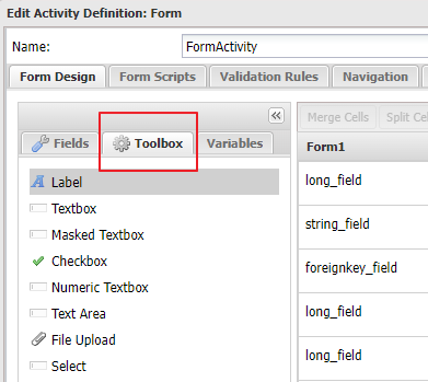
Click on the Toolbox tab, located next to the Fields tab, to open the Toolbox list. The components in this list include:
| Component name | Description |
|---|---|
| Frame | To add a flexbox container that holds other fields (used in the Flex layout). You can configure its direction, gap, alignment, and width. |
| Label | To add a label element |
| Field Label | To add a standalone label tied to a field (with required/help markup) |
| Textbox | To add a textbox field |
| Masked Textbox | To add a textbox field with specific validation of input values |
| Checkbox | To add a checkbox field |
| Numeric Textbox | To add a textbox field that allows to input numeric values only |
| Text Area | To add a text-area field |
| File Upload | To add a file upload field |
| Select | To add a drop-down list field |
| Datepicker | To add a date time field |
| Radio List | To add a radio button field with multiple options |
| Checkbox List | To add a checkbox field with multiple options |
| Hidden Field | To add a hidden field |
| Time Input | To add a time selection field |
| Custom HTML | To add a field which you can customize HTML |
| Button | To add a button field |
| PDF Viewer | To add a PDF Viewer field |
| Word Editor | To add a Word Editor field |
| Widget Container | To add a widget container which you can create a new widget or reuse another widget |
| Monaco Editor | To add Monaco editor |
| Icon Picker | To add an icon picker field with pre-set icons. |
| Text Editor | To add a rich-text editor |
Step 2 : Add component to the form.
Click on a field in the Toolbox list, drag it to the form area, and drop it into the desired cell.
Custom HTML
The Custom HTML component (in the Toolbox) lets you add your own markup to the form. Its content is rendered as an AngularJS template against the form scope, so you can use {{ }} interpolation, directives such as ng-if / ng-repeat / ng-bind-html, the translate filter, and Casewhere directives. Reference form data through dataSources.<DataSource>.data.<Field> (and dataSources.WorkflowVariables.data.<Variable> for workflow variables); you can also bind extra data through the component's Data Bindings section.
<!-- A bound summary line -->
<p>Applicant: <strong>{{dataSources.Person.data.FirstName}} {{dataSources.Person.data.LastName}}</strong></p>
<!-- A conditional message driven by a form value -->
<div class="alert alert-warning" ng-if="dataSources.Order.data.Total > 10000">
  {{'order_needs_manager_approval' | translate}}
</div>
<!-- Render an enum value as its display text -->
<span>{{enumText('Person', 'Status', dataSources.Person.data.Status)}}</span>
Add workflow variables
Step 1: Open Variables tab.
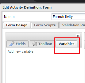
Step 2: Click on Add new variable field.
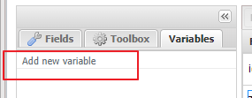
Step 3: Enter the variable name and press the Enter key to add it.
Step 4: Select an added field in the form area, then choose the Properties menu item. In the Properties list, expand the Data Binding section and select the variable.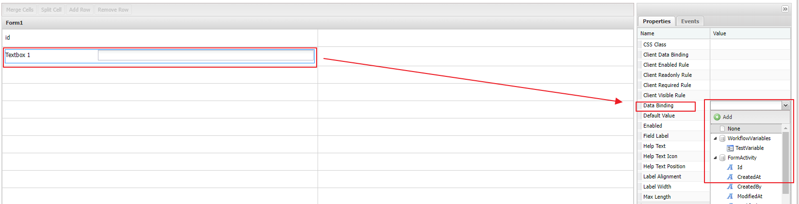
Field properties configuration
After adding a field to the form, select the field to open the Properties menu on the right side of the form area. You can configure specific properties for the field. The available properties are:
| Property name | Description |
|---|---|
| CSS Class | It is used to specify the name of a CSS class applied to the field's UI. This can be a CSS class from a component in the Worker site, a theme, or the Bootstrap library. |
| Client Data Binding | Use this to bind data to a variable on the client side. |
| Client Enabled Rule | Configure a client-side rule to determine whether the field is enabled or disabled. |
| Client Readonly Rule | Configure a client-side rule to determine whether the field is readonly or not. |
| Client Required Rule | Configure a client-side rule to determine whether the field is required or optional. |
| Client Visible Rule | Configure a client-side rule to determine whether the field is visible or hidden. |
| Data Binding | Use this to bind a data-source field or a workflow variable to the field. |
| Default Value | Use this to set the default value of the field in the UI. |
| Enabled | If you choose true, the field will always be enabled. If you choose false, the field will always be disabled. You can also customize the field's enabled state by selecting Custom and adding an expression. |
| Field Label | The field label accepts a text resource key. |
| Help Text | The help content provides a more detailed explanation of the field. |
| Help Text Icon | The icon indicating help text. For example, fas fa-question-circle. |
| Help Text Position | To determine the position of the help icon. The help text appears when you hover over the help text icon. - Label: The icon is displayed right next to the field label. - Input: The icon is displayed right next to the field input. - Inline: The help content is displayed inline. |
| Label Alignment | Determines the alignment of the label with the field input. The available options are: Left, Right, and Top. |
| Label Width | The width of the field label. |
| Name | The field name, which can be referenced in scripts. |
| Min value | Sets the minimum value for the field. The user's input cannot be less than this value. |
| Max value | Sets the maximum value for the field. The user's input cannot be greater than this value. |
| Placeholder | Use this to provide inline explanatory text for the field. |
| Range message | Used to define the error message when the input value does not fall within the min/max range. |
| Readonly | If you select True: The field is always read-only. If you select False: The field is always readable and editable. If you select Custom: You can define specific rules for reading or editing the field. |
| Required | If you select True: The field is mandatory. If you select False: The field is optional. If you select Custom: You can define specific rules for the field's mandatory status. |
| Required message | Used to define the error message when the required field value is missing. |
Field rules and bindings
Several field properties accept rules. Casewhere distinguishes client rules (run live in the browser) from server "Custom" rules (run on the server), and the two can be combined.
Client rules
Client Visible Rule, Client Enabled Rule, Client Readonly Rule, and Client Required Rule are AngularJS boolean expressions evaluated in the browser as the user types — ideal for responsive show/hide and enable/disable logic. Because they are AngularJS expressions, write the form symbols directly, without a $scope. prefix:
dataSources.<DataSource>.data.<Field>— a field value (usedataSources.WorkflowVariables.data.<Variable>for a workflow variable);components.<Name>,form(the AngularJS form, e.g.form.<Field>.$error), andinputs.
// Client Visible Rule on "AddressLine" — show only when HasAddress is ticked
dataSources.Person.data.HasAddress === true
// Client Required Rule on "Comment" — required only when Reason is "Other"
dataSources.WorkflowVariables.data.Reason === 'Other'
// Client Readonly Rule on "Amount" — read-only once the record is locked
dataSources.Order.data.IsLocked === true
Client rules inherit from their container: hiding or disabling a Frame hides or disables the fields inside it.
Custom (server) rules
The Enabled, Readonly, and Required properties offer True, False, and Custom. Choosing Custom opens a C# editor where you write a server-side predicate using ctx; it runs on the trusted server when the form loads and is submitted.
// Required = Custom on "CvrNumber" — required only for company applicants
ctx.FormData["Applicant"]["ApplicantType"] == "Company"
A field's effective state at runtime is the combination of its server rule and its client rule.
Data Binding vs Client Data Binding
- Data Binding binds the field to a data-source attribute or a workflow variable. The value is persisted when the form is submitted — this is the normal way to bind a field.
- Client Data Binding instead points the field at an arbitrary client-side expression. It is not persisted and is intended for transient, UI-only values. When both are set, Client Data Binding takes precedence.
Field events configuration
In Properties & Events section, by clicking on Events tab, list of events will be displayed. You can configure action of an event for the field. Those events are:
| Event name | Description |
|---|---|
| Blur | Define the event handler for when the "Blur" event. |
| Change | Define the event handler for when the "Change" event. |
| Click | Define the event handler for when the "Click" event. |
| DblClick | Define the event handler for when the "DblClick" event. |
| Focus | Define the event handler for when the "Focus" event. |
| KeyDown | Define the event handler for when the "KeyDown" event. |
| KeyPress | Define the event handler for when the "KeyPress" event. |
| KeyUp | Define the event handler for when the "KeyUp" event. |
| MouseDown | Define the event handler for when the "MouseDown" event. |
| MouseEnter | Define the event handler for when the "MouseEnter" event. |
| MouseLeave | Define the event handler for when the "MouseLeave" event. |
| MouseMove | Define the event handler for when the "MouseMove" event. |
| MouseOver | Define the event handler for when the "MouseOver" event. |
| MouseUp | Define the event handler for when the "MouseUp" event. |
Writing an event handler
An event handler is a snippet of JavaScript that you enter in a Monaco editor (the Enter Event Script dialog). It is spliced into the form's AngularJS controller, so the form-scope symbols must be accessed through $scope:
$scope.dataSources.<DataSource>.data.<Field>— read or write a data-source-bound field (use$scope.dataSources.WorkflowVariables.data.<Variable>for a workflow variable);$scope.setDefaultValue(value, 'DataSource', '<DataSource>', '<Field>')— set a default value on first load only;$scope.enumText('<DataSource>', '<Field>', value)— the display text of an enum value;$scope.components.<Name>— the field API (visible(),enabled(),readonly(),required()).
$scope.is required in event handlers, but must not be used in client rules. In an event handler (JavaScript),dataSources,enumText, and the helpers live on$scope. In a client rule or{{ }}interpolation (an AngularJS expression), you write the same symbols without$scope.— adding it there makes the expression silently evaluate toundefined.
Most events also receive the DOM $event argument. (The Change, MouseEnter, and MouseLeave events do not.)
Example — a Change handler on a Country field that derives a Region field on the same data source:
$scope.dataSources.Applicant.data.Region =
    ($scope.dataSources.Applicant.data.Country || '').toUpperCase();
Example — a Click handler on a button that copies the billing address to the shipping address:
$scope.dataSources.Order.data.ShippingStreet = $scope.dataSources.Order.data.BillingStreet;
$scope.dataSources.Order.data.ShippingCity = $scope.dataSources.Order.data.BillingCity;
Form-level events: Select the form Canvas (not a field) to configure lifecycle events — Initializing, Load, FormSubmitted, Unload, and FormSubmitting. A FormSubmitting handler should
return true;to allow submission orreturn false;to block it.
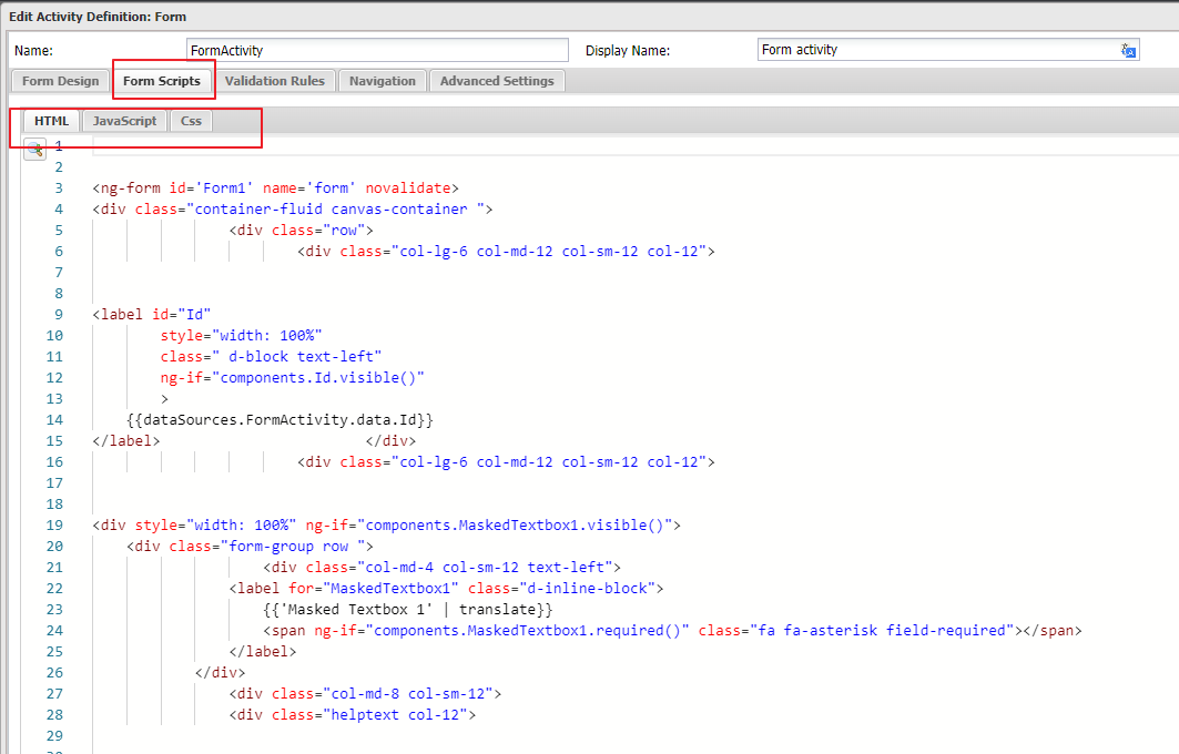
Form Scripts
Form Scripts is the section where you can view the code generated for the form. It has three read-only panels — HTML, JavaScript, and CSS — and Casewhere automatically regenerates them whenever you modify the form design.
Validation Rules
Validation Rules is a section in the Form Activity dialog where you can create and edit validation rules.
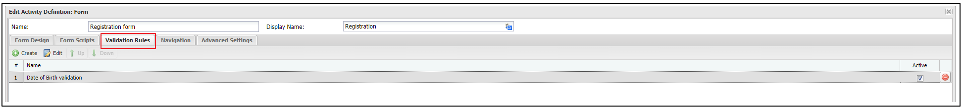
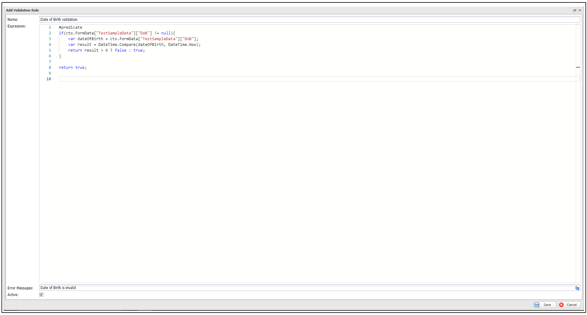
For example, the following is a validation rule for the user's date of birth:
Create a new Validation Rule
Clicking the Create button opens a dialog to add a validation rule:
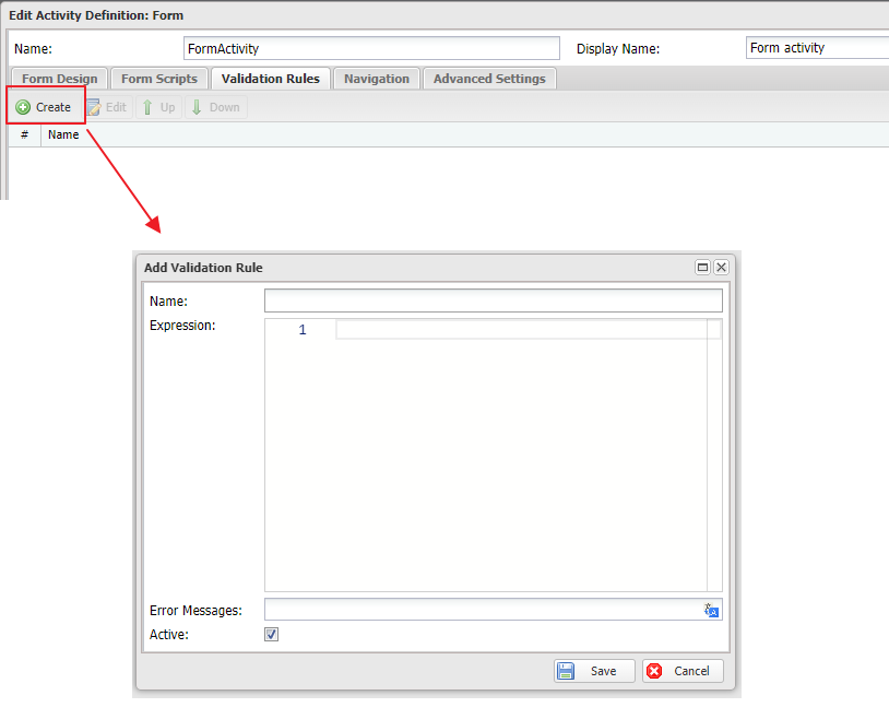
In this dialog, there are fields:
| Field Name | Description |
|---|---|
| Name | Is used to fill name of the validation rule |
| Expression | Is used to fill expression of the validation rule |
| Error Message | Is used to fill error message when field value does not match validation rule |
| Active | Is used to activate or deactivate the validation rule. If the checkbox is unticked, the rule will be deactivated |
Validation rule expressions
A validation rule's Expression is a C# predicate that returns true when the data is valid. It runs on the server after the field rules pass, with access to the workflow context through ctx — for example ctx.FormData["<DataSource>"]["<Field>"], ctx.FormData["<DataSource>"].Get<T>("<Field>"), ctx.User, ctx.Case, and ctx.Use<TApi>(). You can write a one-line expression, or a #predicate block with an explicit return.
// End date must be on or after start date
(System.DateTime)ctx.FormData["Booking"]["EndDate"] >= (System.DateTime)ctx.FormData["Booking"]["StartDate"]
// Applicant must be at least 18
#predicate
var dob = ctx.FormData["Person"].Get<System.DateTime?>("DateOfBirth");
if (dob == null) return true; // let the Required rule handle emptiness
return dob.Value <= System.DateTime.Today.AddYears(-18);
Tip: In addition to these activity-level rules, each field has its own Validation Rules grid in its Properties (the same Name / Expression / Error Message / Active shape) for validation specific to that field.
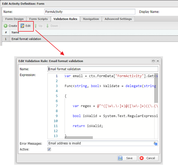
Edit a Validation Rule
By selecting an existing validation rule, then clicking on Edit button, the dialog of editing validation rule will be opened. You can change the name, expression, error message, active state of the validation rule.
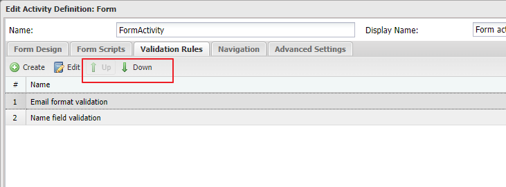
Edit position of a validation rule in the list
You can use Up and Down button to change the position of a validation rule in the list. First, select a rule, then click on Up/Down button move it up/down.
Navigation
Navigation section in Form activity is where you can configure the navigation logic for your activity.
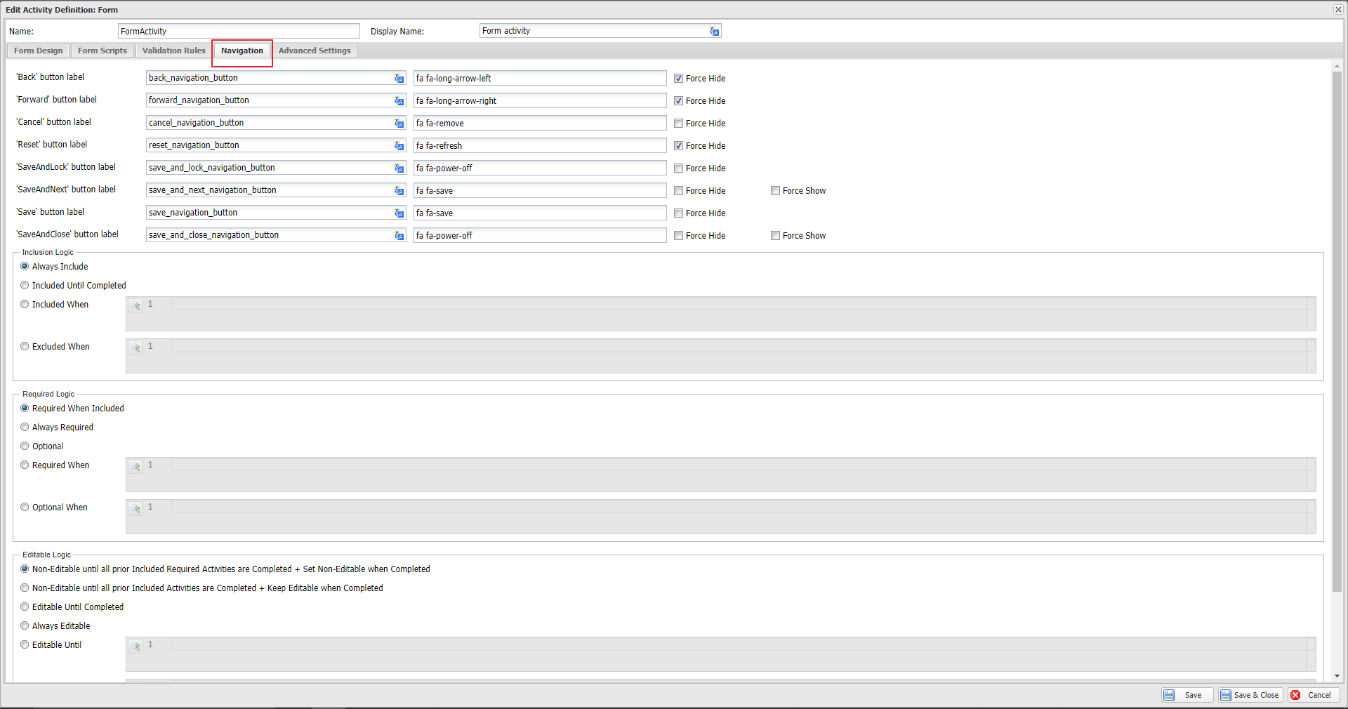
More details can be found in: Workflow navigation
Advanced Settings
Advanced Settings is the section in the Form activity where you can configure some additional advanced settings for the form.
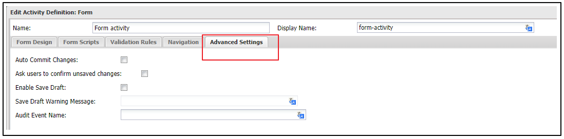
| Settings name | Description |
|---|---|
| Auto Commit Changes | If this checkbox is selected, Casewhere will save all unsaved data to the database after the activity is completed. By default, Casewhere only saves data when the entire workflow is finished. |
| Audit Event Name | Starting from version 2.7, Casewhere automatically audits all events that alter the data state. By default, the activity name is used for auditing, but you can customize it using this setting. |
| Enable Exclusive Lock | Casewhere enables you to control concurrency at the activity level using an exclusive lock. To learn more, refer to Workflow concurrency control. |
| Lock Context (optional) | When the exclusive lock is enabled, Casewhere allows only one activity to execute at a time across the entire system. This may not be ideal for many scenarios. By providing a lock context, you can control concurrency more granularly. For example, you can enable the lock on specific data objects, allowing multiple activities to run as long as they target different objects. The setting accepts an expression that uses the same syntax as the navigation rule. |
| Waiting Timeout | Casewhere will release the lock if it exceeds the configured timeout, even if the activity is not yet complete. |
Once all configurations are complete, clicking Save will save all the changes.