Workflow navigation
In order to work with Casewhere workflows efficiently, you, as the solution developer, need to understand how the workflow engine works, especially how it navigates from one activity to another.
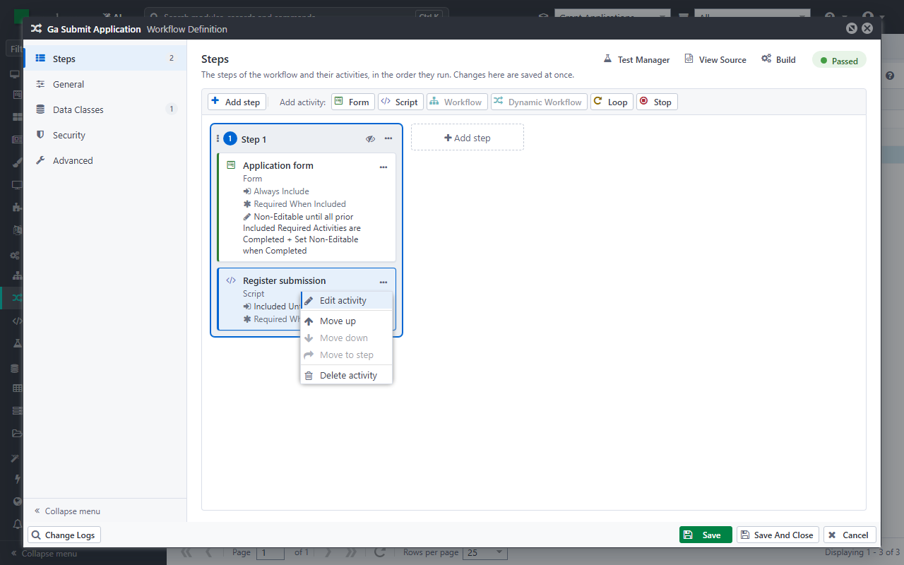
After adding an activity to a step, open the activity's menu (...) and click Edit activity, or double-click the activity, to set up the activity definition.
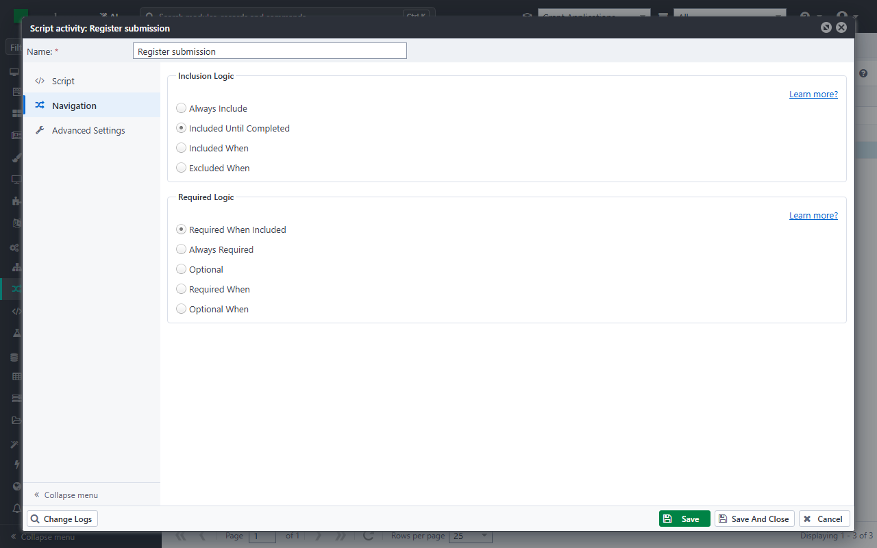
The navigation settings can be found in the Navigation section, which is available for all activity definitions.
Activity navigation
Inclusion logic
The inclusion logic controls whether the workflow engine should execute the activity or not. You can configure by choosing one of the following options:
- Always Include: The workflow engine will always execute the activity.
- Included Until Completed: After executing the activity, the workflow engine will exclude it from the execution path. If the activity is a UI activity, you will see it disappear in the workflow wizard.
- Included When: The workflow engine will execute the activity when the expression returns true. You can learn more about the syntax here.
- Excluded When: The workflow engine will skip the activity when the expression returns true. You can learn more about the syntax here.
For UI activities, the default setting is Always Include while it is Included Until Completed for automated activities.
Required logic
The required logic determines whether the activity is required to complete the workflow. A workflow completes when all required activities are completed. You can configure the logic by choosing one of the following options:
- Required When Included: The activity is only required when it is included.
- Always Required: The activity is always required.
- Optional: The activity is optional and does not impact the workflow completion.
- Required When: The activity is required when the expression returns true. You can learn more about the syntax here.
- Optional When: The activity is optional when the expression returns true. You can learn more about the syntax here.
The default value is Required When Included.
Editable logic
The editable logic controls whether or not the activity is available for user input. This setting is applicable for UI activities only. You can configure the logic by choosing one of the following options:
- Non-Editable until all prior Included Required Activities are Completed + Set Non-Editable when Completed
- Non-Editable until all prior Included Activities are Completed + Keep Editable when Completed
- Editable Until Completed: The activity is set to non-editable after it is completed.
- Always Editable: The activity is always editable.
- Editable Until: The activity is editable until the expression returns true. You can learn more about the syntax here.
- Non-Editable Until: The activity is non-editable until the expression returns true. You can learn more about the syntax here.
The default value is Non-Editable until all prior Included Required Activities are Completed + Set Non-Editable when Completed.
Completion logic
The completion logic lets the workflow engine complete a form activity by itself, without waiting for the user. This setting is applicable for form activities only.
- Auto Complete Activity Without User Interaction: When the workflow engine reaches the form, it validates the data the form already has (required fields and validation rules) and completes the form when the data is valid. The form does not save anything. When the data is not valid, the form waits for the user as usual.
- Only When: The form completes by itself only when the expression returns true. Leave it empty to complete the form by itself whenever its data is valid. An expression that fails counts as false. You can learn more about the syntax here.
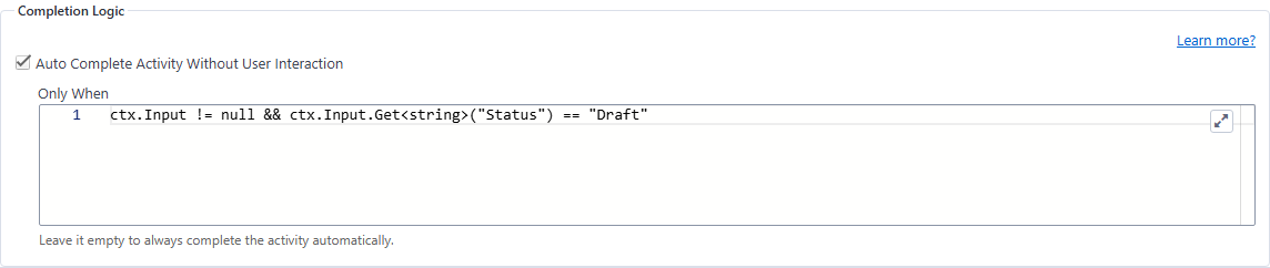
A typical use is a long form that users can save as a draft: when they continue the draft, the steps they have already filled in complete by themselves, and the workflow opens at the first step that is missing. See Example 4 - Continue a draft application.
Note:
ctx.Activity.IsCompletedoes not tell whether the user has completed the form before: whenever the workflow engine runs from an activity, it first marks the activities after it as not completed. Base the expression on data instead, such as the workflow's input or a workflow variable.
Workflow wizard buttons
The workflow wizard provides a set of buttons for end-users to submit data, navigate back and forth. You can customize these navigation buttons from Casewhere Admin in the Buttons table at the bottom of the Navigation section of a form activity.
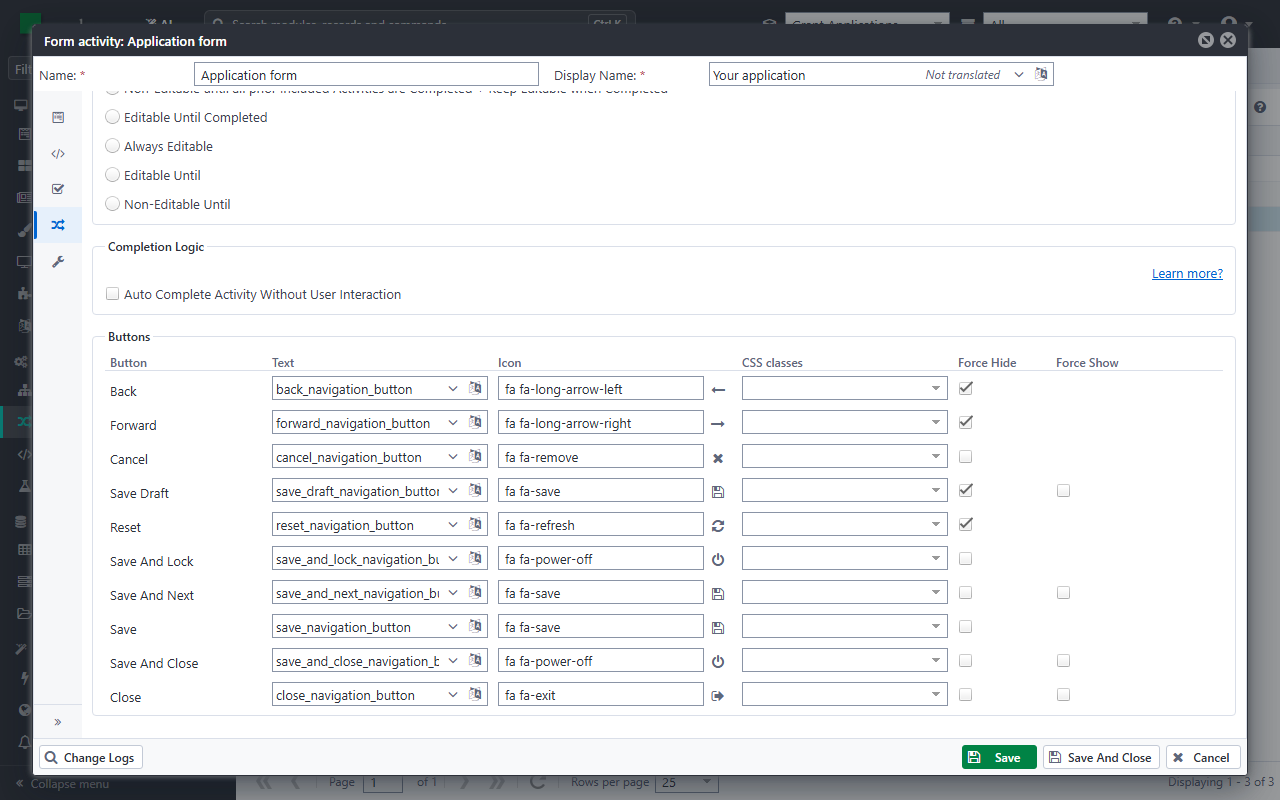
Below are the navigation buttons' default behaviors, but you can always override them by using Force Hide or Force Show.
- Back: Move to the previous activity. This button does not save data.
- Forward: Move to the next activity in the current execution path. This button does not save data.
- Cancel: Close the workflow wizard and discard all unsaved changes. Always visible.
- Reset: Clear unsaved changes and reload the activity.
- Save And Next: Save data and navigate to the next activity in the current execution path. Disappears at the last activity.
- Save: Appears at the last activity in the current execution path instead of Save And Next.
- Save And Close: Save data and close the workflow wizard. Only appears at the last activity of the current execution path.
- Save Draft: Save the current data as a draft without completing the activity.
- Close: Close the workflow wizard.
- Save And Lock (deprecated): Save data and lock the workflow. This button is deprecated and should not be used in new implementations.
Here you can also customize the buttons' appearance:
- Text: Casewhere accepts text resource keys for button's label.
- Icon: The CSS classes of the icon shown before the label, for example
fa fa-paper-plane. You can use the Font Awesome 4.7 icons. A preview of the icon shows beside the field. - CSS classes: More CSS classes for the button, separated by spaces. A Bootstrap color class replaces the button's default color:
btn-primary,btn-secondary,btn-success,btn-danger,btn-warning,btn-info,btn-light,btn-dark,btn-link, or an outline variant such asbtn-outline-danger. Any other class is added to the button, such as the sizebtn-smorbtn-lg, or a class of your own.
The arrow of the CSS classes field, or the Down key in it, opens shortcuts for the common colors and sizes. A pick replaces the class of its kind (color or size) and keeps the other classes, and Outline switches the color to its outline variant. You can still type any class in the field.
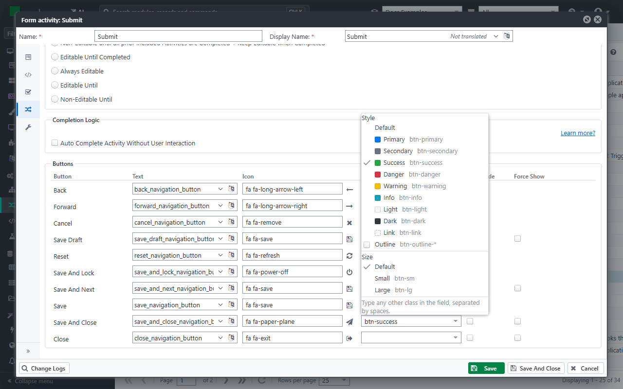
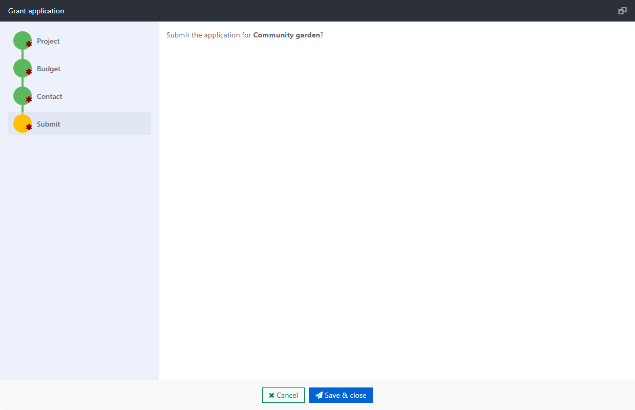
For example, the Submit step of Example 4 hides Save, and its Save And Close has the CSS classes btn-success and the icon fa fa-paper-plane. The colors come from the worker site's theme: on the example's site, the success color is blue, and the default color of the buttons is green.