General settings of form component
Display settings
The settings in the Display tab are for modifying the front-end UI of a component.
The following are the general settings in the Display tab of form components.
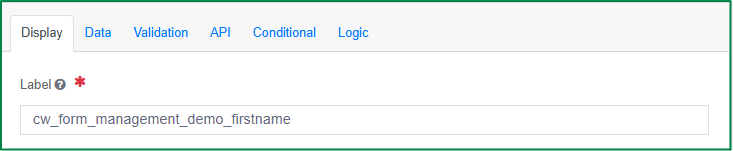
Label
This option is used to define the name or title of the field. You can also enter the text resource key for the label if you want the field label to be displayed in multiple languages.
Label Position
This option is used to define the position of the field label. There are 6 options in the list of positions; you can choose an item from the provided list.
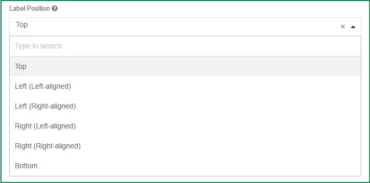
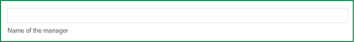
- Top: the label will be displayed on the top of the component and left-aligned
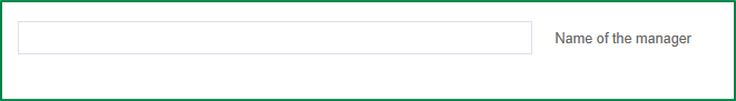
- Left (Left-aligned): the label will be displayed at the left of the component and aligned to the left of the component width span.
- Left (Right-aligned): the label will be displayed at the left of the component and aligned to the right of the component width span.

- Right (Left-aligned): the label will be displayed at the right of the component and aligned to the left of the component width span.
- Right (Right-aligned): the label will be displayed at the right of the component and aligned to the right of the component width span.

- Bottom: the label will be displayed below the component and left-aligned.
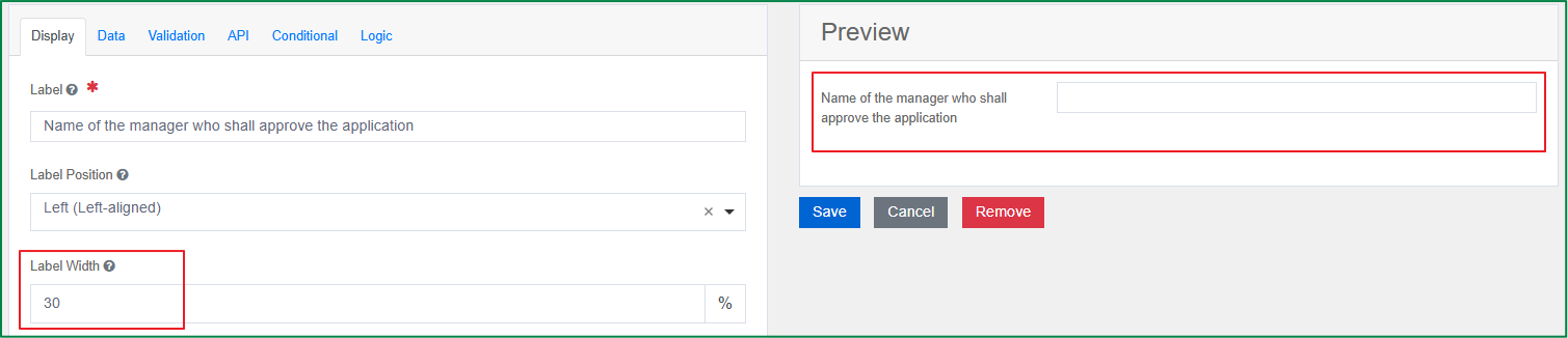
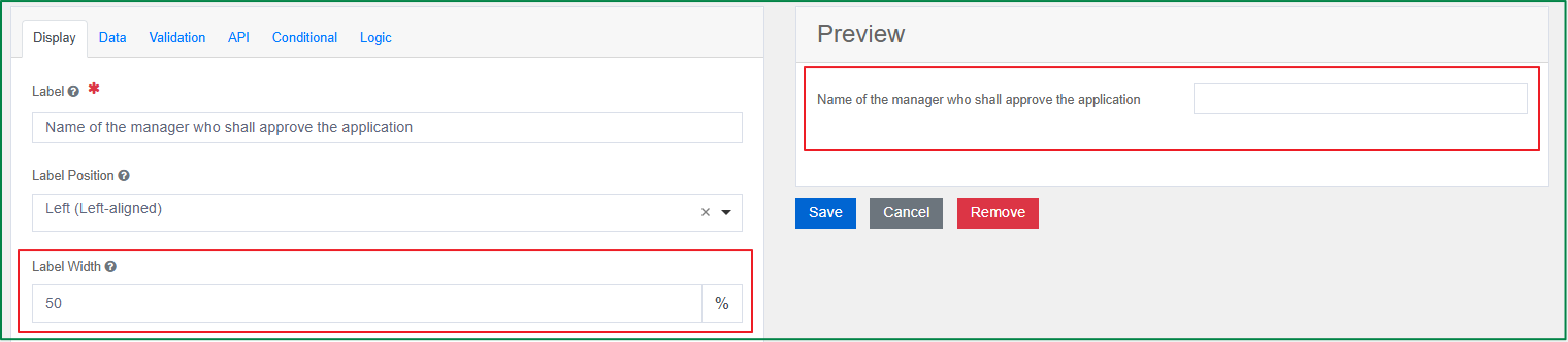
Label Width
This option is used to define the width of the label on the line, in percentages. By default, the label width is 30%. This option is only enabled if the Label position is Left/Right.
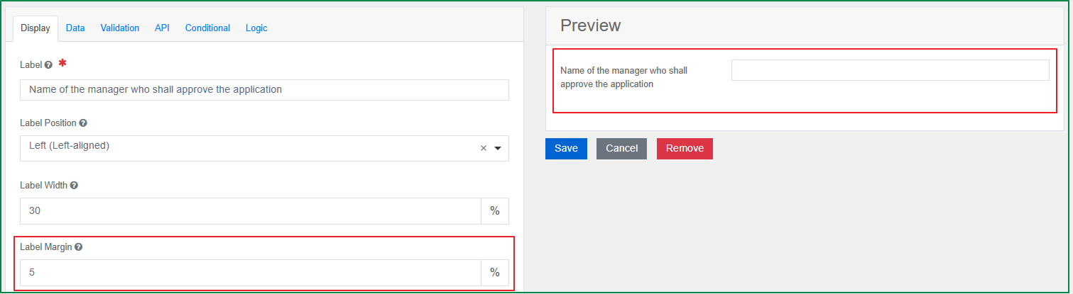
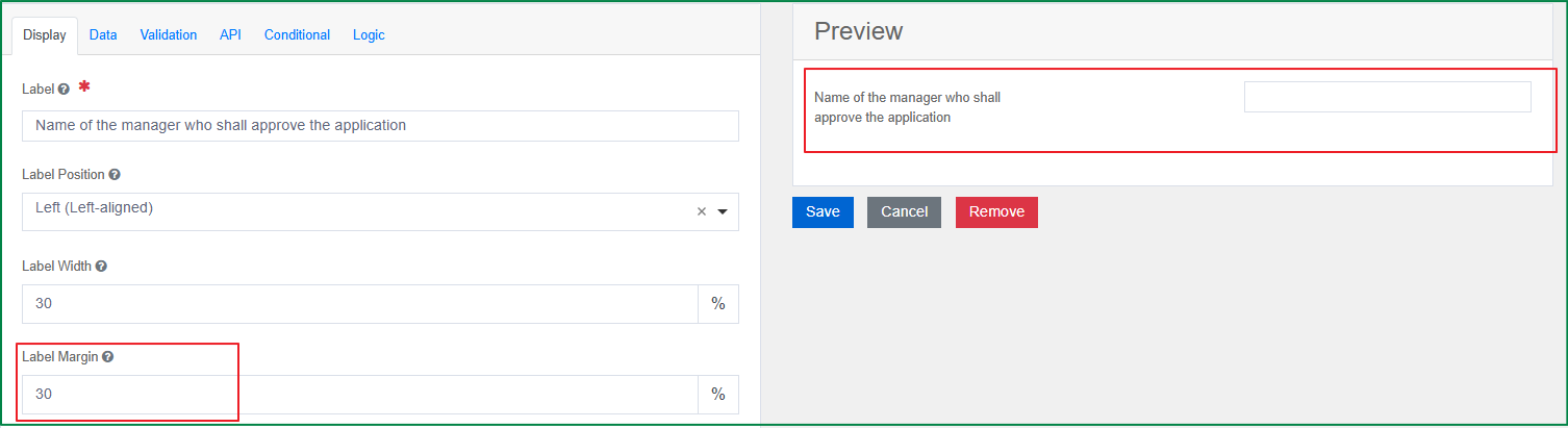
Label Margin
This option is used to define the width of the label margin on the line, in percentages. By default, the label margin width is 3%. This option is only enabled if the Label position is Left/Right.
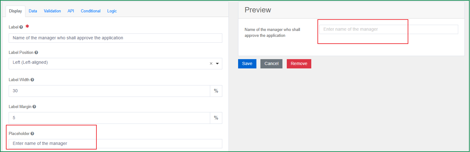
Placeholder
This option is used to define the placeholder text that will appear when this field is empty.
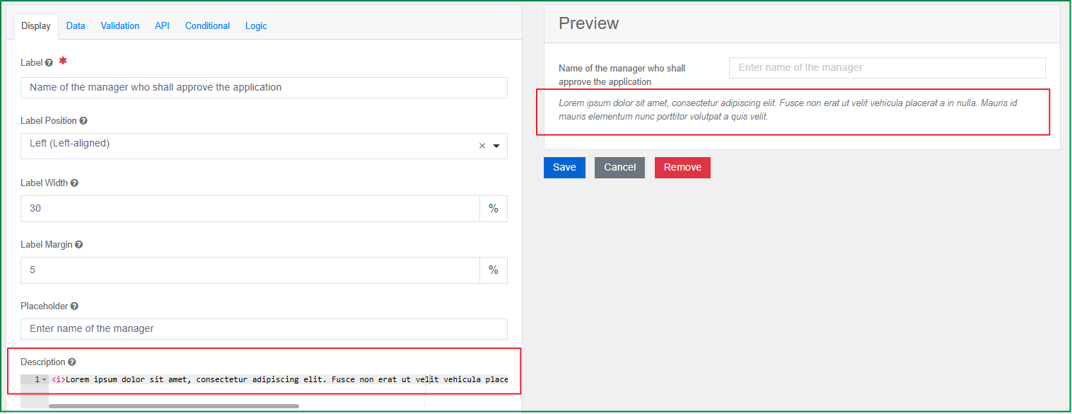
Description
This option is used to define the description of the field, which is displayed below the field. You can style the description content by using HTML.
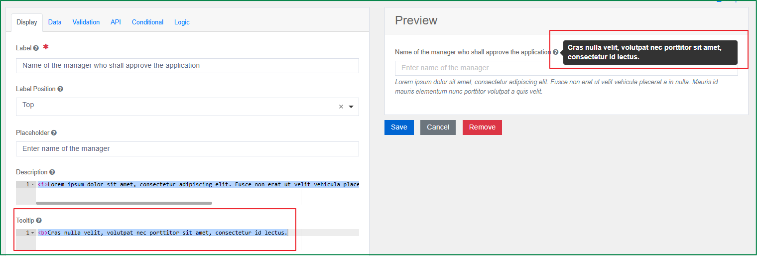
Tooltip
This option is used to define the tooltip of the field. If the tooltip is defined, a question mark icon will be displayed to the right of the field label in the front-end view. When the end-user hovers over the icon, the tooltip content will be displayed. You can style the tooltip content by using HTML.
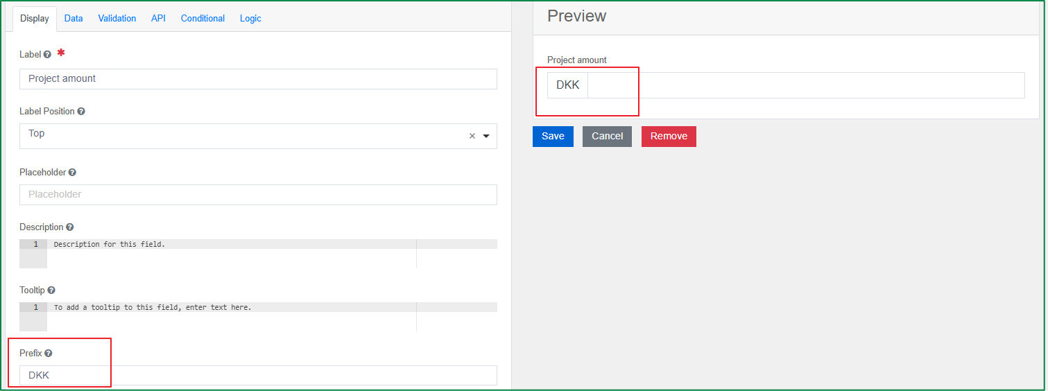
Prefix
This option is used to define the text which is shown before the input field, for example, 'DKK' for currency.
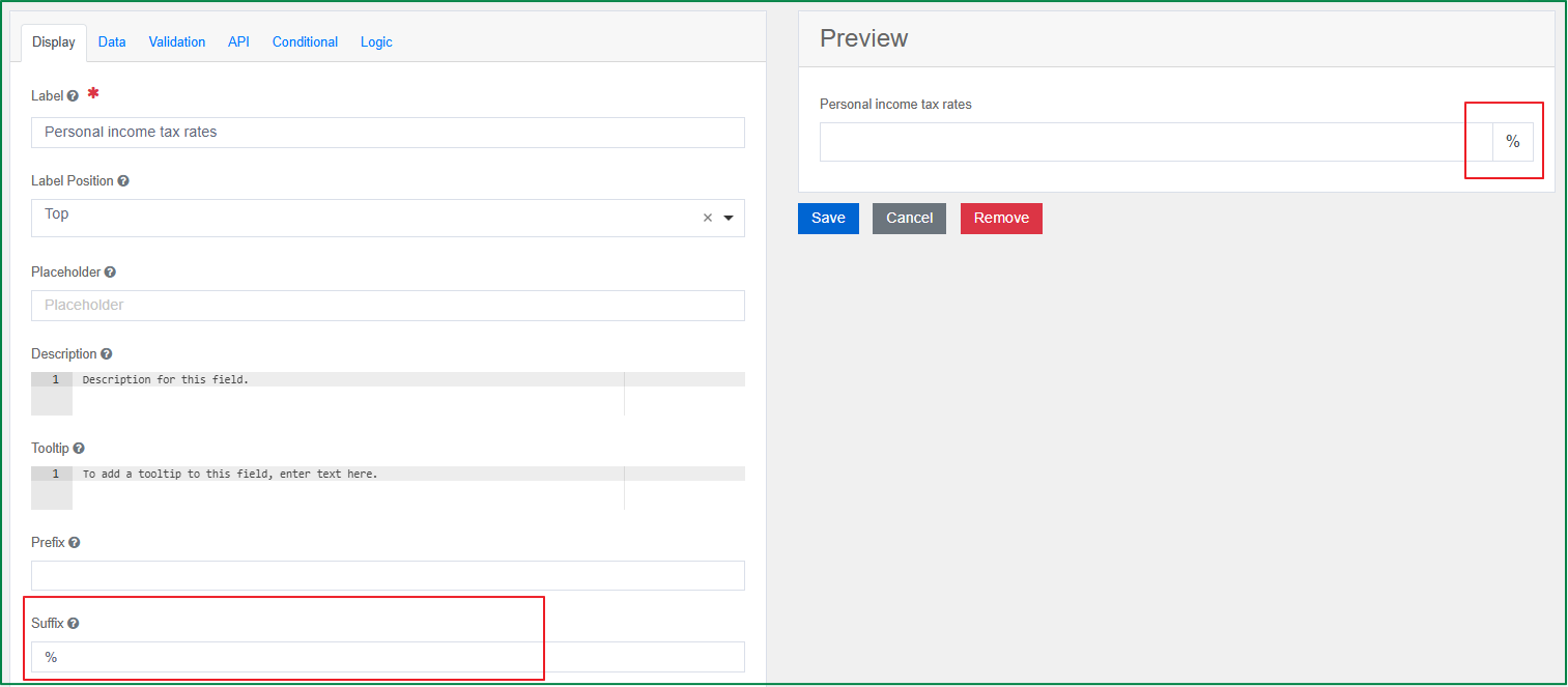
Suffix
This option is used to define the text which is shown after the input field, for example, '%' for percentage.
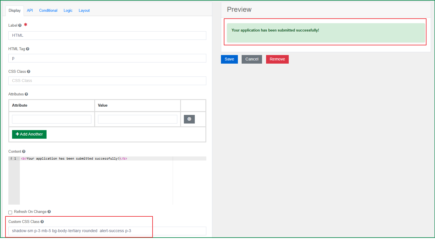
Custom CSS Class
You can add a custom CSS class to apply styling and formatting to the component. You may add multiple class names separated by a space.
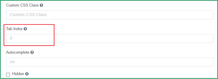
Tab Index
This option is used to define the order in which fields are focused when the end-user presses the Tab key. If the tab index is filled, the default tab order of the form will be overridden.
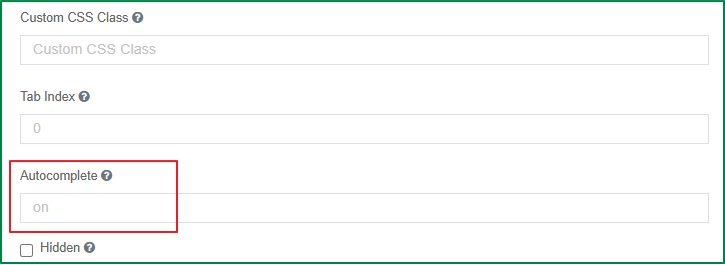
Autocomplete
This option is enabled by default. It indicates whether the input fields will automatically populate data from values previously entered by the user, based on the cache of the user's browser. Enter the value off in the setting field to disable it.
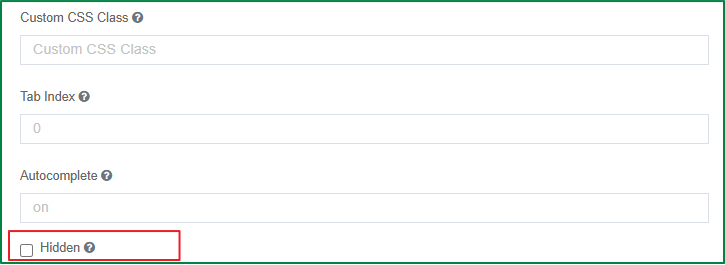
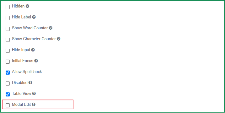
Hidden
This option is used to hide the field from the rendered form in the view of end-users. However, a hidden field is still part of the form JSON. You can use it in combination with the visibility and accessibility dependency rule.
For example, the Auxiliary documents field is hidden by default, and is only displayed, enabled, and required if the value of the Project duration field is longer than 6 months. In this case, the Hidden checkbox in the configuration of the Auxiliary documents field should be ticked.
Hide Label
Tick this checkbox if you want to hide the label of this component. After the checkbox is ticked, the field label is still displayed in design mode, but will be hidden on the rendered form in the view of end-users.
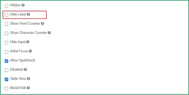
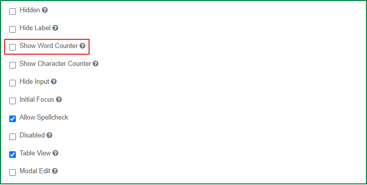
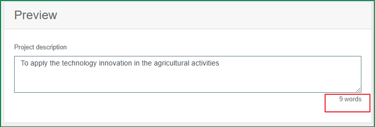
Show Word counter
Tick this checkbox if you want to show the count of the filled words while the end-user is typing.
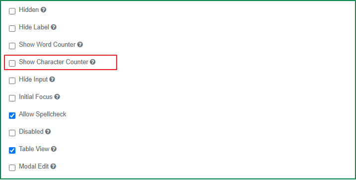
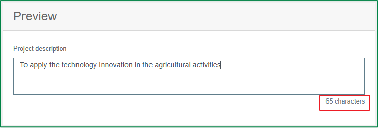
Show characters counter
Tick this checkbox if you want to show the count of the filled characters while the end-user is typing.
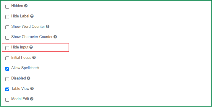
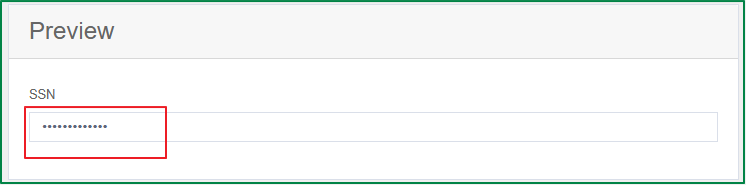
Hide Input
Tick this checkbox if you want the input data in the field to be displayed with circle characters, like how it is displayed in password fields. This setting can be used to handle sensitive data, such as Tax ID or SSN.
This option does not encrypt the data on the server. Do not use this setting for passwords.
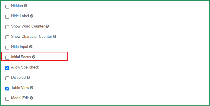
Initial Focus
Tick this checkbox if you want the field to be focused initially on the rendered form when the form is loaded. Only one component should have the Initial Focus setting enabled. If more than one component on the form has the Initial Focus setting enabled, only the last component with the setting enabled in the JSON structure will be focused on the form.
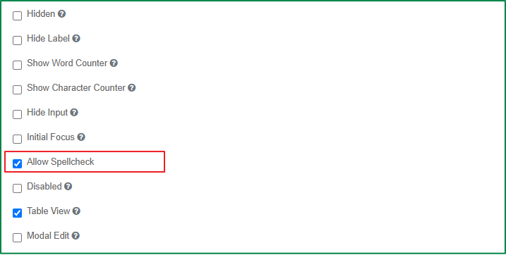
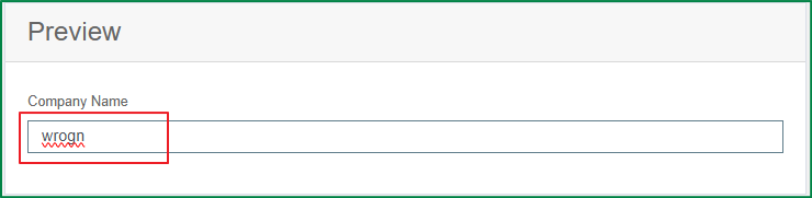
Allow Spellcheck
Tick this checkbox if you want to enable real-time spellchecking for input fields on the rendered form. This setting is turned on by default.
Disabled
Tick this checkbox if you want the field to be displayed in a disabled state on the rendered form. The end-user cannot input data into the disabled field.
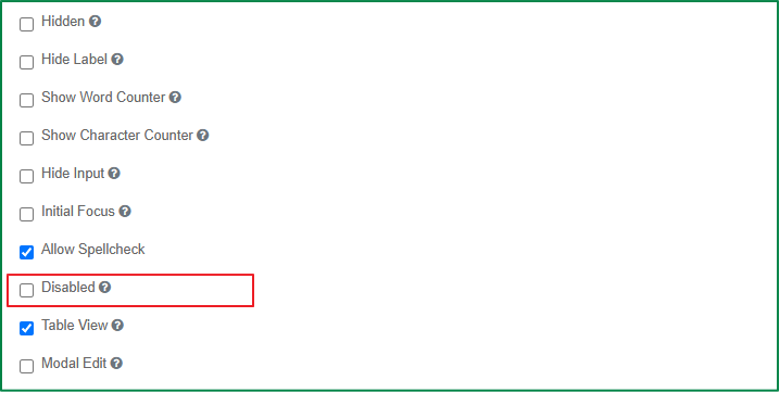
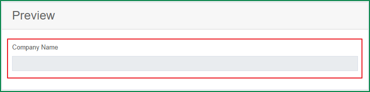
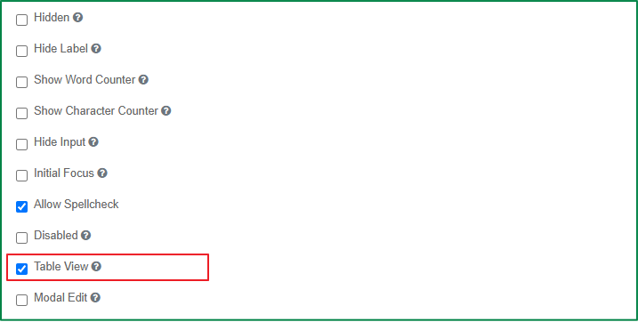
Table View
If checked, the input data of the field will be shown in the table view of the submissions list.
Modal Edit
Tick this checkbox if you want the end-user to input data for the field in a modal window.
If this option is enabled, on the rendered form, the input field will be replaced with a button.
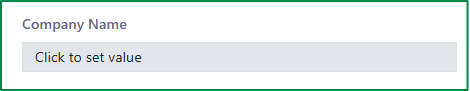
Then, when the end-user clicks the button, a modal window will be opened to input, or edit the field data.

Data settings
The settings in the Data tab are used to configure end-user input data: how it interacts with other field data within the form, and how it is stored on the server, such as setting a default value or configuring data calculations.
The following are the general settings in the Data tab of form components.
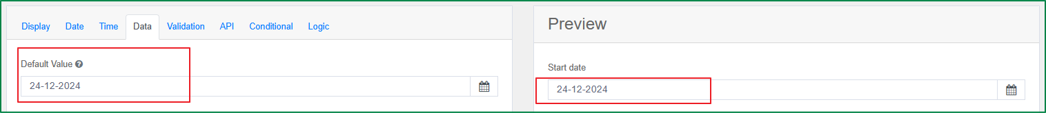
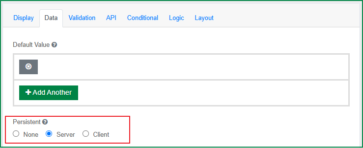
Default Value
This option is used to define the default value which will be displayed in the field when the form is rendered. If the end-user does not make any change to the field, the default value will be saved with the submission.
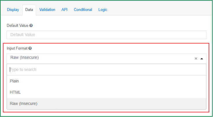
Input Format
This option is used to force the output of the field to be sanitized in a specific format. There are 3 format options: Plain, HTML, and Raw.
Persistent
This option is used to determine how the field data will be stored when the form is submitted. There are 3 persistence options: None, Server, and Client. The default selected option is Server.
- None: The front-end will submit the data to the backend, but the backend will not store the value. Select this option when client-side logic is needed on the form without the need to send or save the data to the server.
- Server: The front-end will submit the data to the backend, and the backend will store the value.
- Client: The front-end will not submit the data to the backend, and the backend will not store the value. Select this option when the server needs to intercept data for workflows such as logic or calculations, but the data does not need to be stored.
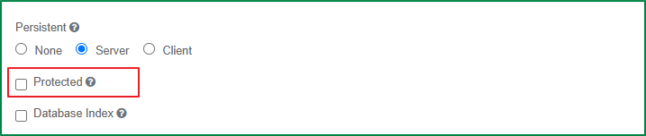
Protected
This option is used to prevent the field data from being queried from an API call. Tick this checkbox if an extra layer of protection is needed for sensitive data.
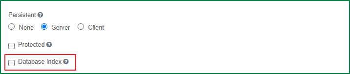
Database Index
Tick this checkbox if you want to set this field as an index within the database. It is used to increase the performance of submission queries.
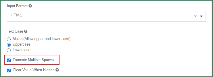
Truncate Multiple Spaces
Tick this checkbox if you want to remove the unnecessary spaces between words or characters within the field.
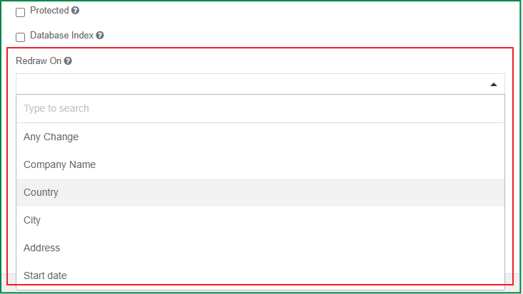
Redraw On
This option is used to refresh the component when a specific change occurs on the rendered form. This option includes a dropdown list of fields added to the form; you can select a field from the dropdown list, and then, when there is a change on the selected field, the component will be refreshed. If you select the Any change option in the list, the component will be refreshed when any change occurs on the rendered form.
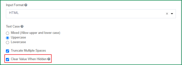
Clear Value When Hidden
This option is used to clear the entered field value when the field is hidden. By default, this setting is on. Untick the checkbox if you want the field value to be retained and subsequently re-displayed when using conditional logic.
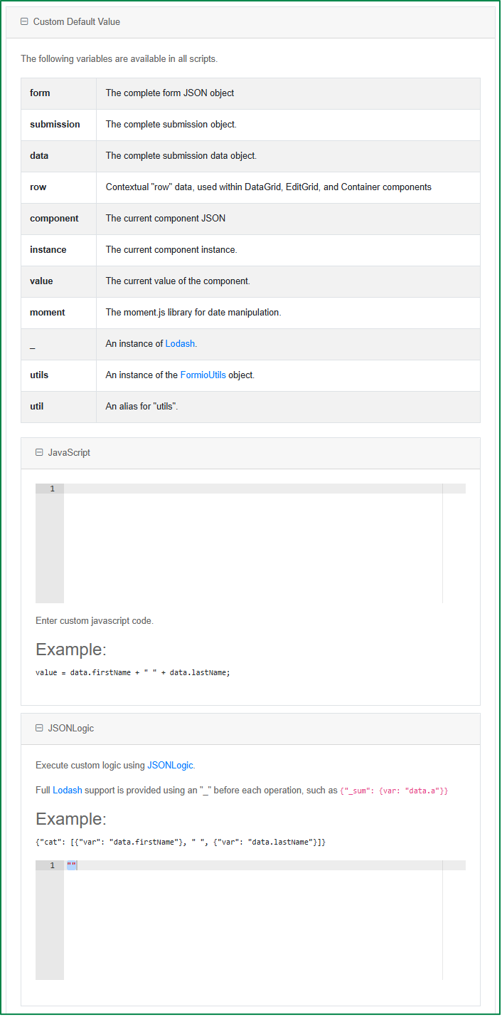
Custom Default Value
With this option, you can write custom Javascript or JSON Logic to set the default value of the field.
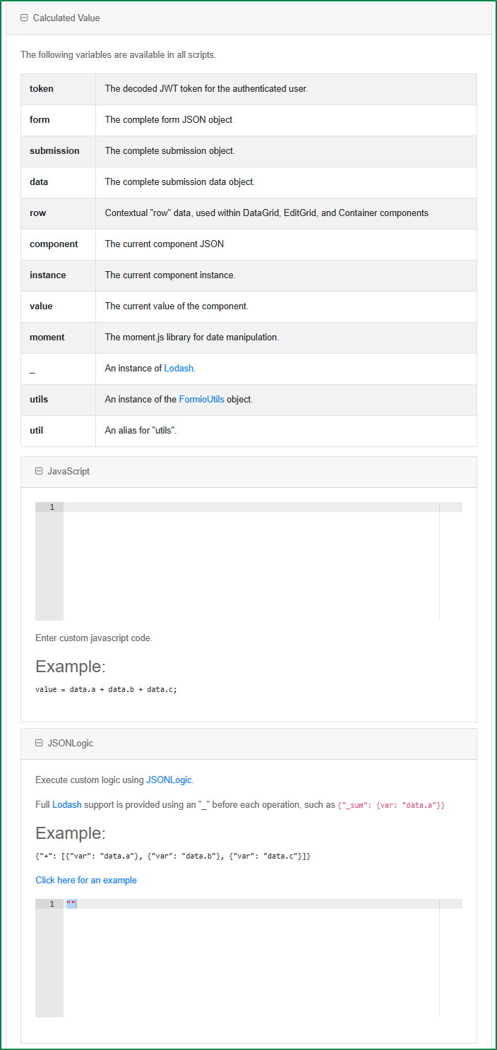
Calculated Value
With this option, you can write custom Javascript or JSON logic to set up calculation logic on the field.
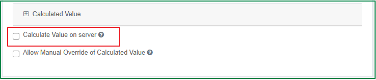
Calculate Value On Server
This option is used to run the calculations on the server side. This setting is useful if you want to override the values submitted on the back-end with the calculations performed on the server.
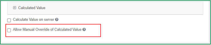
Allow Manual Override of Calculated Value
By default, the end-user cannot input any value into a field that has calculations set. Tick this option if you want the end-user to be able to input data to override the calculated value in the field.
Validation settings
The settings in the Validation tab relate directly to the configurable front-end and back-end validations for the field, such as required fields, unique data, min/max requirements, custom validations, and custom error messages.
The following are the general settings in the Validation tab of form components.
Validate On
This option is used to determine when the front-end validation of this component should be triggered. There are 2 options: Blur and Change.
- Blur: The validation will be triggered when the field is no longer focused. This option is useful when the field requires a certain format, so that the validation is only triggered after the end-user has completed the data input, for example, email or phone number.
- Change: The validation will be triggered whenever there is a change in the field.
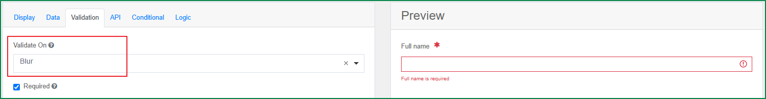
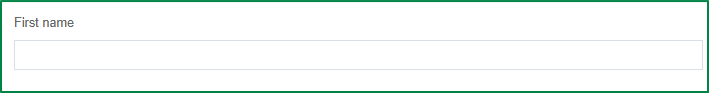
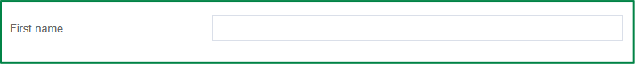
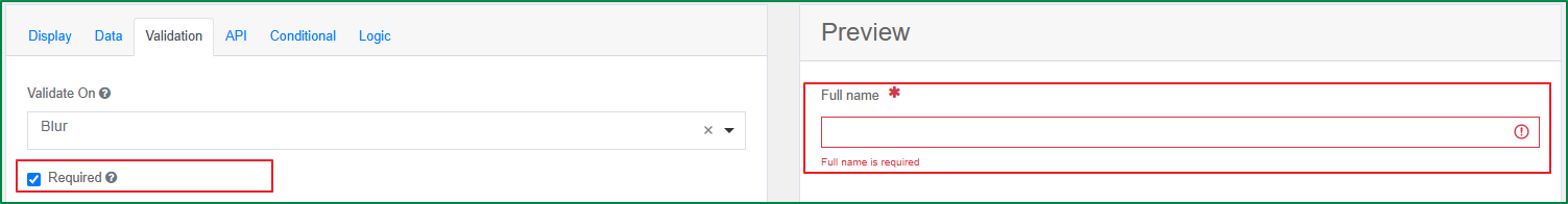
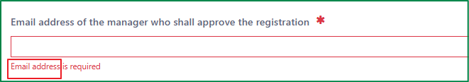
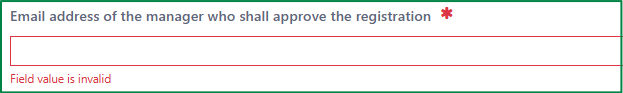
Required
Tick this checkbox if you want to show a red asterisk to the right of the field label and force the end-user to input data for the field before submitting the form. If the end-user submits the form without filling in data for the required field, an error message will be displayed and the form cannot be submitted.
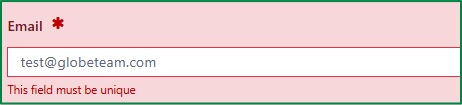
Unique
Tick this checkbox if you want to disallow submitting the same value for the field multiple times. For example, apply this validation to the Email field of a registration form so that an email address cannot be submitted twice.
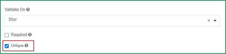
When this setting is on, if the end-user submits the rendered form with a duplicate value for the field, the submission will be prevented and the duplicate-value error message will be displayed.
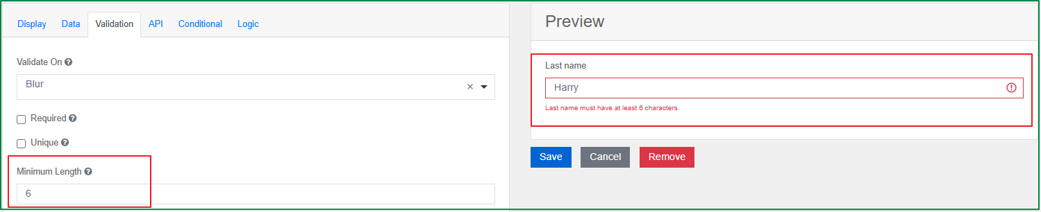
Minimum Length
This option is used to define the minimum number of characters in the input data. If the end-user inputs data with fewer characters than the minimum length, the minimum-character error message will be displayed.
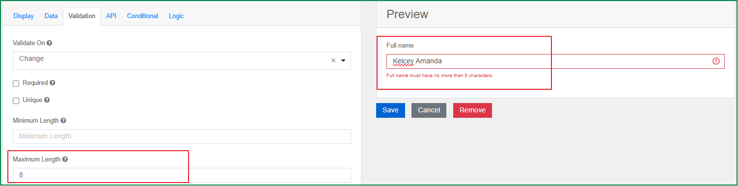
Maximum Length
This option is used to define the maximum number of characters in the input data. If the end-user inputs data with more characters than the maximum length, the maximum-character error message will be displayed.
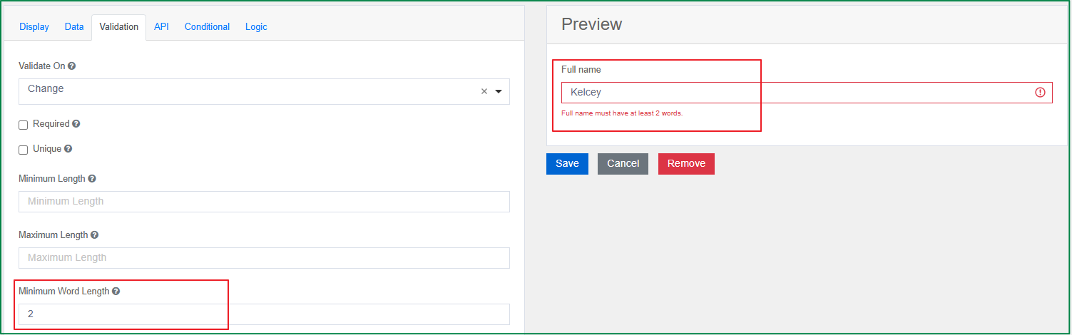
Minimum Word Length
This option is used to define the minimum number of words in the input data. If the end-user inputs data with fewer words than the minimum word length, the minimum-word error message will be displayed.
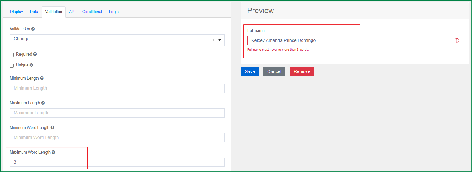
Maximum Word Length
This option is used to define the maximum number of words in the input data. If the end-user inputs data with more words than the maximum word length, the maximum-word error message will be displayed.
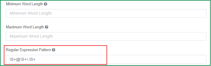
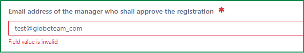
Regular Expression Pattern
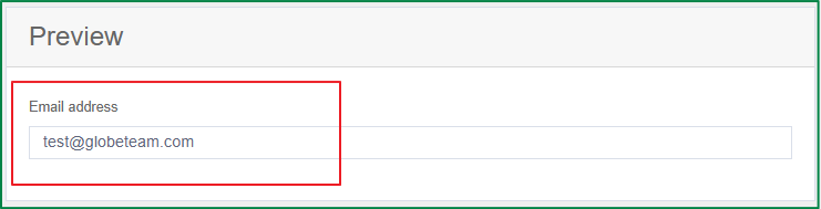
With this option, you can define a Regex pattern (or filter) that specifies a set of strings that must match the pattern. The following is an example of an email address pattern.
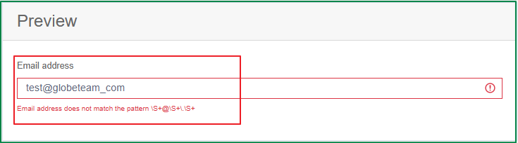
On the rendered form, if the end-user inputs data that does not match the defined pattern, the pattern-mismatch error message will be displayed as follows.
The validation passes if the entered data matches the defined pattern.
Error Label
With this option, you can define the field label that is shown in the error message when the validation is triggered. This option is useful when the field label is too long and you want to shorten the error message.
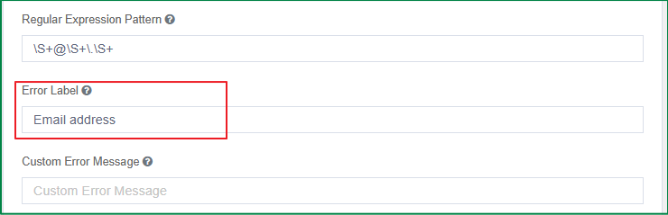
The following shows the defined error label in the error message on the rendered form:
Custom Error Message
With this option, you can define a common error message that is used for all validations.
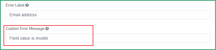
On the rendered form, when any validation is triggered, the common error message is displayed instead of the error message specific to that validation.
The following are examples of the common error message: for the Regex pattern-mismatch validation,
and the validation of required field:
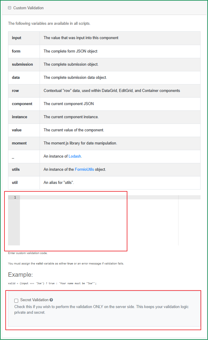
Custom Validation
With this option, you can write Javascript to set up your own validation rules for the field.
- Secret Validation: Tick this checkbox if you want the custom validation logic to be performed only on the server side. This option keeps your validation logic private and secret.
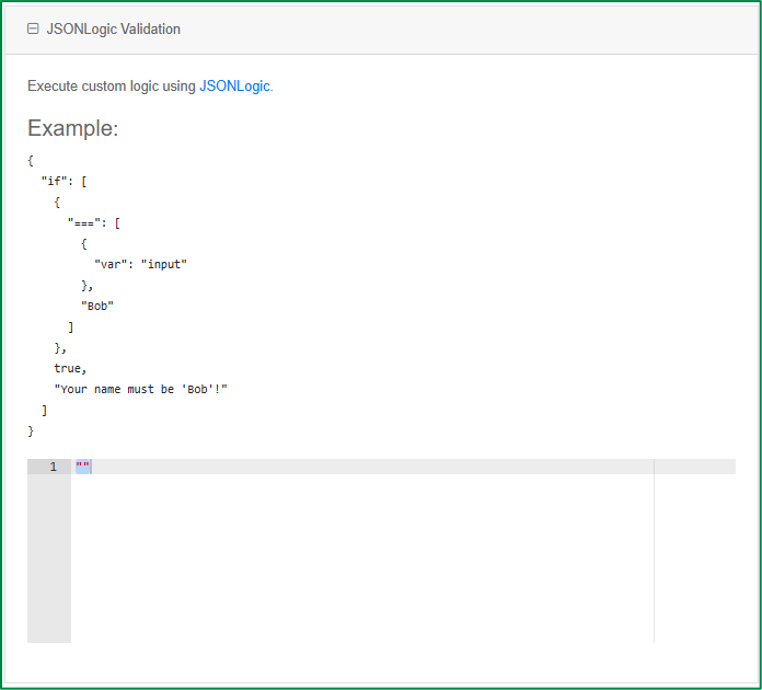
JSONLogic Validation
With this option, you can write JSON logic to set up your own validation rules for the field.
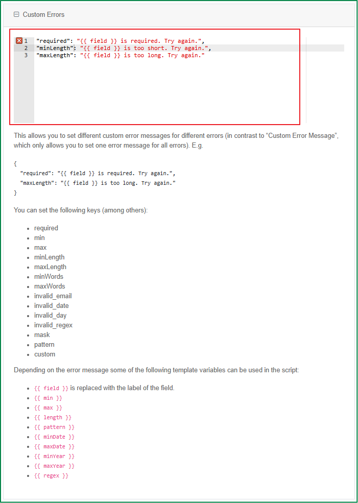
Custom Errors
With this option, you can define different custom error messages for multiple errors, whereas the Custom Error Message setting only allows you to set one error message for all errors.
API settings
The settings in the API tab contain back-end settings such as the Property Name of the field, as well as custom properties that can be set, such as HTML and Tags.
Conditional and Logic settings
The settings in the Conditional and Logic tabs are for creating intelligent workflows using the Conditions and Logic system of Form.io, such as showing or hiding fields, merging the component JSON schema, conditionally setting field settings, and more, all based on user interaction on the form.