Configuration
Introduction
A grid contains rows and columns. Columns expand to fill the row and resize to fit additional columns. It is based on a 12-column layout with different breakpoints depending on the screen size.
Usage
Here are some grid examples. You can use them by copying them into your HTML file:
<ion-grid>
    <!-- Normal list -->
    <ion-row>
        <ion-col>ion-col</ion-col>
        <ion-col>ion-col</ion-col>
        <ion-col>ion-col</ion-col>
        <ion-col>ion-col</ion-col>
    </ion-row>

    <!-- List with size -->
    <ion-row>
        <ion-col size="6">ion-col [size="6"]</ion-col>
        <ion-col>ion-col</ion-col>
    	<ion-col>ion-col</ion-col>
  	</ion-row>
</ion-grid>
You can click here for more details.
Demo
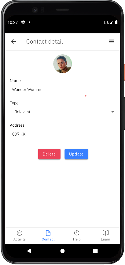
The contact detail page also implements a simple grid that contains Delete and Update buttons.
See the code below. You can easily find it in the contact-detail.page.html file, in the src/app/pages/contact/contact-detail folder.
<ion-grid>
    <ion-row class="ion-justify-content-around">
        <ion-col class="ion-text-right">
            <ion-button size="medium" color="danger" type="button" class="text-transform-unset" (click)="deleteContact()">
                Delete
            </ion-button>
        </ion-col>
        <ion-col>
            <ion-button size="medium" color="primary" type="button" class="text-transform-unset" (click)="updateContact()">
				Update
            </ion-button>
        </ion-col>
    </ion-row>
</ion-grid>
We also have the corresponding actions in contact-detail.page.ts.
...
export class ContactDetailPage implements OnInit {
	contacts = [];
	...

	deleteContact = async (id: string) => {
		...
	}
	updateContact = () => {
		...
	}
}