Configuration
Introduction
This article shows you how to use a list on a page, then demonstrates the contact list that the app uses.
Usage
Here are some list examples. You can use them by copying them into your HTML file:
List of text items
<ion-list>
    <ion-item>
        <ion-label>Pokémon Yellow</ion-label>
    </ion-item>
    <ion-item>
        <ion-label>Mega Man X</ion-label>
    </ion-item>
    <ion-item>
        <ion-label>The Legend of Zelda</ion-label>
    </ion-item>
</ion-list>
List of sliding items
<ion-list>
    <ion-item-sliding>
        <ion-item>
            <ion-label>Item 1</ion-label>
        </ion-item>
        <ion-item-options side="end">
            <ion-item-option (click)="unread(item)">Unread</ion-item-option>
        </ion-item-options>
    </ion-item-sliding>

    <ion-item-sliding>
        <ion-item>
            <ion-label>Item 2</ion-label>
        </ion-item>
        <ion-item-options side="end">
            <ion-item-option (click)="unread(item)">Unread</ion-item-option>
        </ion-item-options>
    </ion-item-sliding>
</ion-list>
Let's dive into the details:
- There are two sliding items defined by the
<ion-item-sliding>tag. - The
<ion-item>tag contains the UI of the item. <ion-item-options>contains the list of<ion-item-option>elements, shown by swiping the item from left to right or vice versa.
- There are two sliding items defined by the
You can click here for more details.
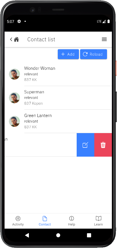
Demo
The contact feature now uses the sliding list type. It supports swipe actions that you can use to reveal options.
See the code below. You can easily find it in the contact-list.page.html file, in the src/app/pages/contact/contact-list folder.
<ion-list>
	<ion-item-sliding *ngFor="let contact of contacts">
		<ion-item>
			<ion-avatar slot="start">
				<img [src]="contact.avatar" />
			</ion-avatar>
			<ion-label>
				<h2>{{contact.name}}</h2>
				<h3>{{contact.type}}</h3>
				<p>{{contact.address}}</p>
			</ion-label>
		</ion-item>
		<ion-item-options side="end" (ionSwipe)="deleteContact(contact.id)">
        	<ion-item-option [routerLink]="['/contacts', contact.id]">
            	<ion-icon name="create-outline" slot="icon-only"></ion-icon>
            </ion-item-option>
			<ion-item-option color="danger" expandable (click)="deleteContact(contact.id)">
            	<ion-icon name="trash" slot="icon-only"></ion-icon>
        	</ion-item-option>
		</ion-item-options>
    </ion-item-sliding>
</ion-list>
We also have the corresponding actions in contact-list.page.ts.
...
export class ContactListPage implements OnInit {
	contacts = [];
	...

	deleteContact = async (id: string) => {
		...
	}
}