Component: Self-service theme
Introduction
To provide a standard theme which can be used for every self-service worker sites in the future, the self-service theme has been developed. It is well referred to the https://designsystem.dk/design/.
In this design system, it defines various things, includes:
- Colors
- Typography
- Corners, lines, shadows
- Icons
- Logos
- Data visualization and infographics
- Layout
- Design resources
- Design check
- Availability
Components
The theme has a set of components with predefined styles, which you can use directly in your HTML.
Below is the set of supported components:
- Accordions
- Badges
- Alerts
- Breadcrumbs
- Cards
- Cookie notification
- Date indication
- Date picker
- Details
- Dropdown menu
- Tabs
- Error messages
- Error summary
- Fields
- Footers
- Form
- Function link
- Headers
- Buttons
- Modal window
- Notification (Toast)
- Overflow menu
- Pagination
- Radio button
- Page navigation
- Skip link
- Spinner
- Language selector
- Structured lists
- Search field
- Back link
- Tables
- Tags
- Text area
- Check box
- Toggle switch
- Tool tip
- Step indicators
- Attach file (Upload)
Note: for some components, it requires Javascript to function.
To get more information about how to use these components, you can visit to the link https://designsystem.dk/kode/komponenter/.
Self-service theme in CW
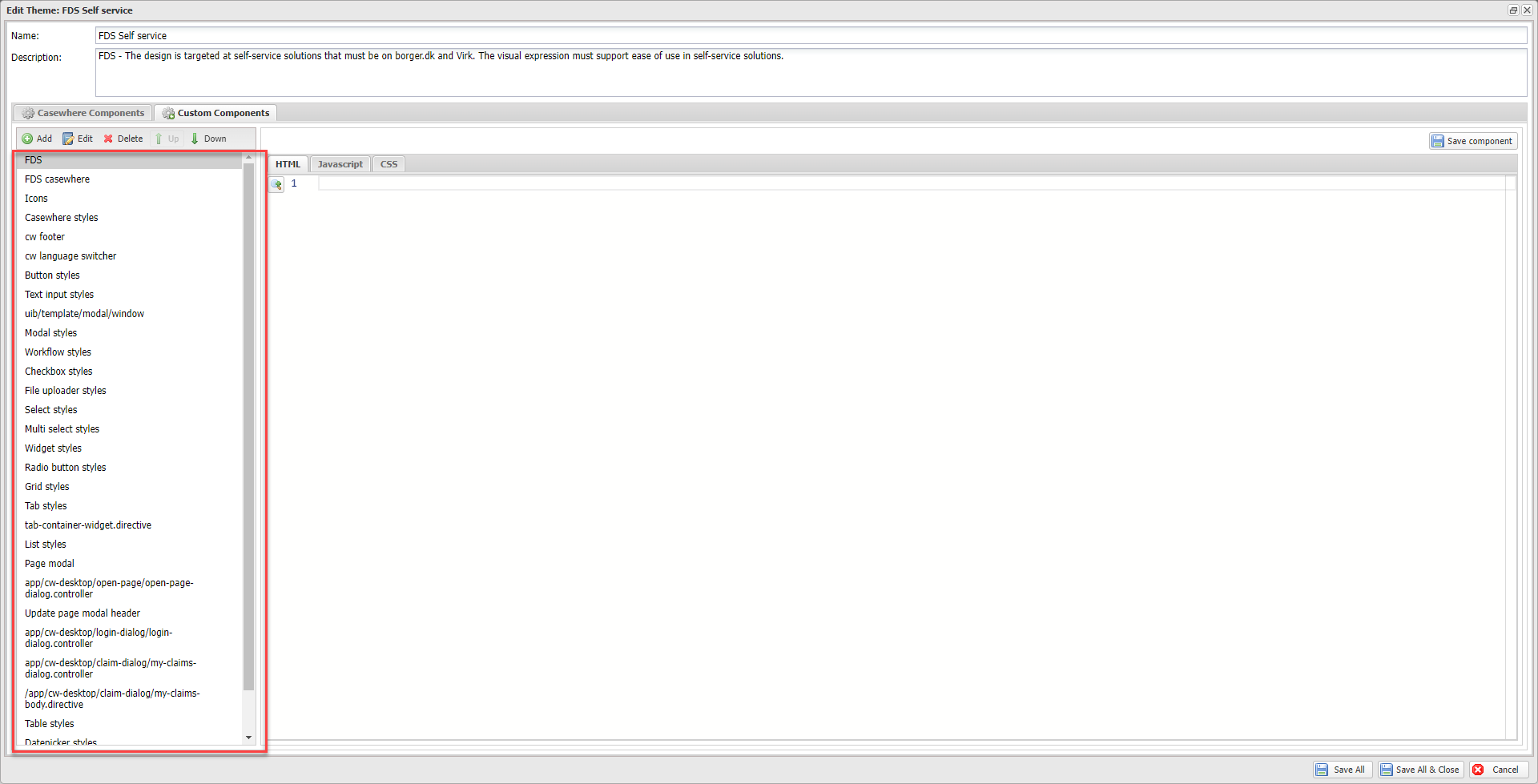
In this theme, we styled all the built-in components to comply with the common design system.

Apart from that, we also apply the look and feel to all the supported components in CW.

Installation
Requirements
- Casewhere 2.6.10 or later
Configuration
- Import product: DK Common Design System Theme
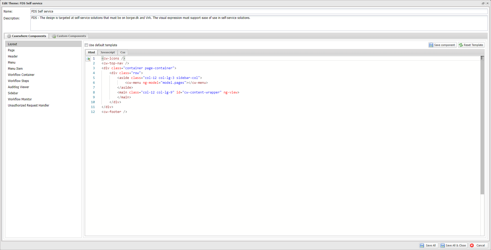
- Create a worker site, select FDS Self service as its theme.
Releases
1.0.0 - 03/17/2022
Download (login required): DK Common Design System Theme v1.0.0
Roadmap
- Apply L&F for CMS widgets
- Handle more UI cases