Component: Form management - Form design
Introduction
Form design lets the form admin drag and drop independent components into the body of the form builder. The form builder provides a UI that makes it easy for the form admin to visualize and modify the form.
Workflow of form management

Guideline
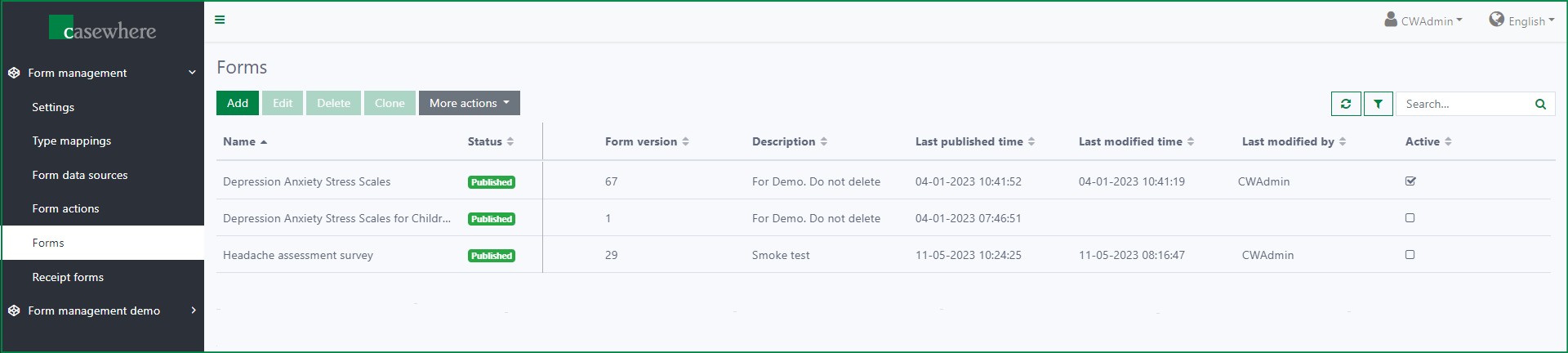
Add new form
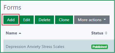
By clicking the Add button, the Add form dialog will be opened.
The dialog includes the following fields:
Name
- This field is required.
- Form name must be unique.
Description
- This field is optional.
- You can add more information about the form.
Active
- By default, the form is active. You can deactivate it by unticking the checkbox.
- An inactive form cannot be accessed on the public site even if it was published.
Status
- By default, the form status is Draft when it is created.
- A form can have one of these statuses: Draft or Published.
- Draft
- A form has Draft status when it is newly created, or when it is edited after being published.
- Published
- A form has Published status after it is published successfully.
- Draft
You can explore the different configurations of different field components here.
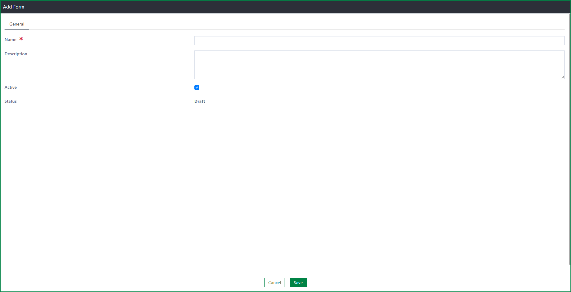
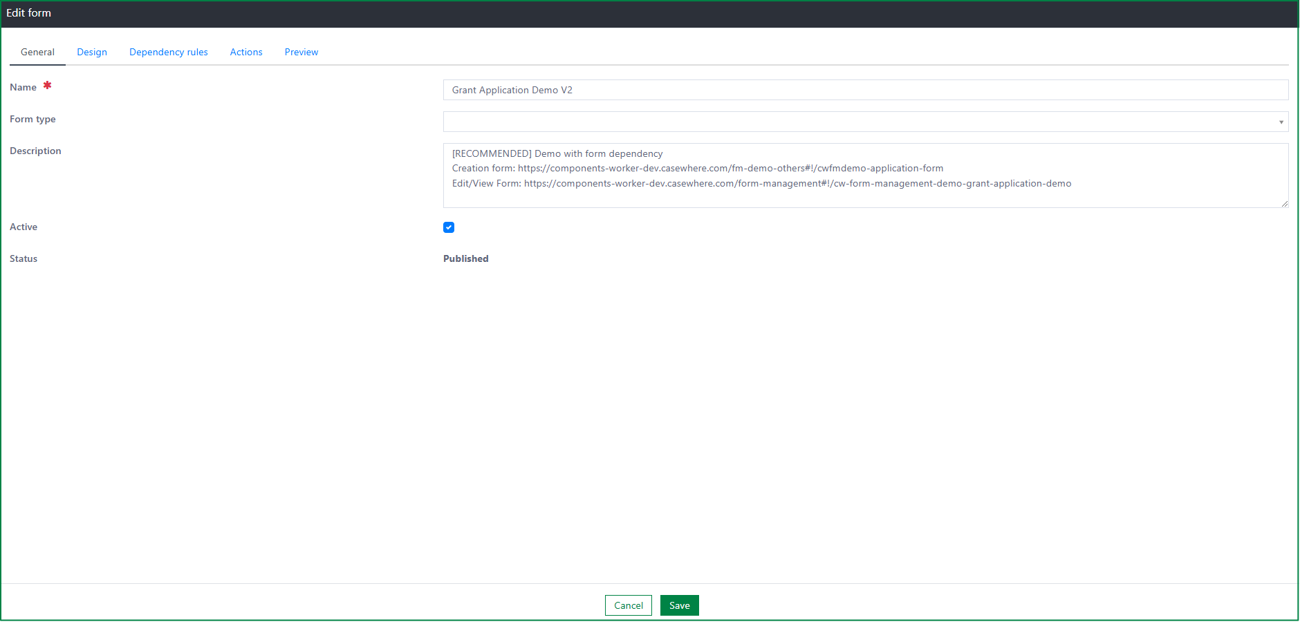
Edit a form
The Edit form dialog will be opened after a new form is created successfully, or by selecting a form and clicking the Edit button.
The Edit form dialog includes 5 tabs: General, Design, Dependency rules, Actions, and Preview.
General
This tab displays all the saved general information of the form, such as Name, Form type, Description, Active, and Status.
Design
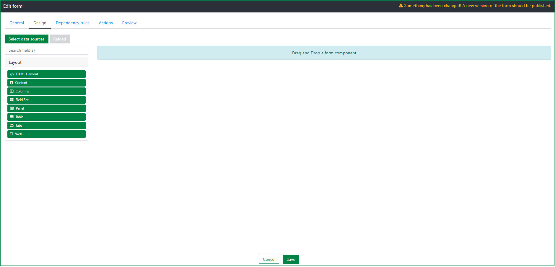
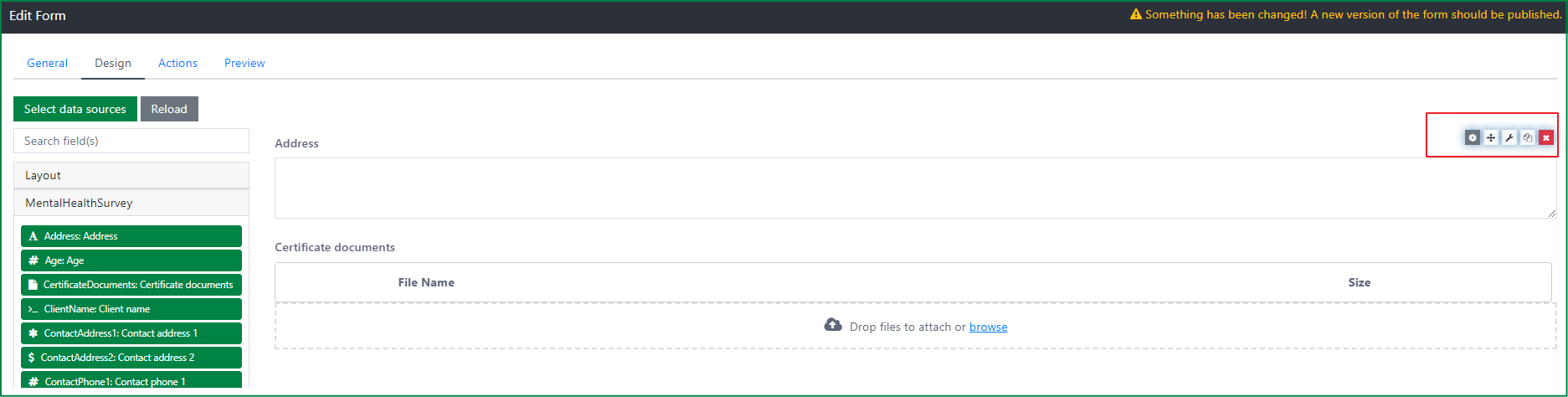
The Design tab includes 2 sections: fields list, and form design area.
You can drag and drop the fields from the fields list to the form design area.
The fields list includes 2 types of field: layout fields from Form.io, and fields from the form data source. There are many form data sources to be used for various forms, so you must select the specific form data source for your form design.
In this part, we separate it into 2 main actions:
- Select form data source
- Design form
Select form data source
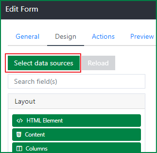
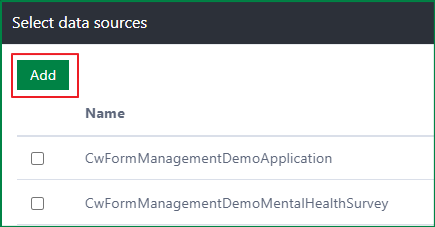
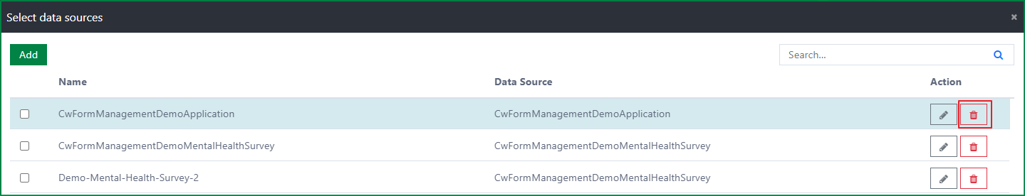
By clicking the Select data sources button, the Select data source dialog will be opened.
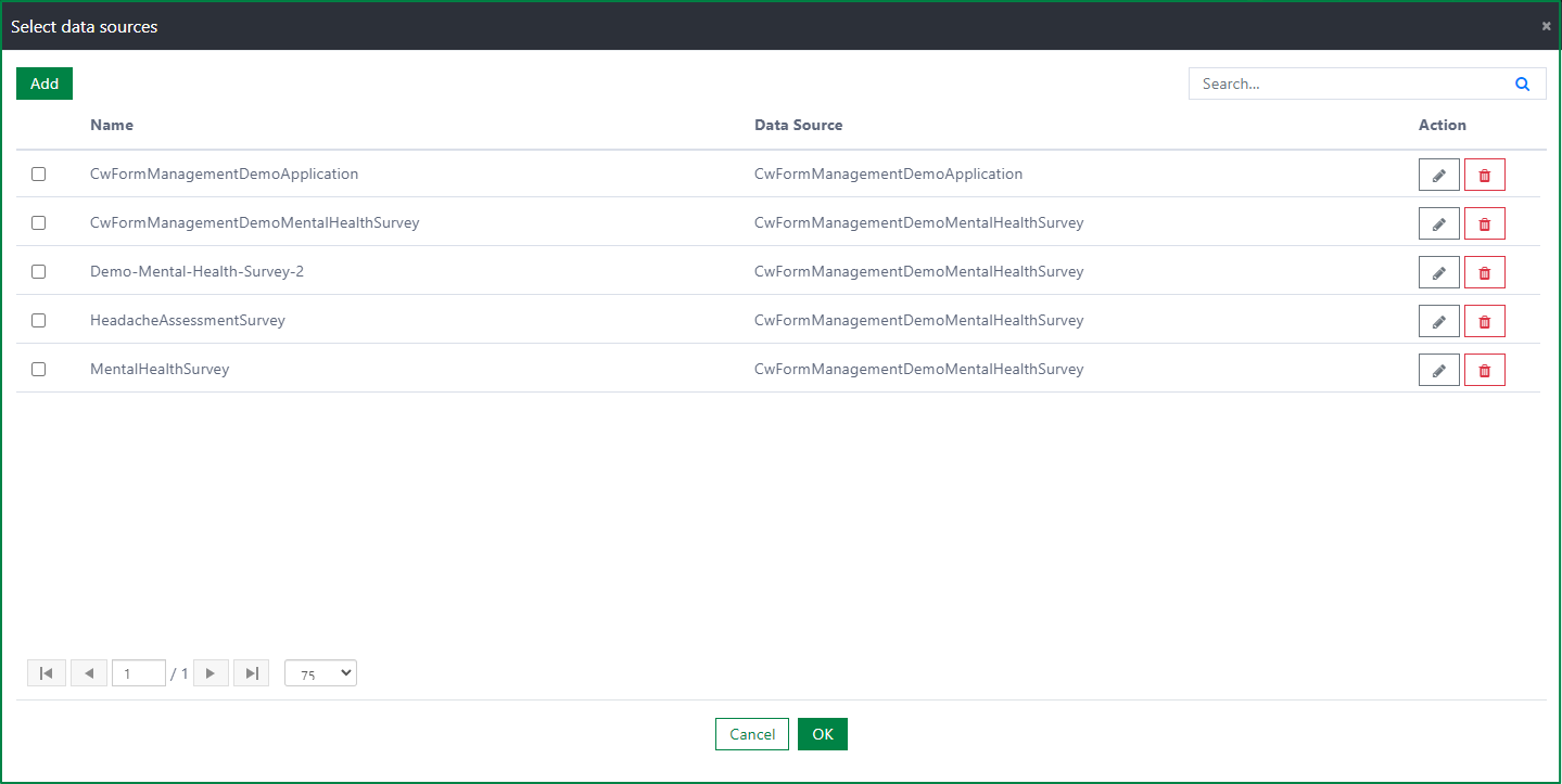
The dialog includes a list of all form data sources created on the Form data sources page. The form data sources are displayed with basic information such as Name and Data source.
You can select one or multiple data sources to use in designing the form. After a data source is selected, the list of fields under the data source will be displayed in the fields list section.
Besides selecting existing form data sources, you can also manage form data sources in this dialog: add a new form data source, edit a form data source, and delete a form data source.
- Add new form data source
By clicking the Add button, the Add new form data source dialog will be opened.
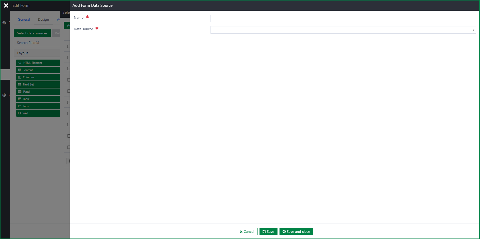
The steps to add a new data source are the same as the Add new form data source flow described on the [Data management][data-management.md] page. The added form data source will be stored on the Form data sources page and displayed properly in the Select data source dialog.
- Edit form data source
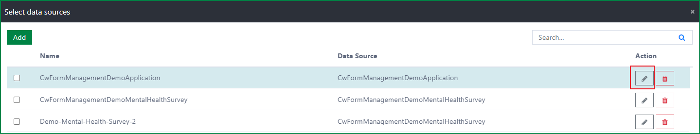
By clicking the Edit button at each form data source record, the Edit form data source dialog will be opened.
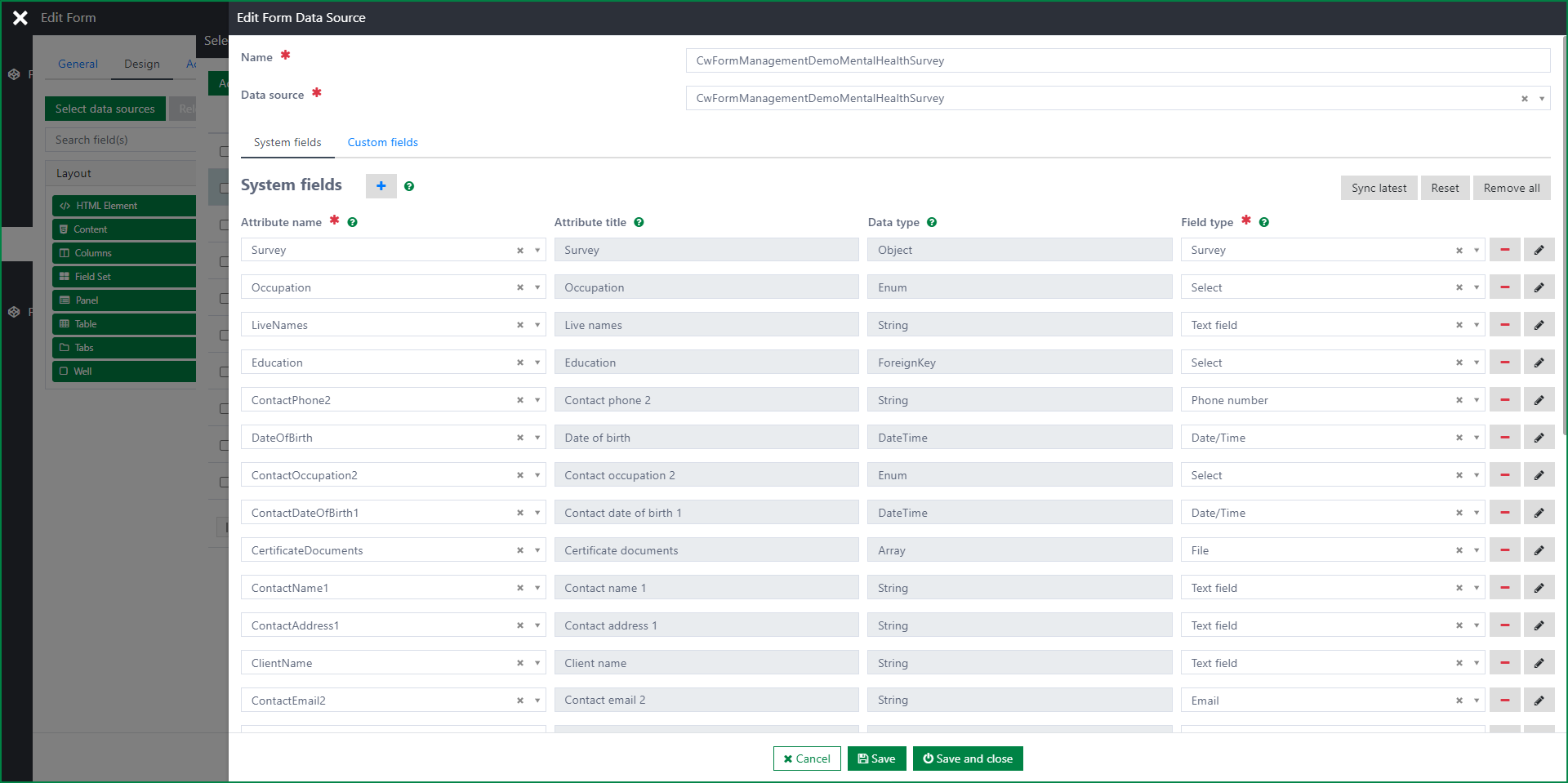
You can edit the form data source as described in the Edit form data source flow on the [Data management][data-management.md] page.
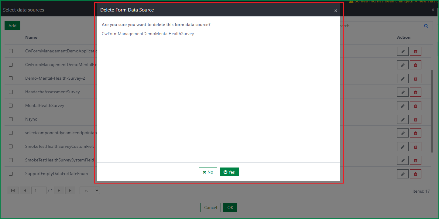
- Delete form data source
By clicking the Delete button at each form data source record in the list, a deletion confirmation dialog will be opened. You can choose to cancel or continue the deletion of the form data source. Only a form data source that is not in use can be deleted. A data source deleted in the Select data sources dialog will also be deleted from the Form data sources page.
Design form
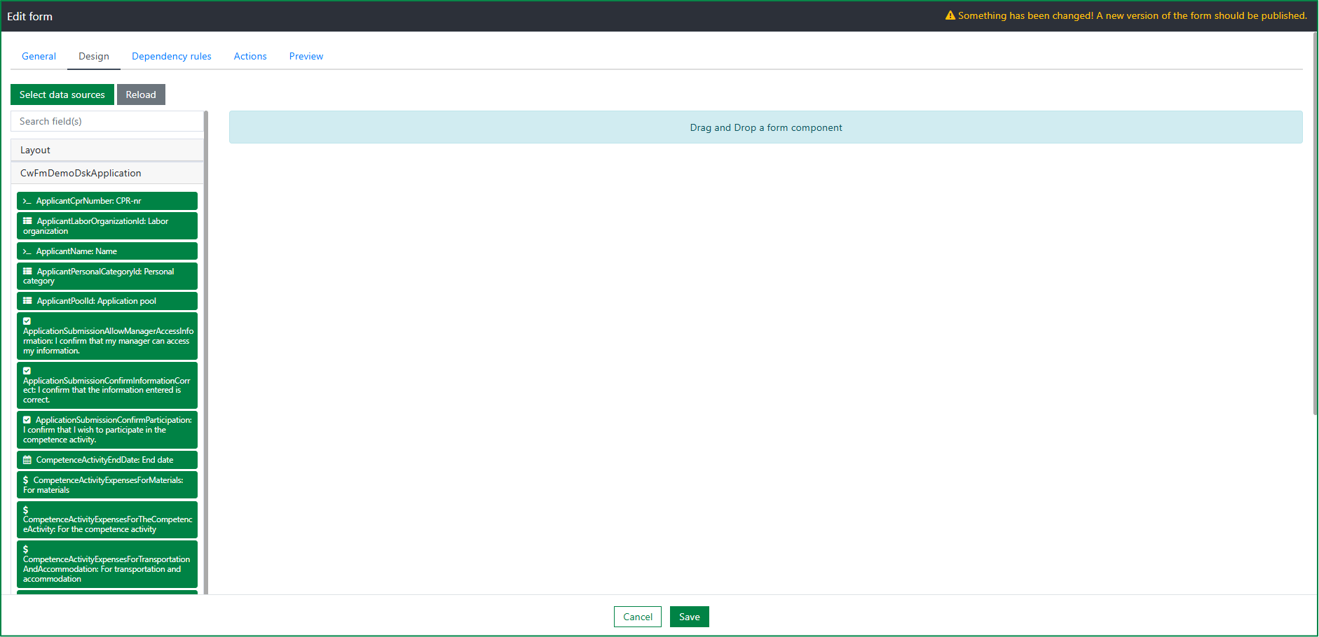
After the data sources are selected, all fields under the data sources will be displayed in the fields list section. You can drag and drop the fields onto the design area to design the form.
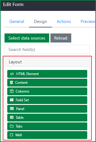
You can customize the UI of the form (columns, table, etc.) by using the layout fields supported by Form.io. The supported layout fields are: HTML element, Content, Columns, Field set, Table, Tabs, and Well.
After adding a field to the form, you can edit the component settings, change the field position in the form, edit the JSON of the component, copy a new field from the field, and remove the field from the form.
The relevant functional buttons will be displayed when you hover over the added field.
- Edit component settings
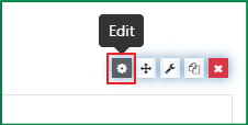
By clicking the Edit button, the corresponding component settings dialog will be opened, according to the field type of the field.
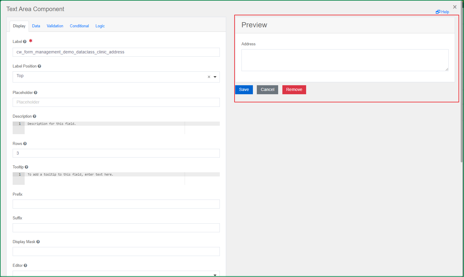
The dialog includes 2 sections: a configuration section and a preview section.
The configuration section includes 5 tabs: Display settings, Data, Validation, Conditional, and Logic.
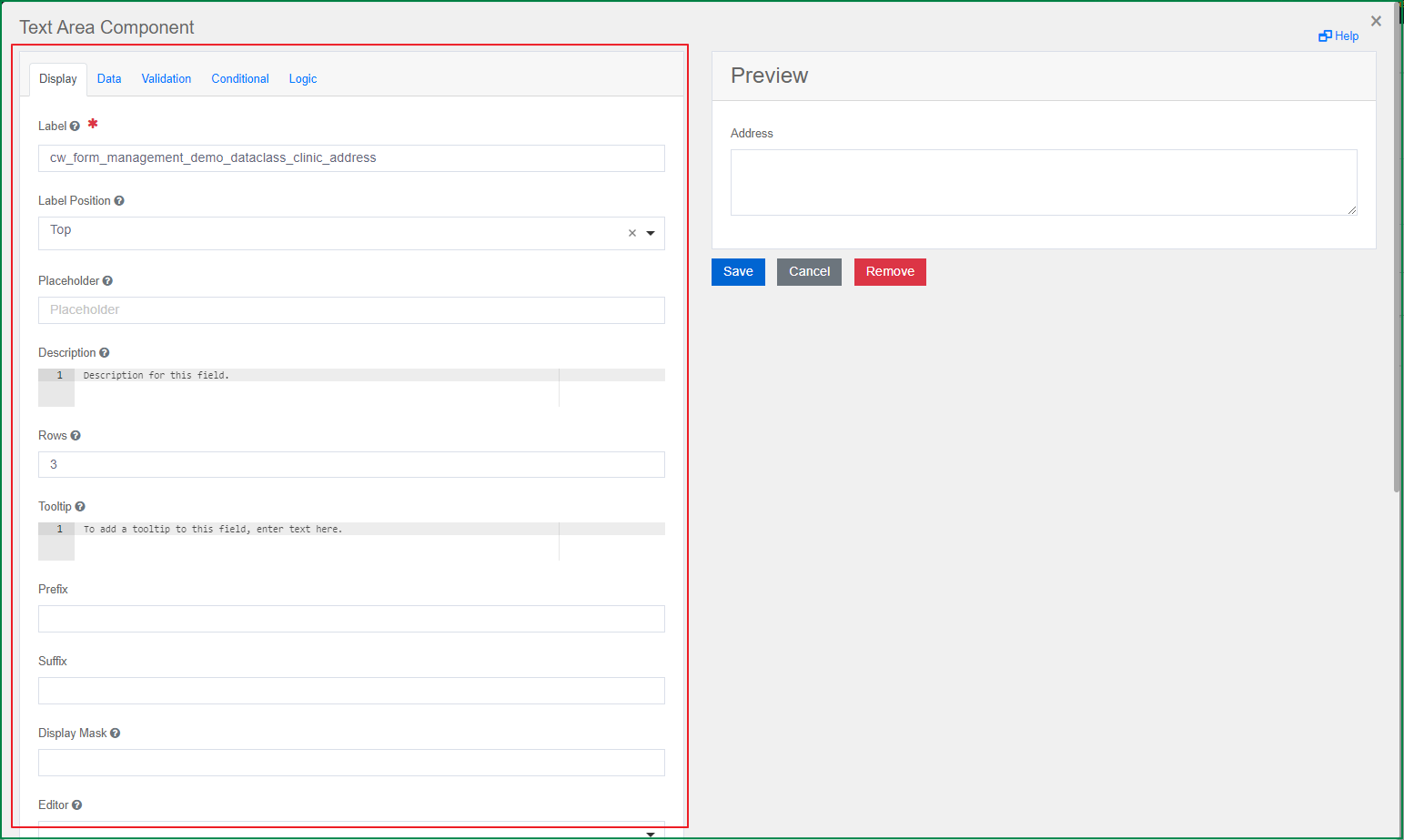
After configuring the settings for the field, you can preview it in the preview section before saving the changes.
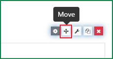
- Change the field position in the form
You can change the position of the field in the form by holding the Move button and moving the field to the desired position.
- Edit JSON of component
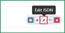
By clicking the Edit JSON button, the corresponding JSON dialog of the component will be opened. You can edit the component settings directly by configuring the JSON.
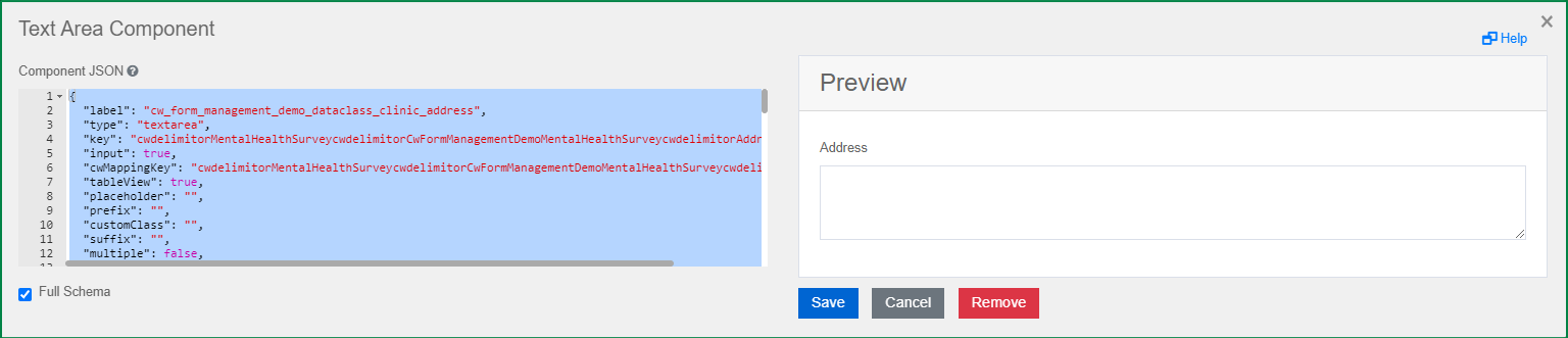
The JSON Schema depends on the configuration of the component.
If you tick the Full Schema checkbox, it will show the full schema configurations, including the schema of settings that were not configured for the component.
- Copy new field from the current field
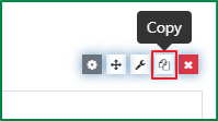
You can copy the field by clicking the Copy button and paste it under another field by clicking the Paste below button.
- Remove the field from the form
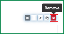
When you click the Remove button of the field, the field will be removed from the form immediately.
After you finish designing the form, you must save the form design before moving to the other tabs.
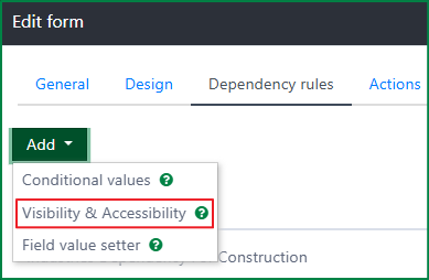
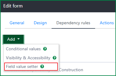
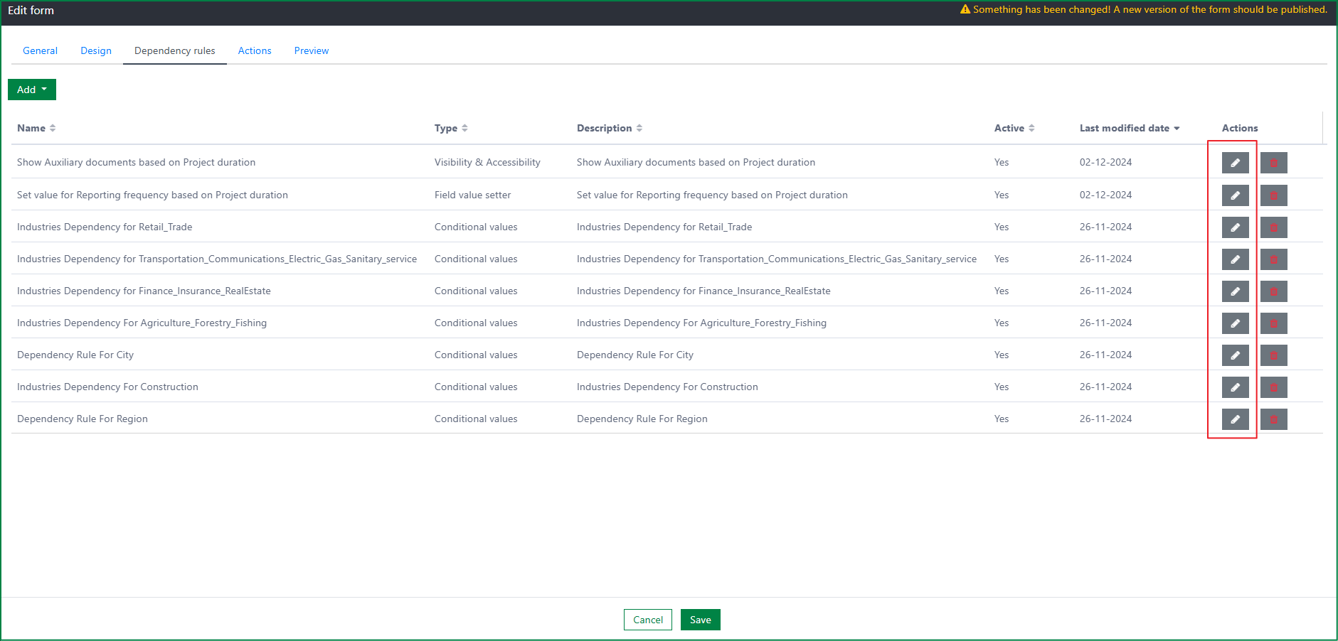
Dependency rules
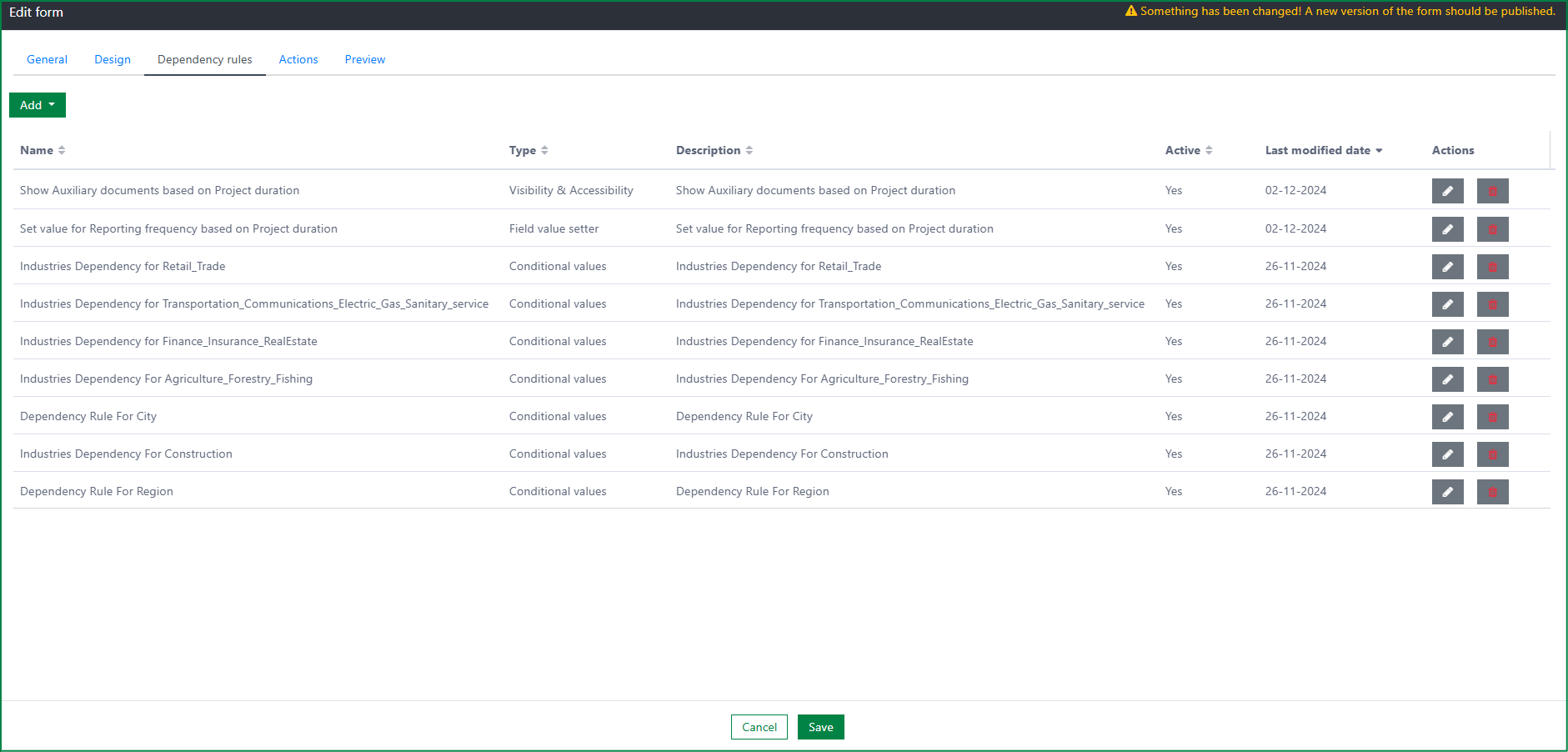
The Dependency rules tab includes a list of dependency rules configured for fields in the form. You can add, edit, and delete dependency rules.
Changes to dependency rules are only activated on the submission form when the form is published after the changes are made.
There are 3 types of dependency rules: Conditional values, Visibility & Accessibility, and Field value setter.
- Conditional values dependency rule
- This rule defines the dependency of a field's list of values on the value of other fields. This rule is only available for dependent fields with the field type Select, Select boxes, or Radio button.
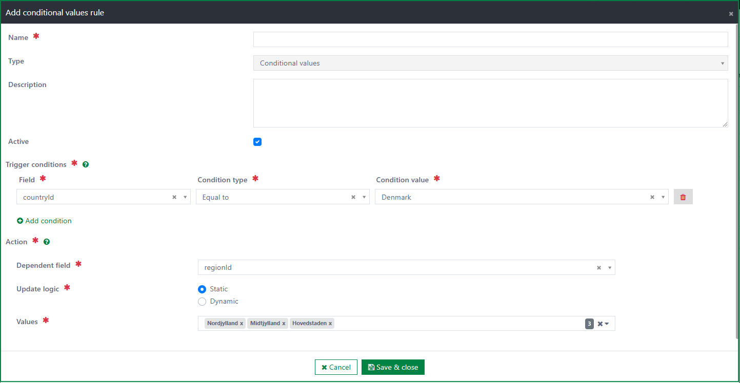
- The following is an example of the dependency of the Region list of values on the value of the Country field:
- If the selected value of the Country field is Denmark, the list of values for the Region field includes Hovedstaden, Midtjylland, and Nordjylland.
- If the selected value of the Country field is Germany, the list of values for the Region field includes Dresden, Bautzen, and Leipzig.
- Visibility & Accessibility dependency rule
- This rule defines whether a field should be shown/hidden, required/not required, or enabled/disabled based on the value of other fields.
- The following is an example of the dependency of the visibility and accessibility of the Auxiliary documents field on the value of the Project duration field:
- If the value of the Project duration field is greater than or equal to 6 months, the Auxiliary documents field is shown, required, and enabled.
- If the value of the Project duration field is less than 6 months, the Auxiliary documents field is hidden, and not required.
- Field value setter dependency rule
- This rule defines the value of a field based on the value of other fields.
- The following is an example of setting the value of the Reporting frequency field based on the value of the Project duration field, given that the Reporting frequency field cannot be entered manually:
- If the value of the Project duration field is less than 12 months, the value of the Reporting frequency field is set to Monthly automatically.
- If the value of the Project duration field is equal to or greater than 12 months, the value of the Reporting frequency field is set to Quarterly automatically.
Add new dependency rule
Conditional values dependency rule
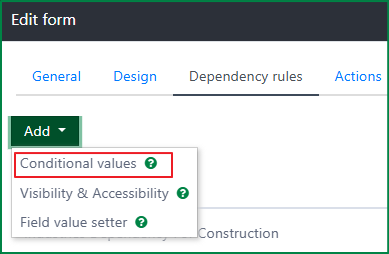
By clicking the Add button and selecting the Conditional field values option, the Add conditional field values rule dialog is displayed.
The dialog includes the following fields:
Name
- This field is required.
- The name of the dependency rule must be unique.
Type
- The field is read-only and prefilled with type Conditional values.
Description
- This field is optional.
- You can add more information about the dependency rule.
Active
- By default, the dependency rule is active. You can deactivate it by unticking the checkbox.
- In the submission form, only an active dependency rule is effective.
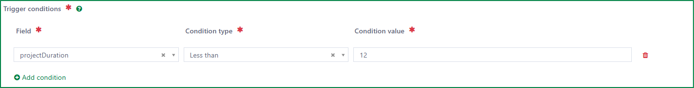
Trigger conditions
This section is used to define a list of conditions that trigger the execution of the dependency rule.
Given example (1): If the selected country is Denmark, the list of regions includes Hovedstaden, Midtjylland, and Nordjylland; in this example, the Trigger conditions will handle the part If the selected country is Denmark.
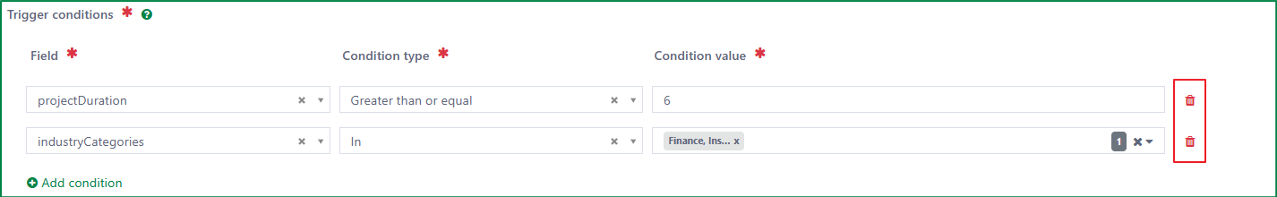
A dependency rule can have one or multiple trigger conditions. If multiple conditions are added, the relation between them is AND, which means that the rule is only triggered if all conditions are met.
You can also delete added trigger conditions by clicking the Delete button at the end of the condition row, but the rule must have at least one trigger condition.
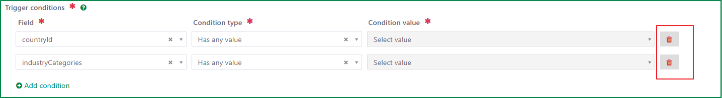
By clicking the Add condition button, a new condition record is added. Each record includes the following fields:
Field
- This field is used to select the field that is the object of the condition.
- This field is required.
- The dropdown list values are the fields added to the form in the Design tab. You can select a field from the list.
- If there are multiple trigger conditions, the condition field must be unique. You cannot add 2 conditions with the same condition field.
- Fields with the data type Document or Guid are not supported.
- According to example (1) above, the value should be Country.
Condition type
- This field is used to select the type of the condition.
- This field is required.
- The field includes a list of condition types.
- There are 9 condition types; the list of condition types is displayed according to the data type of the selected field.
- The mappings between condition type and data type are shown in the following table.
Data type Condition type Array In, Not in, Has any value Boolean Equal to, Not equal to, Has any value DateTime Equal to, Not equal to, Greater than, Greater than or equal, Less than, Less than or equal, Has any value Double Equal to, Not equal to, Greater than, Greater than or equal, Less than, Less than or equal, Has any value Enum In, Not in, Equal to, Not equal to, Has any value ForeignKey In, Not in, Equal to, Not equal to, Has any value Integer Equal to, Not equal to, Greater than, Greater than or equal, Less than, Less than or equal, Has any value Long Equal to, Not equal to, Greater than, Greater than or equal, Less than, Less than or equal, Has any value String Equal to, Not equal to, Has any value Guid Equal to, Not equal to, Has any value - According to example (1) above, the Condition type should be Equal to.
Condition value
This field is used to define value of the condition field.
This field is required.
If the selected Condition type is Has any value, the field is disabled. This means that the rule is triggered by any value of the condition field except the null value.
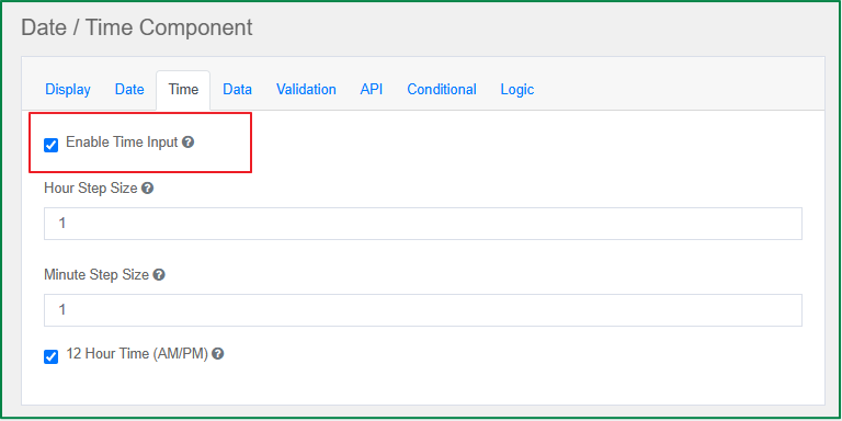
If the selected field has the data type DateTime and the component's Enable Time Input setting was enabled, the Condition value field format is date and time. If the component's Enable Time Input setting was disabled, the Condition value field format is date only.

According to example (1) above, the Condition value should be Denmark.
Action
This section is used to define the action that will be executed when the dependency rule is triggered.
- According to example (1) above, this Action section will handle the part the list of regions includes Hovedstaden, Midtjylland, and Nordjylland.
The section includes the following fields:
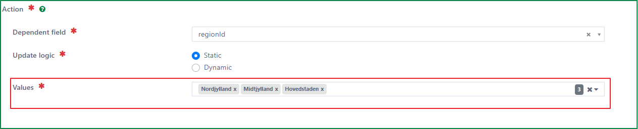
Dependent field
- This field is used to select the field that is the object of the action when the dependency rule is executed.
- This field is required.
- The dropdown list values are the fields with the field types Select, Select boxes, or Radio button that were added to the form in the Design tab. You can select a field from the list.
- According to example (1) above, the Dependent field value should be Region.
Update logic
- This field is used to select the logic for updating the dependent field.
- There are 2 types of update logic: Static and Dynamic.
- If the selected update logic is Static, the Values field is displayed.
- With this option, you can select one or multiple items from the list of defined values of the dependent field to be shown in the UI when the dependency rule is triggered.
- If the selected update logic is Dynamic, the fields to configure the filter condition are displayed.
- With this update logic, only the values matching the filter condition will be shown in the UI when the dependency rule is triggered.
- The Dynamic option is only enabled if the data type of the selected dependent field is ForeignKey or Array-ForeignKey.
- According to example (1) above, the Update logic field value should be Static.
Values
This field is only displayed if the update logic is Static.
This field is used to select the lists of values of the dependent field that will be displayed when the dependency rule is triggered.
This field is required once it is displayed.
The dropdown list values are the values of the selected dependent field. You can select one or multiple items from the list.
According to example (1) above, the Values field values should be Hovedstaden, Midtjylland, and Nordjylland.
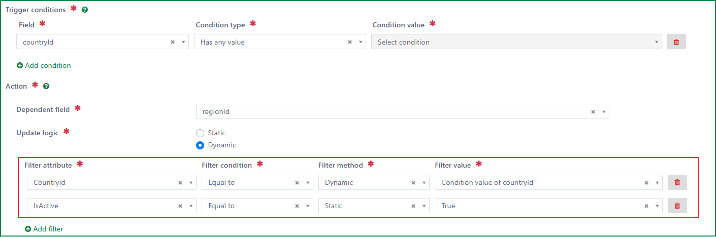
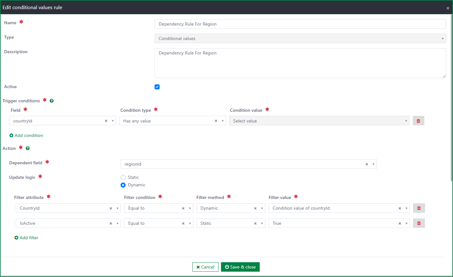
Filter condition
This section is only displayed if the update logic is Dynamic.
This section is used to configure the condition that filters, based on the attributes of the field, which values of the dependent field will be displayed when the dependency rule is triggered.
You can add one or multiple conditions. If multiple conditions are added, the relation between them is AND.
You can also delete added conditions by clicking the Delete button at the end of the condition row, but the rule must have at least 1 filter condition if the update method is Dynamic.
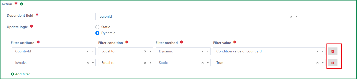
By clicking the Add filter button, a new filter condition record is displayed with the following fields:
Filter attribute
- This field is used to select an attribute of the dependent field. The attribute is the object of the filter condition.
- This field is required.
- The dropdown list of the field includes the attributes of the selected dependent field.
Filter condition
- This field is used to select the type of the condition.
- This field is required.
- The field includes a list of condition types.
- The list of condition types is displayed according to the data type of the selected attribute.
- The mappings between condition type and data type are shown in the following table.
Data type Condition type Array In, Not in Boolean Equal to, Not equal to DateTime Equal to, Not equal to Double Equal to, Not equal to Enum In, Not in, Equal to, Not equal to ForeignKey Based on the data type of the field that the attribute refers to Integer Equal to, Not equal to Long Equal to, Not equal to String Equal to, Not equal to Guid Equal to, Not equal to Filter method
- This field is used to select the filtering method.
- This field is required.
- There are 2 methods: Static and Dynamic.
- With the Static method, you can select the existing values of the selected filter attribute.
- With the Dynamic method, you can select the
- The list of values for the Filter value field depends on the selected method.
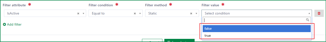
Filter value
- This field is required.
- If the filter method is Static, the list of values for the Filter value field is the values of the selected attribute.
For example, if the filter attribute is IsActive (boolean), the list of filter values is true and false.
- If the filter method is Dynamic, the list of values for the Filter value field is the condition values of the trigger conditions configured above.
For example: if there are trigger conditions on the fields countryId and industryCategories, then the values of the Filter value field include Condition value of countryId and Condition value of industryCategories.
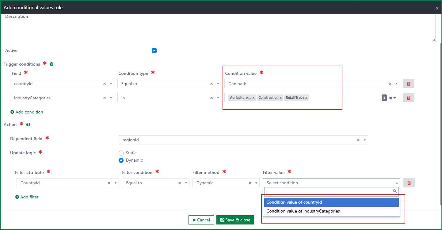
The following is an example of the conditional value dependency rule with a filter condition: If a country is selected, then the list of values for the Region must include the active regions of the selected country.
Visibility & Accessibility dependency rule
By clicking the Add button and selecting the Visibility & Accessibility option, the Add visibility and accessibility rule dialog is displayed.
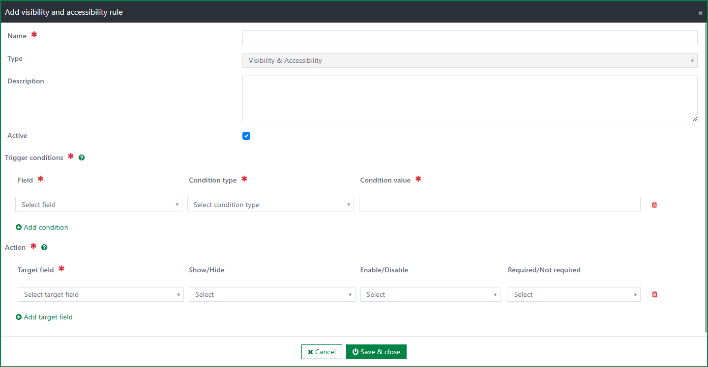
The dialog includes the following fields:
Name
- This field is required.
- The name of the dependency rule must be unique.
Type
- The field is read-only and prefilled with type Visibility & Accessibility.
Description
- This field is optional.
- You can add more information about the dependency rule.
Active
- By default, the dependency rule is active. You can deactivate it by unticking the checkbox.
- In the submission form, only an active dependency rule is effective.
Trigger conditions
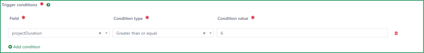
This section is used to define a list of conditions that trigger the execution of the dependency rule.
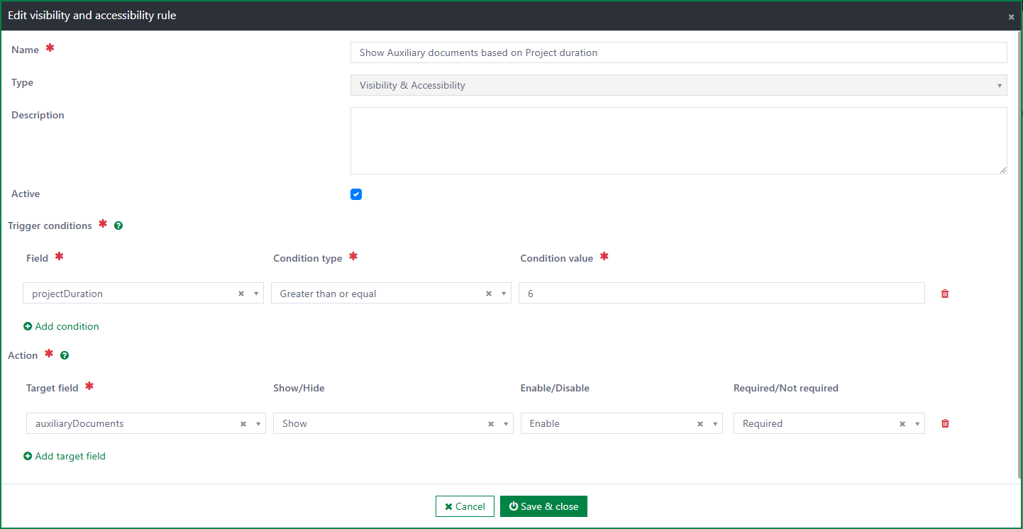
Given example (2): If the Project duration is greater than or equal to 6 months, the Auxiliary documents field is shown, required, and enabled; in this example, the Trigger conditions will handle the part If the Project duration is greater than or equal to 6 months.
A dependency rule can have one or multiple trigger conditions. If multiple conditions are added, the relation between them is AND, which means that the rule is only triggered if all conditions are met.
You can also delete added trigger conditions by clicking the Delete button at the end of the condition row, but the rule must have at least one trigger condition.
By clicking the Add condition button, a new condition record is added. Each record includes the following fields:
Field
- This field is used to select the field that is the object of the condition.
- This field is required.
- The dropdown list values are the fields added to the form in the Design tab. You can select a field from the list.
- If there are multiple trigger conditions, the condition field must be unique. You cannot add 2 conditions with the same condition field.
- Fields with the data type Document or Guid are not supported.
- According to example (2) above, the value should be Project duration.
Condition type
- This field is used to select the type of the condition.
- This field is required.
- The field includes a list of condition types.
- There are 9 condition types; the list of condition types is displayed according to the data type of the selected field.
- The mappings between condition type and data type are shown in the following table.
Data type Condition type Array In, Not in, Has any value Boolean Equal to, Not equal to, Has any value DateTime Equal to, Not equal to, Greater than, Greater than or equal, Less than, Less than or equal, Has any value Double Equal to, Not equal to, Greater than, Greater than or equal, Less than, Less than or equal, Has any value Enum In, Not in, Equal to, Not equal to, Has any value ForeignKey In, Not in, Equal to, Not equal to, Has any value Integer Equal to, Not equal to, Greater than, Greater than or equal, Less than, Less than or equal, Has any value Long Equal to, Not equal to, Greater than, Greater than or equal, Less than, Less than or equal, Has any value String Equal to, Not equal to, Has any value Guid Equal to, Not equal to, Has any value - According to example (2) above, the Condition type should be Greater than or equal.
Condition value
This field is used to define value of the condition field.
This field is required.
If the selected Condition type is Has any value, the field is disabled. This means that the rule is triggered by any value of the condition field except the null value.
If the selected field has the data type DateTime and the component's Enable Time Input setting was enabled, the Condition value field format is date and time. If the component's Enable Time Input setting was disabled, the Condition value field format is date only.
According to example (2) above, the Condition value should be 6.
Action
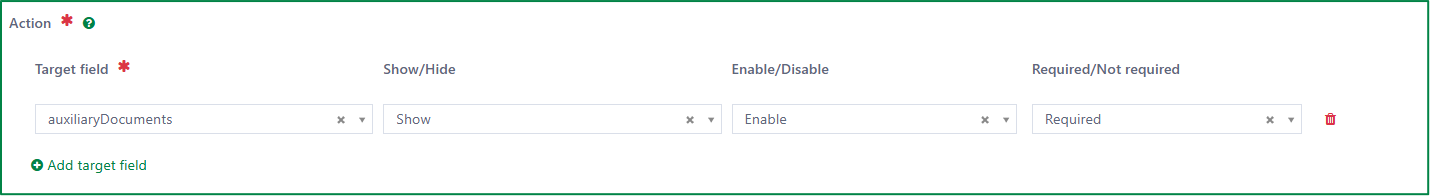
This section is used to define the action that will be executed when the dependency rule is triggered.
- According to example (2) above, this Action section will handle the part the Auxiliary documents field is shown, required, and enabled.
You can add one or multiple target fields.
You can also delete added target fields by clicking the Delete button at the end of the row, but the rule must have at least one target field.
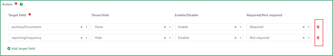
By clicking the Add target field button, a new action record is added. Each record includes the following fields:
- Target field
- This field is used to select the field that is the object of the action when the dependency rule is executed.
- This field is required.
- The dropdown list values are the fields added to the form in the Design tab. You can select a field from the list.
- According to example (2) above, the Target field value should be Auxiliary documents.
- Show/Hide
- This field is used to select whether the target field should be shown or hidden when the dependency rule is executed.
- This field is required.
- The dropdown list values are: Show and Hide.
- According to example (2) above, the Show/Hide field value should be Show.
- Enable/Disable
- This field is used to select whether the target field should be enabled or disabled when the dependency rule is executed.
- This field is required.
- The dropdown list values are: Enable and Disable.
- According to example (2) above, the Enable/Disable field value should be Enable.
- Required/Not required
- This field is used to select whether the target field should be required or not required when the dependency rule is executed.
- This field is required.
- The dropdown list values are: Required and Not required.
- According to example (2) above, the Required/Not required field value should be Enable
- Target field
Field value setter dependency rule
By clicking the Add button and selecting the Field value setter option, the Add field value setter rule dialog is displayed.
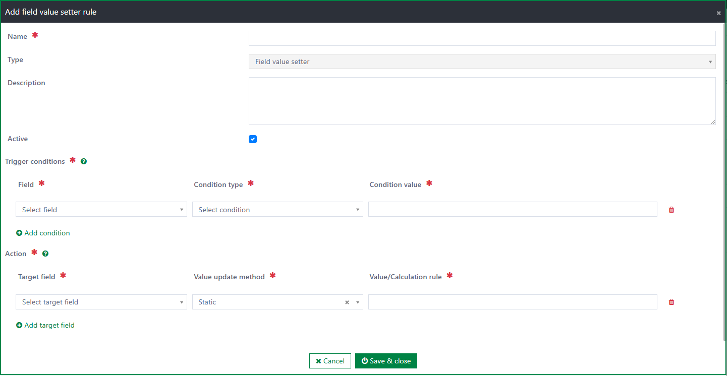
The dialog includes the following fields:
Name
- This field is required.
- The name of the dependency rule must be unique.
Type
- The field is read-only and prefilled with type Field value setter.
Description
- This field is optional.
- You can add more information about the dependency rule.
Active
- By default, the dependency rule is active. You can deactivate it by unticking the checkbox.
- In the submission form, only an active dependency rule is effective.
Trigger conditions
This section is used to define a list of conditions that trigger the execution of the dependency rule.
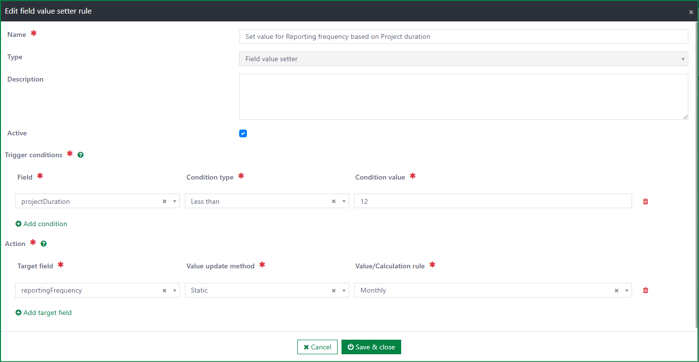
Given example (3): If the value of the Project duration field is less than 12 months, the value of the Reporting frequency field is set to Monthly automatically; in this example, the Trigger conditions will handle the part If the value of the Project duration field is less than 12 months.
A dependency rule can have one or multiple trigger conditions. If multiple conditions are added, the relation between them is AND, which means that the rule is only triggered if all conditions are met.
You can also delete added conditions by clicking the Delete button at the end of the condition row, but the rule must have at least one trigger condition.
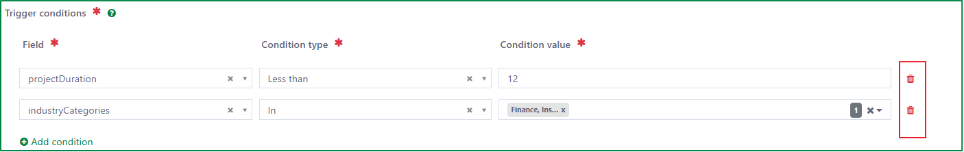
By clicking the Add condition button, a new condition record is added. Each record includes the following fields:
Field
- This field is used to select the field that is the object of the condition.
- This field is required.
- The dropdown list values are the fields added to the form in the Design tab. You can select a field from the list.
- If there are multiple trigger conditions, the condition field must be unique. You cannot add 2 conditions with the same condition field.
- Fields with the data type Document or Guid are not supported.
- According to example (3) above, the value should be Project duration.
Condition type
- This field is used to select the type of the condition.
- This field is required.
- The field includes a list of condition types.
- There are 9 condition types; the list of condition types is displayed according to the data type of the selected field.
- The mappings between condition type and data type are shown in the following table.
Data type Condition type Array In, Not in, Has any value Boolean Equal to, Not equal to, Has any value DateTime Equal to, Not equal to, Greater than, Greater than or equal, Less than, Less than or equal, Has any value Double Equal to, Not equal to, Greater than, Greater than or equal, Less than, Less than or equal, Has any value Enum In, Not in, Equal to, Not equal to, Has any value ForeignKey In, Not in, Equal to, Not equal to, Has any value Integer Equal to, Not equal to, Greater than, Greater than or equal, Less than, Less than or equal, Has any value Long Equal to, Not equal to, Greater than, Greater than or equal, Less than, Less than or equal, Has any value String Equal to, Not equal to, Has any value Guid Equal to, Not equal to, Has any value - According to example (3) above, the Condition type should be Less than.
Condition value
This field is used to define value of the condition field.
This field is required.
If the selected Condition type is Has any value, the field is disabled. It means that the rule is triggered with any value of the condition field except for the null value.
If the selected field having data type DateTime and the setting Enable Time Input of the component was enabled, the Condition value field format is date time. If the setting Enable Time Input of the component was disabled, the Condition value field format is date only.
According to example (3) above, the Condition value should be 12.
Actions
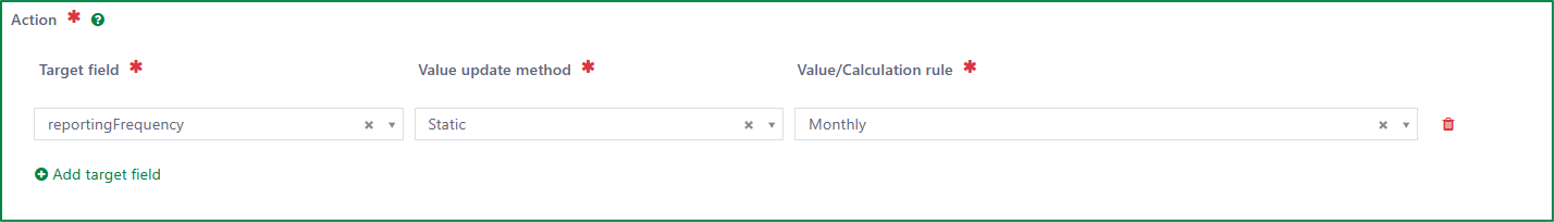
This section is used to define the action that will be executed when the dependency rule is triggered.
- According to example (3) above, this Action section will handle the part the value of the Reporting frequency field is set to Monthly automatically.
You can add one or multiple target fields.
You can also delete added target fields by clicking the Delete button at the end of the row, but the rule must have at least one target field.
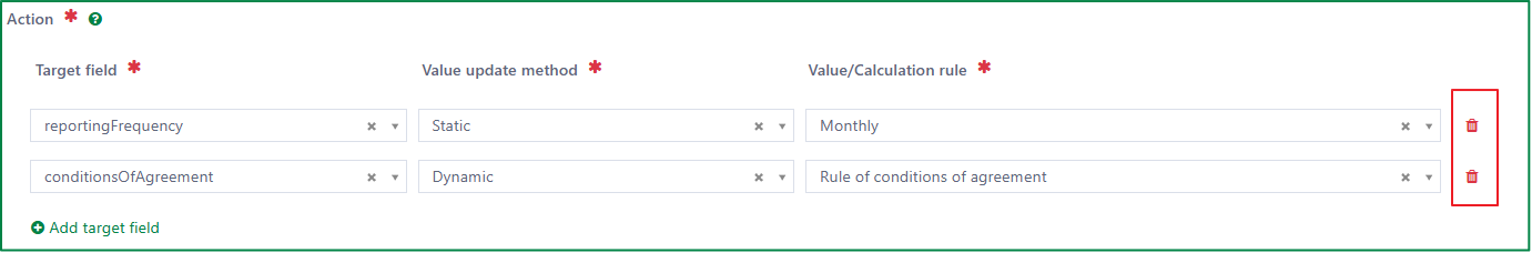
By clicking the Add target field button, a new action record is added. Each record includes the following fields:
- Target field
- This field is used to select the field that is the object of the action when the dependency rule is executed.
- This field is required.
- The dropdown list values are the fields added to the form in the Design tab. You can select a field from the list.
- Fields with the data type Document or Guid are not supported.
- According to example (3) above, the Target field value should be Reporting frequency.
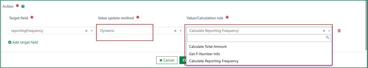
- Value update method
- This field is used to select the method of updating the value of the target field when the dependency rule is triggered.
- This field is required.
- The dropdown list values are: Static and Dynamic.
- The values of the Value/Calculation rule field depend on the selected update method.
- According to example (3) above, the Value update method value should be Static.
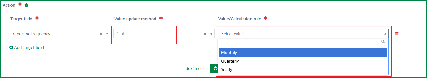
- Value/Calculation rule
This field is used to select the static value that will be set for the target field, or to select the calculation rule that calculates the value of the target field when the dependency rule is triggered.
If the Value update method field value is Static, you can enter or select a value for the target field according to the data type of the field:
If the data type is Array, Boolean, or Enum, the Value update method field is a dropdown list that includes the values of the target field, and you can select a value from the list.
If the data type is String, DateTime, Integer, Long, Double, or Guid, the Value update method field is an input field, and you can enter the value.
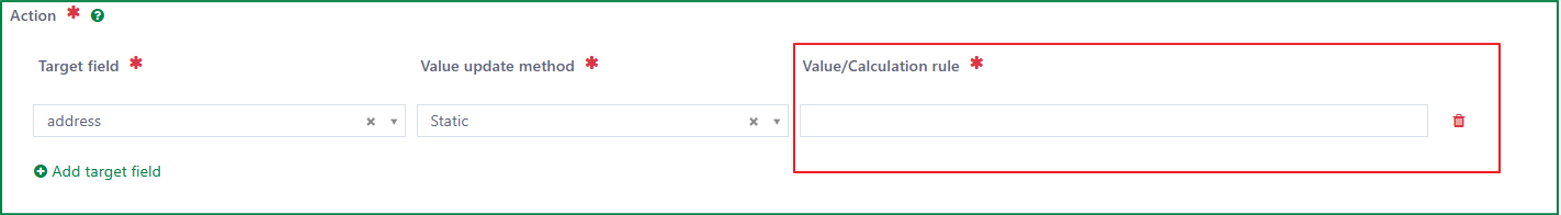
If the data type is ForeignKey, it depends on the field that it refers to.
If the Value update method field value is Dynamic, the Value update method field is a dropdown list that includes the active rules with the type Form field value setter dependency rule configured on the Rules page.
According to example (3) above, with the update method as Static, the Value/Calculation rule field value should be Monthly.
- Target field
Edit dependency rule
By clicking the Edit button at the row of an item in the list of dependency rules in the Dependency rules tab, the corresponding edit dialog is opened according to the dependency rule type.
You can edit the following fields in the dialog:
- Name
- Description
- Active
- Trigger conditions
- Action
Edit condition values rule dialog
Edit visibility and accessibility rule dialog
Edit field value setter rule dialog
Delete dependency rule
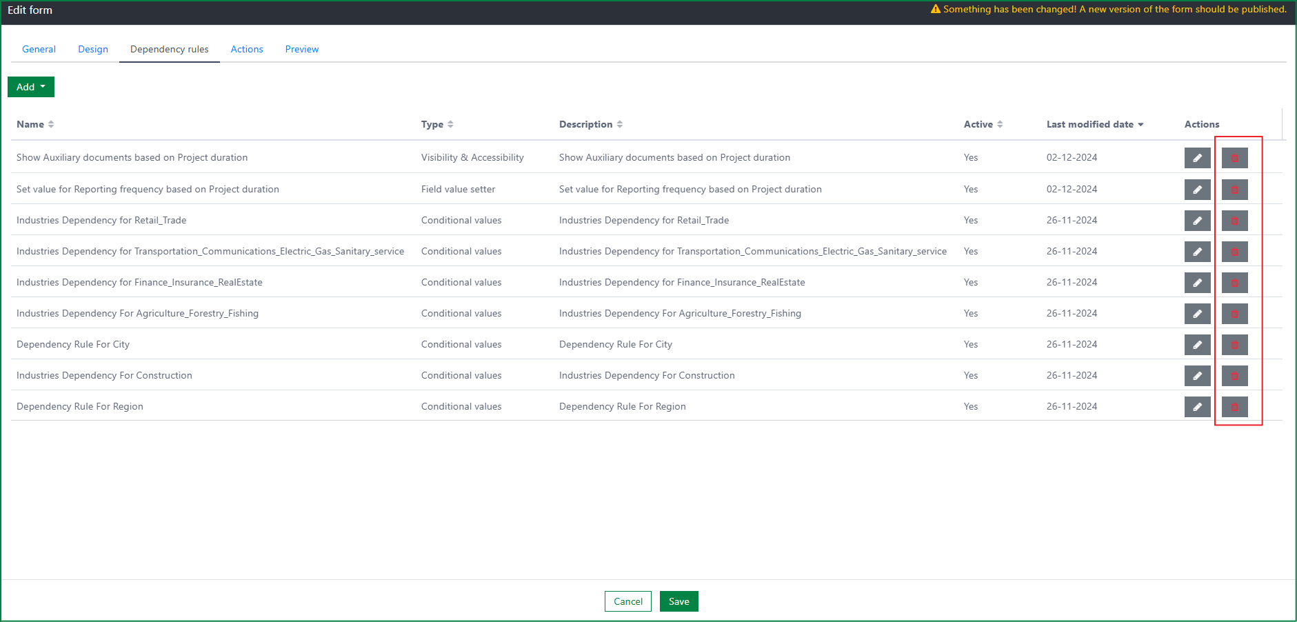
By clicking the Delete button at the row of an item in the list of dependency rules in the Dependency rules tab, the deletion confirmation dialog is displayed.
- If you select the No button, the deletion will be cancelled.
- If you select the Yes button, the dependency rule is deleted immediately.
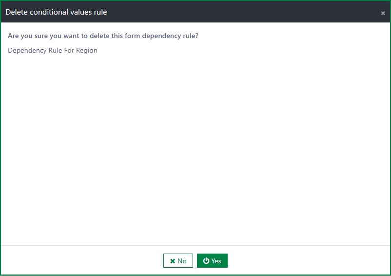
After deletion, the deleted dependency rule is still effective on the submission form until you publish the form again.
Actions
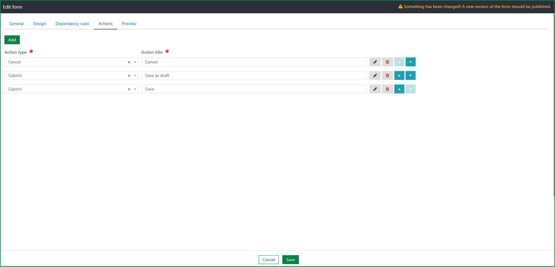
The Actions tab includes a list of actions created for the form.
In the list, each form action is displayed with information such as Action type and Action title.
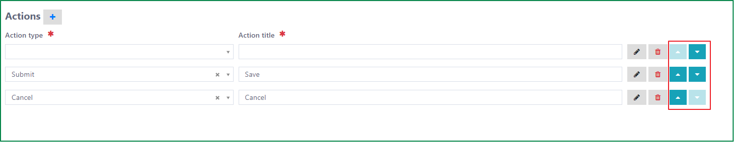
The order of the action buttons on the rendered form, from left to right, depends on the order of the actions in the list, from top to bottom. To change the order of the form actions, you can use the up/down arrow at the right of each action.
You can also add new form action, edit form action, and delete form action.
Add new form action
By clicking the Add button, a new row for a new form action will be added at the top of the form actions list.
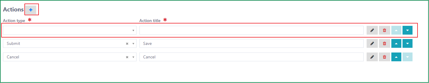
You must select the Action type and fill in the Action title for the new action.
The Action type list includes 2 types: Submit and Cancel.
Depending on the selected Action type, other relevant configurations will be displayed in the Edit form action dialog.
Edit form action
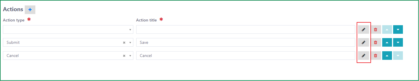
By clicking the Edit button at each form action row, the Edit form action dialog will be opened.
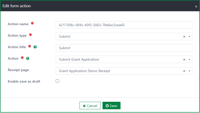
The dialog includes the following fields:
- Action name
- This field is required.
- The action name must be unique.
- Action type
- This field is required.
- You must select an item from the list. There are 2 action types in the list: Submit and Cancel.
- Action title
- This field is required.
- The action title is the name of the button that is displayed on the rendered form UI.
- If the form is multilingual, you should fill in the text resource key in the field.
- Action
- This field is only displayed if the Action type is Submit.
- The field is required once it is displayed.
- You must select an action from the list. The list of actions is retrieved from the Form actions page.
- Receipt page
- The receipt page is displayed after the rendered form is submitted successfully.
- This field is optional and only displayed if the Action type is Submit and the Enable save as draft checkbox is unticked.
- You can select a receipt form from the list. The list of receipt forms is retrieved from the Receipt forms page.
- The receipt form is only displayed after it is published.
- Enable save as draft
- This field is only displayed if the Action type is Submit.
- By default, the Save as draft function is disabled. You can enable it by ticking the checkbox.
- With this function, you can save the data filled in on the rendered form temporarily as a draft before submitting it.
Delete form action
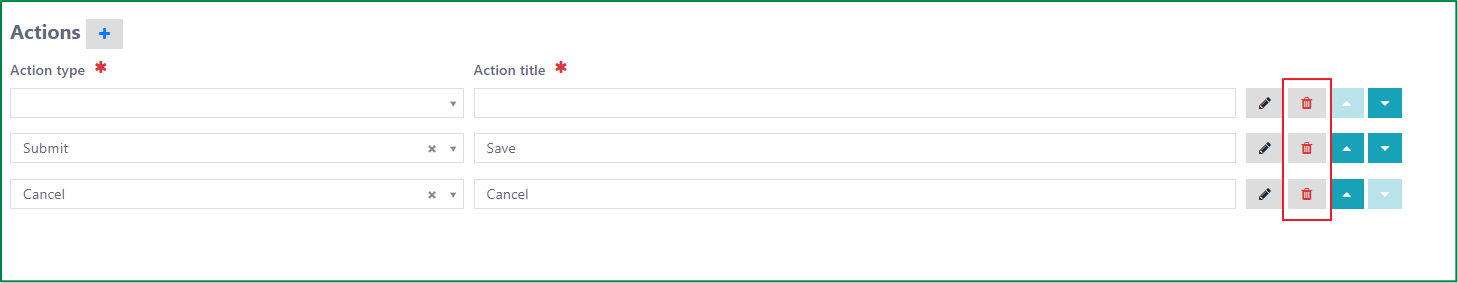
By clicking the Delete button at the right of the action, the form action will be deleted.
The deletion function will be disabled if there is only 1 form action in the list. The form must have at least 1 action.
Preview
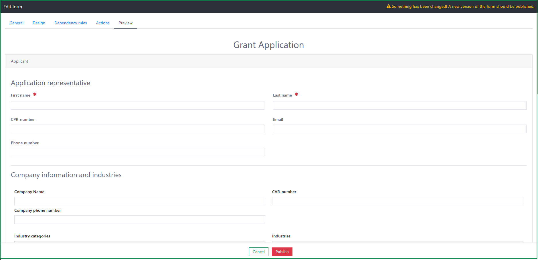
After you finish configuring the form actions, you must save the changes before going to the Preview tab to preview the rendered form and publish it.
In preview mode, you can view how the designed form displays after being published. You can also try filling in the form and check its behavior.
At this preview step, changes to the form are not yet available on the public site. They are only available after the form is published successfully. You can publish the form with the Public button in the Preview tab.

By clicking the Public button, a confirmation dialog will be opened.
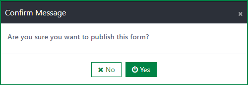
If you select the Yes button, the form will be published immediately. If you select the No button, the publication will be cancelled.
Delete a form
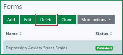
The Delete button is only enabled after a form is selected.
By clicking the Delete button, the deletion confirmation dialog will be opened.
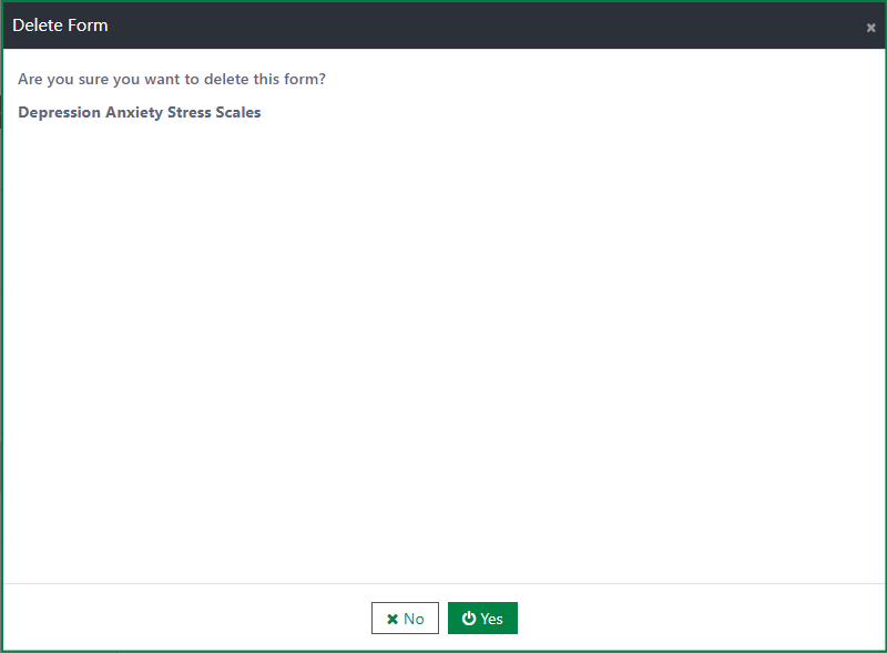
If you select the Yes button, the form will be deleted immediately. If you select the No button, the deletion will be cancelled. After deletion, the deleted form will no longer be accessible on the public site.
Other actions
Clone new form
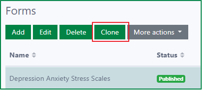
The Clone button is only enabled after an item in the list of forms is selected.
By clicking the Clone button, a confirmation dialog for cloning will be opened.

If you select the No button, the cloning process will be cancelled. If you select the Yes button, the cloning process will start, and it will take a while to complete.
After the cloning process is completed, the new form dialog will be opened. The name of the new form includes the name of the original form and a suffix. The status of the new form is Draft by default.
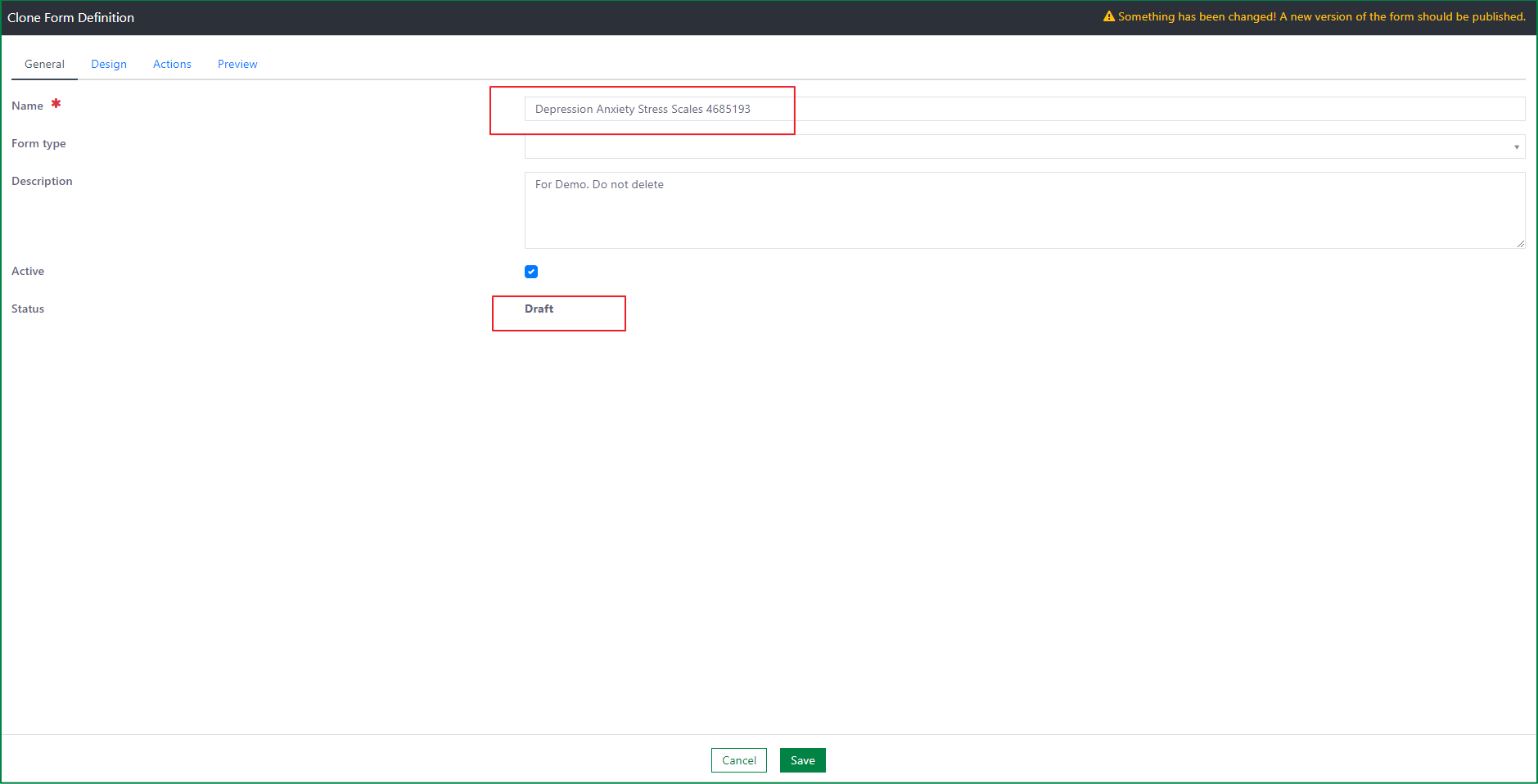
The new form inherits the form design and all configurations of the original form.
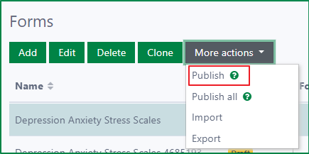
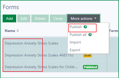
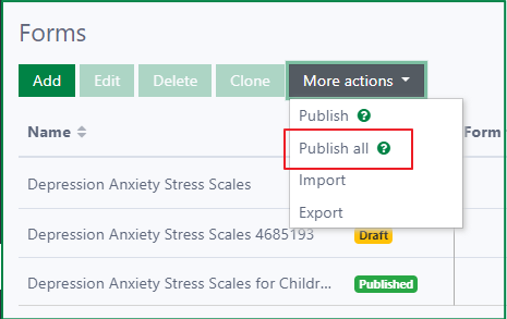
Publish form
Besides publishing a form in the Edit form dialog, you can also publish a single form, multiple forms, or all forms without having to open each form to publish it.
- Publish a form
- To publish a form, select a form and then click the Publish button; the selected form will be published immediately.
- Publish multiple forms
- To publish multiple forms at once, select multiple forms and then click the Publish button; the selected forms will be published immediately.
- Publish all forms
- To publish all forms, click the Publish all button; a publication confirmation dialog will then be opened. If you select the Yes button, all forms whose status is Draft will be published immediately. If you select the No button, the publication will be cancelled.
Import form
Besides creating forms manually, you can import a list of forms from a JSON file.
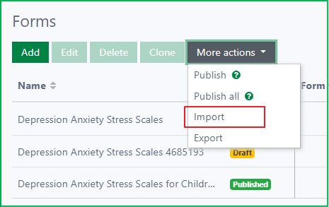
By clicking the Import button, the Import form actions dialog will be opened. Then, you can select a JSON file and upload it via the File upload field.
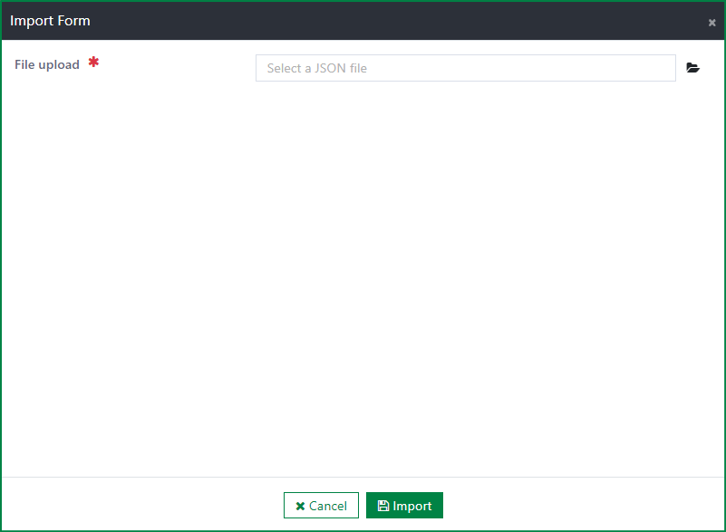
After the import process is completed, the forms will be created and displayed properly in the Forms list.
Export form
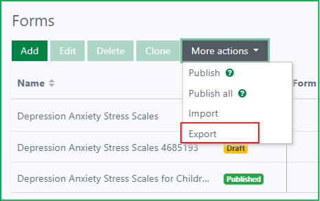
By clicking the Export button, the list of forms will be exported immediately as a JSON file. You can also export one or multiple forms instead of the whole list by selecting the forms and then clicking the Export button.