Form components and specific settings
Besides the general settings, each form component has its own specific configuration options, which differ between components. These configurations allow the form admin to turn on authorization and add new features to the component fields. With these configurations, the form admin has the power to customize the form based on business needs.
Basic form components
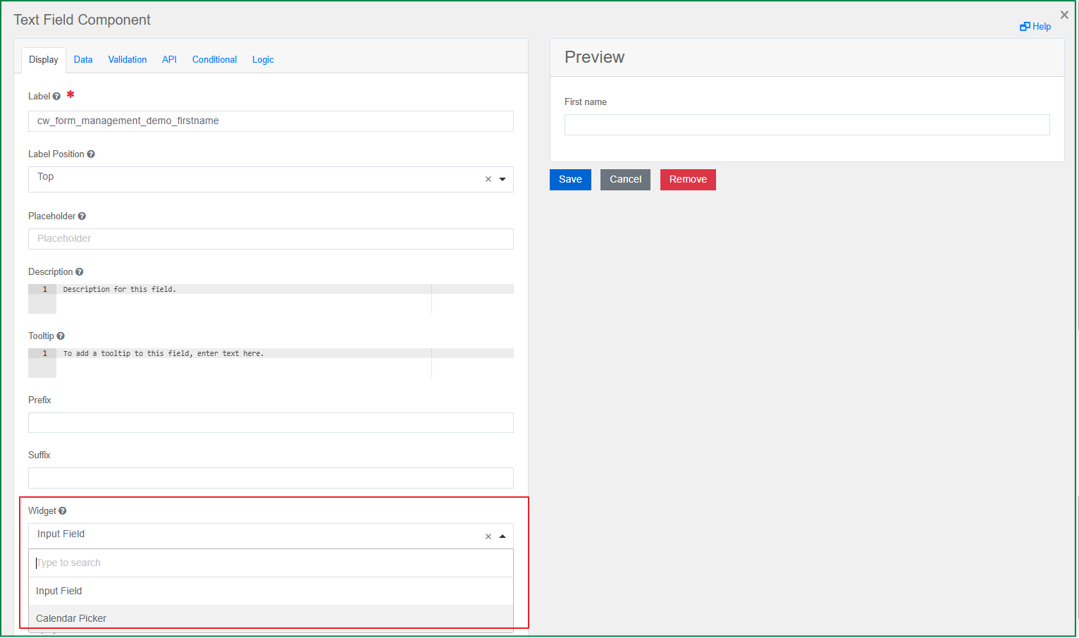
Text field
A Text field can be used for short, general text input. There are options to change the widget and define input masks and validations, which allow users to mold information into the desired formats.
Widget
This option is displayed in the Display tab. The widget is the display UI used to input the value of the field. You can change the widget to Input Field or Calendar Picker.
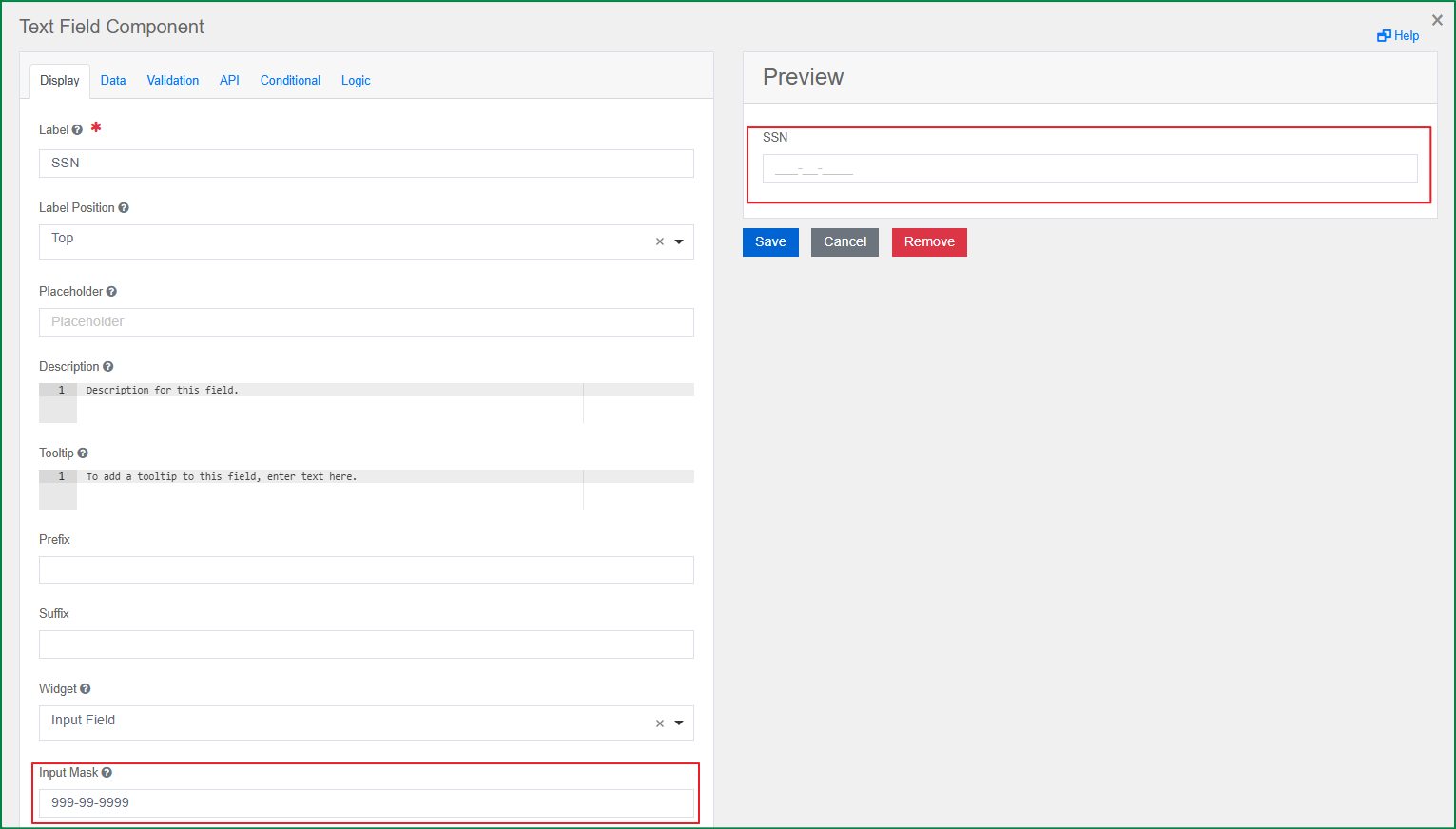
Input Mask
This option is displayed in the Display tab. Define the input mask when you want the end-user to input data in a specific format, such as postal codes, SSN, etc. The input mask will affect the value that is saved. If the Display Mask is not defined, the field format will follow the input mask.
Display Mask
This option is displayed in the Display tab. A display mask helps display the input in a readable way and will not affect the value that is saved. If you want to affect both the displayed and saved value, you should use the Input Mask instead.
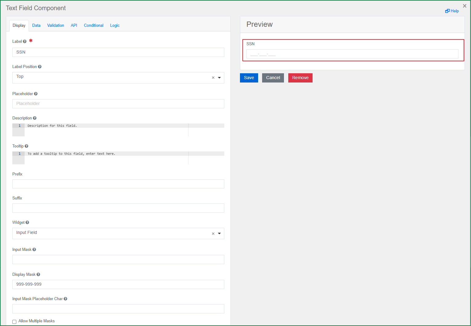
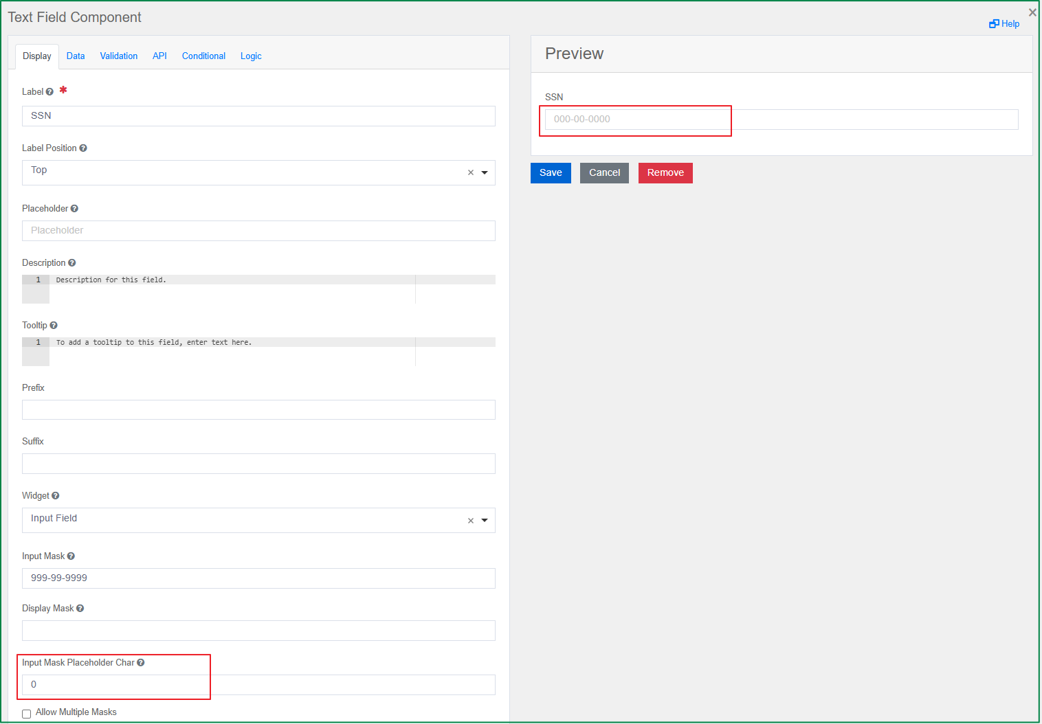
Input Mask Placeholder Char
This option is displayed in the Display tab. It is only enabled if the Input Mask or the Display Mask is defined. With this option, you can define the character that is used as the placeholder of the field. The character will be displayed according to the defined mask.
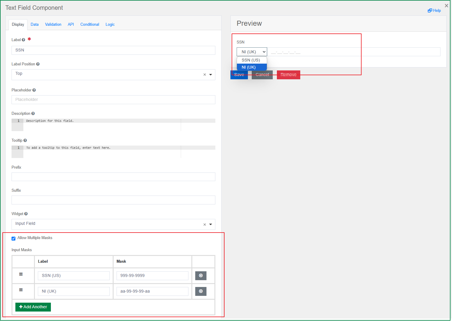
Allow Multiple Masks
This option is displayed in the Display tab. If you want the end-user to be able to select the input format, you can use this setting. When the Allow Multiple Masks checkbox is ticked, the Input Mask and Display Mask fields are hidden. Meanwhile, the Input Masks grid field for adding input masks will be displayed, and you can add multiple input masks. If the field has this setting, the end-user will see a list of the defined masks from which to select the format they want.
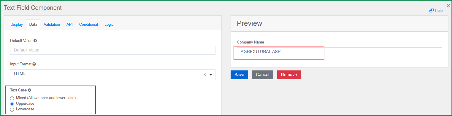
Text Case
This option is displayed in the Data tab. It is used to define the case of the value when the end-user inputs the data. There are 3 options for text case: Mixed, Uppercase, and Lowercase.
Mixed: If this option is selected, the entered values are kept as they are; they can be either lowercase or uppercase.
Uppercase: If this option is selected, the entered values are forced to uppercase.
Lowercase: If this option is selected, the entered values are forced to lowercase.
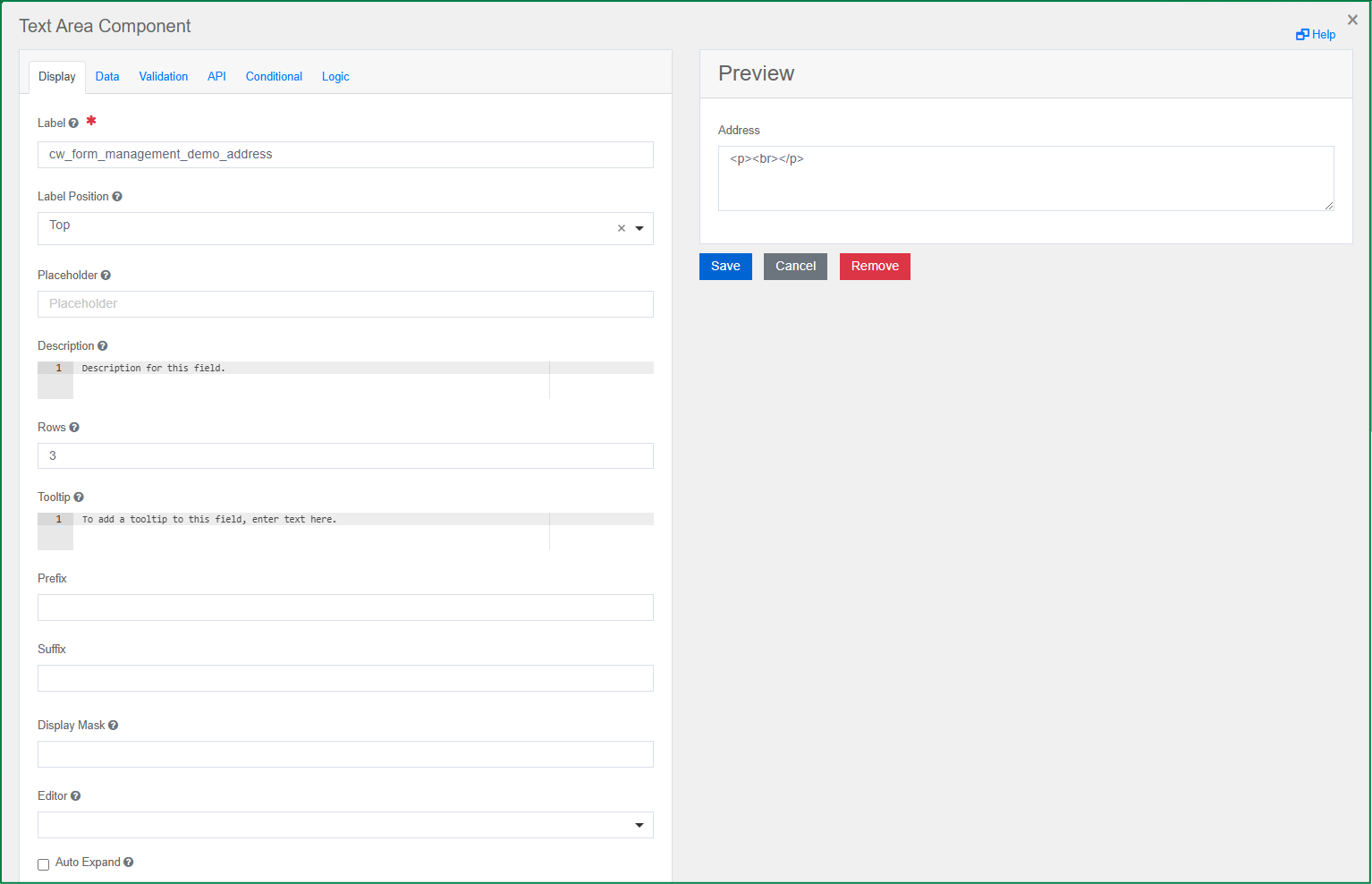
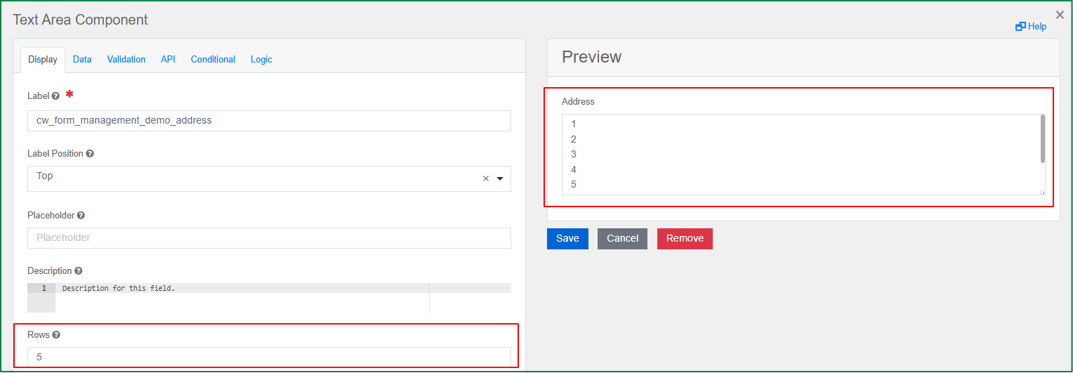
Text area
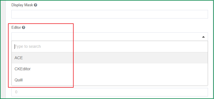
Text area is an input field that allows multiple lines for longer text. Similar to the Text Field component, the Text Area also has the Display Mask option. In addition, you can convert the text area into a WYSIWYG editor for the end-user, and configure image uploads based on the editor.
The following are the specific settings for the Text area component.
Rows
This option is displayed in the Display tab. With this option, you can define how many default rows are set in the Text Area.
Display Mask
This option is displayed in the Display tab. Similar to the Text field component above, the Display Mask helps display the input in a readable way and will not affect the value that is saved.
Editor
This option is displayed in the Display tab. It converts the text area into the selected WYSIWYG Editor user interface. There are 3 editors provided: ACE, CKEditor, and Quill.
Enable image upload
This option is displayed in the Display tab. It is only enabled and displayed if the selected editor is CKEditor or Quill. Tick this checkbox if you want to allow image uploads to the WYSIWYG Editor.
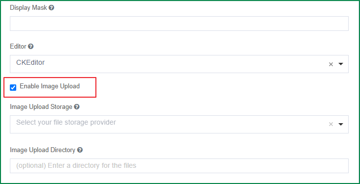
Image Upload Storage
This option is displayed in the Display tab. It is only enabled and displayed if the Enable image upload checkbox is ticked. With it, you can select one of the provided storages in which to save the files.
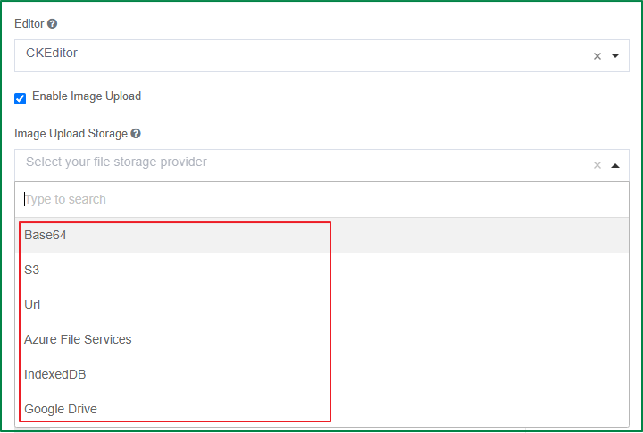
Image Upload Directory
This option is displayed in the Display tab. It is only enabled and displayed if the Enable image upload checkbox is ticked. You can enter a directory in which to place all the uploaded files.
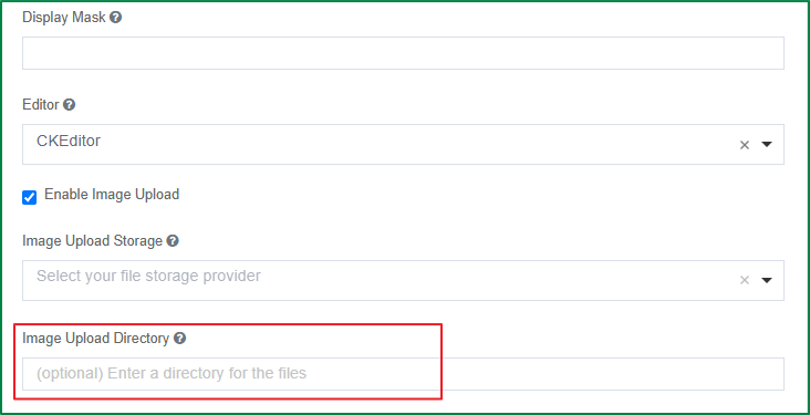
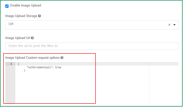
Image Upload Custom request options
This option is displayed in the Display tab. It is only enabled and displayed if the selected image upload storage is Url. With this option, you can pass your custom xhr options.
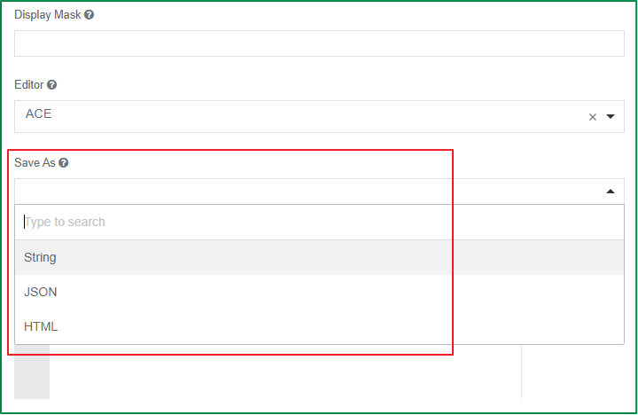
Save as
This option is displayed in the Display tab. It is only enabled and displayed if the selected editor is ACE or Quill. You can select whether the value should be entered and stored in the database as String, JSON, or HTML.
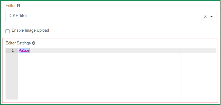
Editor Settings
This option is displayed in the Display tab. Here you can modify the code base of the WYSIWYG Editor to customize the UI specific to your needs.
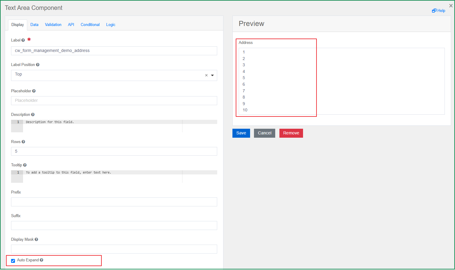
Auto expand
This option is displayed in the Display tab. It is only enabled if no WYSIWYG editor is selected. When this option is turned on, the height of the text area field expands automatically according to the number of lines of entered data. The expansion happens immediately as the user is typing into the field.
Text Case
This option is displayed in the Data tab. It is used to define the case of the value when the end-user inputs the data. There are 3 options for text case: Mixed, Uppercase, and Lowercase.
Mixed: If this option is selected, the entered values are kept as they are; they can be either lowercase or uppercase.
Uppercase: If this option is selected, the entered values are forced to uppercase.
Lowercase: If this option is selected, the entered values are forced to lowercase.
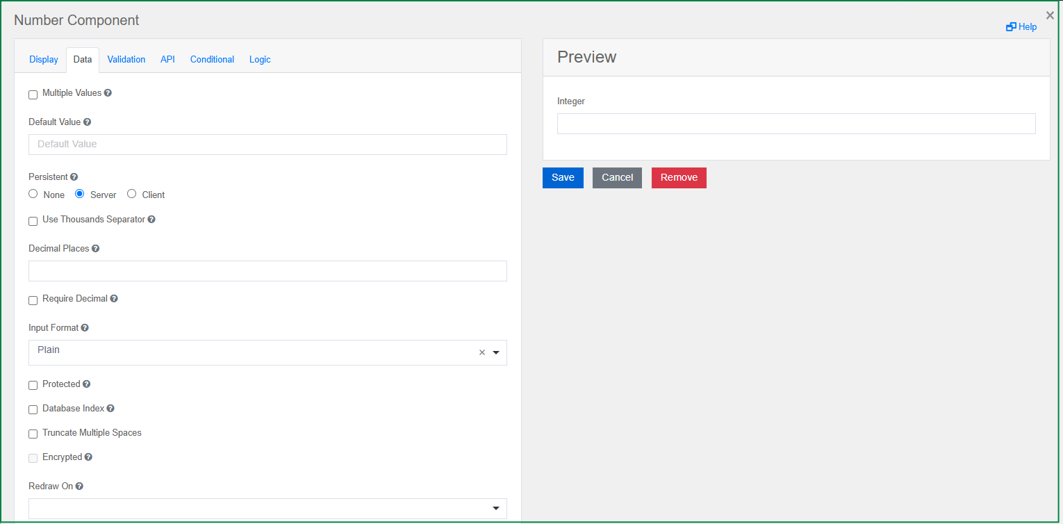
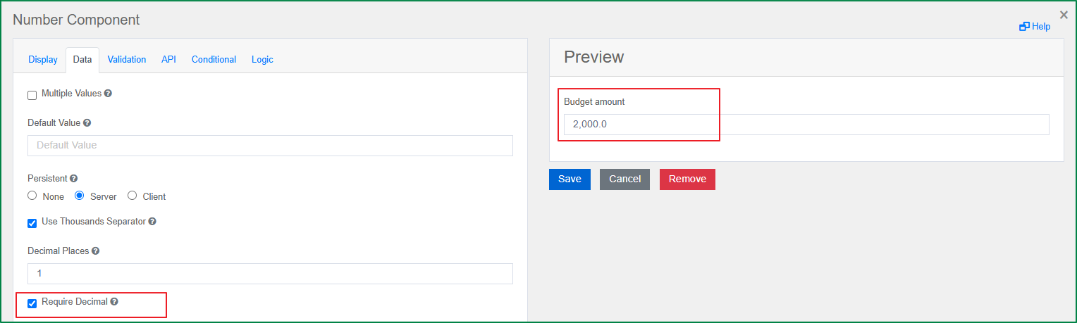
Number
A Number field can be used whenever a field should be limited to a numeric value. The specific settings of the Number component include Use Thousands Separator, Decimal Places, and Require Decimals.
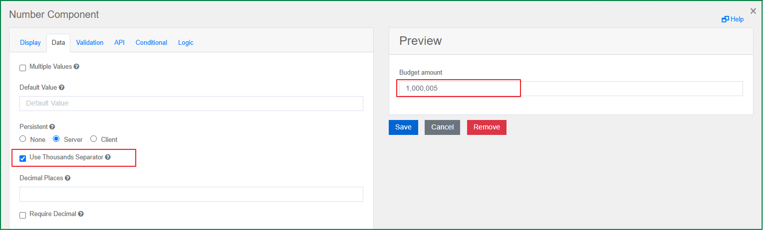
Use Thousands Separator
This option is displayed in the Data tab. Tick this option if you want the value in this component to separate thousands with a local delimiter.
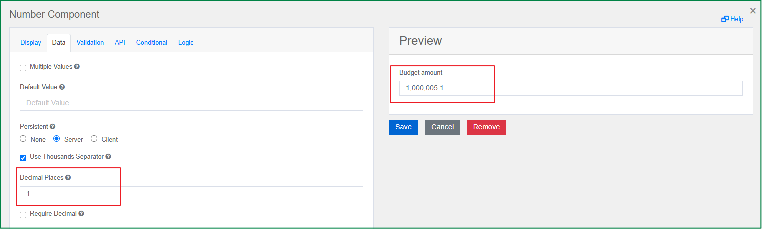
Decimal Places
This option is displayed in the Data tab. It specifies the maximum number of decimal places for the values in this field.
Require Decimal
This option is displayed in the Data tab. If you tick this option, decimals are always shown for this field, even if they are trailing zeros.
Password
The Password component is an input field in which the entered value is displayed as hidden input symbols. Similar to the Text Field component, the Password component also has the Display Mask option. Unlike the Text field component, the HTML <input> type of the Password component is password instead of text. The Password component does not have other specific settings.
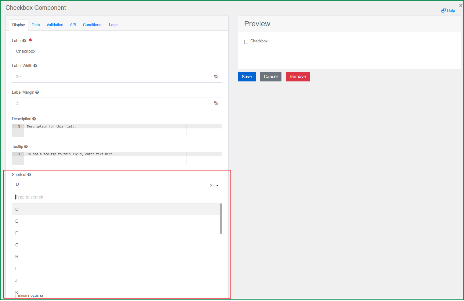
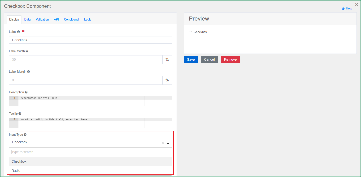
Check Box
The Check Box component can be used for an input field with a boolean value. It can either be ticked (true) or unticked (false). You can configure the input type for this component.
Shortcut
This option is displayed in the Display tab. You can select a key from the list to use as the shortcut to tick or untick the checkbox on the rendered form. On the rendered form, to use the shortcut, press the key combination Ctrl + the selected key.
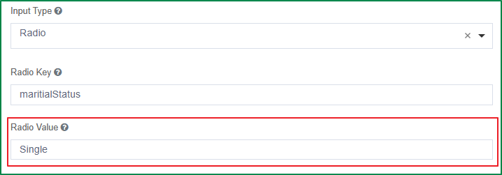
Input Type
This option is displayed in the Display tab. You can select the input type for the field. When you drag and drop the field onto the form, the default Input Type is Checkbox; you can change it to Radio.
Radio Key
This option is displayed in the Display tab. The Radio Key setting is only displayed and enabled if the selected Input Type is Radio. You can enter the key of the radio that will store data, e.g., maritialStatus.
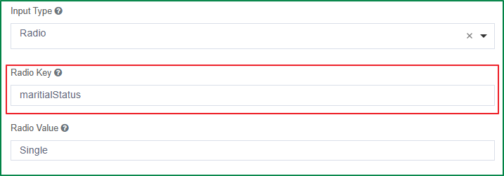
Radio Value
This option is displayed in the Display tab. The Radio Value setting is only displayed and enabled if the selected Input Type is Radio. You can enter the value of the radio key for when the checkbox is ticked, e.g., Single.
Select boxes
This component allows you to select one or multiple options in a checkbox-style format. The specific settings of this component include setting values and value shortcuts, min/max validation of the checked number, and checked error messages.
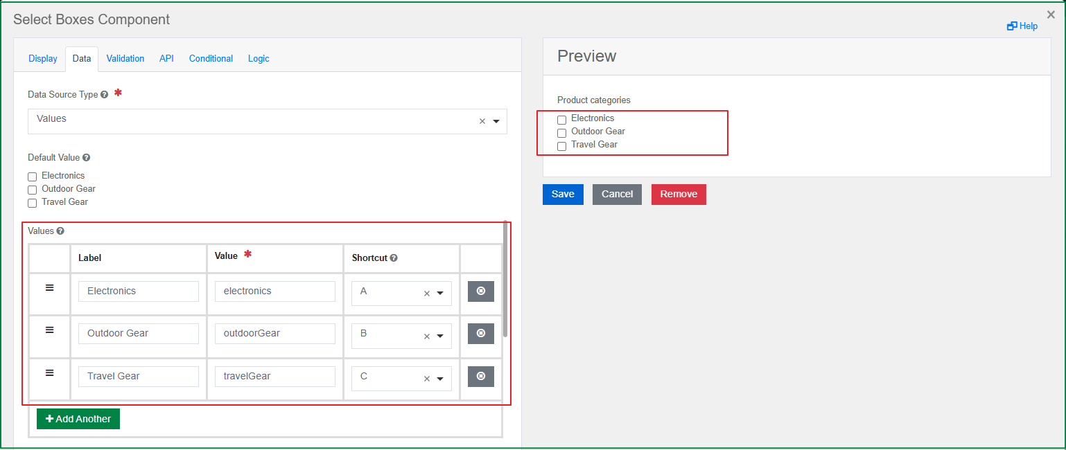
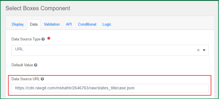
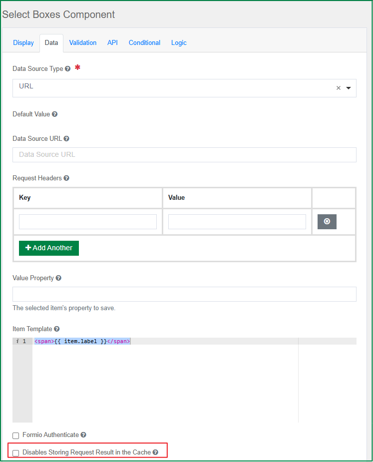
Data Source Type
This option is displayed in the Data tab. It defines whether the data source type used for the component is Values or URL. Additional setting options will be displayed according to the selected data source type.
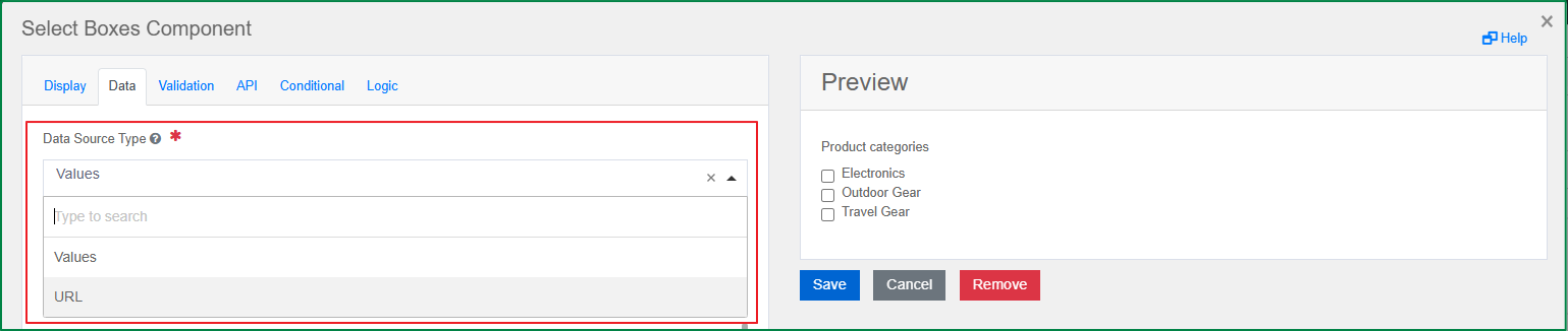
Values
This option is displayed in the Data tab and is only enabled if the Data Source Type is Values. You can define the list of values for the field; each value will be displayed as a checkbox in the checkbox list. There are 3 related settings for the value: Label, Value, and Shortcut.
Label is the front-end identifier for the end-user.
Value is the back-end identifier for the option and is what is saved to the database. Only String or Numeric values should be set for the Value.
Shortcut is the key used to tick or untick the corresponding checkbox of the value on the rendered form. To use the shortcut, press the key combination Ctrl + the selected key.
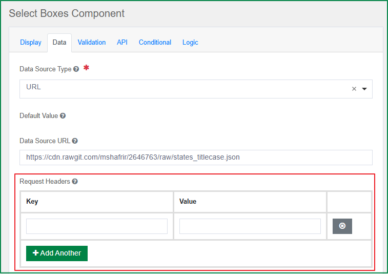
Data Source URL
This option is displayed in the Data tab and is only enabled if the Data Source Type is URL. You can enter the URL that returns a JSON array to use as the data source.
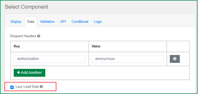
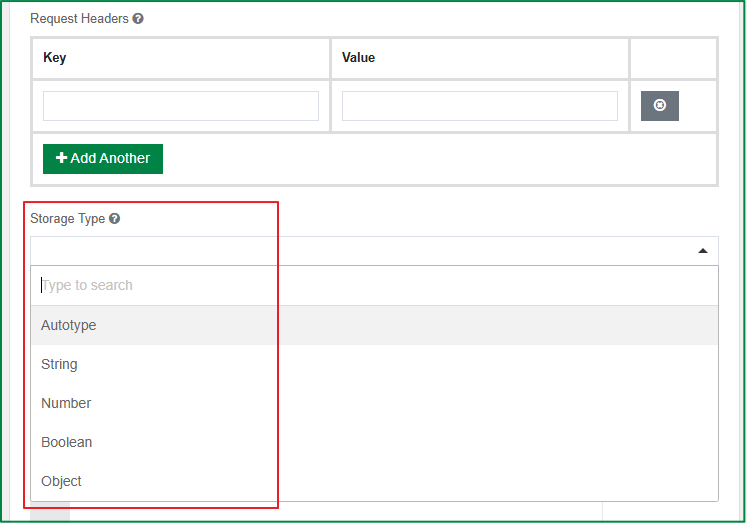
Request Headers
This option is displayed in the Data tab and is only enabled if the Data Source Type is URL. You can set the headers that should be sent along with the request to the URL. This setting is useful for authentication.
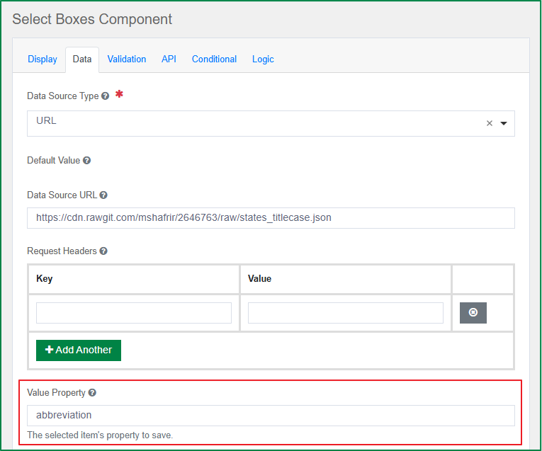
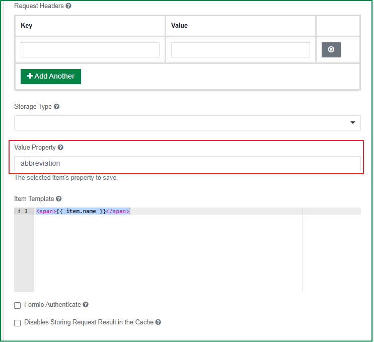
Value Property
This option is displayed in the Data tab and is only enabled if the Data Source Type is URL. You can specify the value that corresponds to the desired property within each object, which is set in the Item Template. If the value is not specified, the item itself will be used.
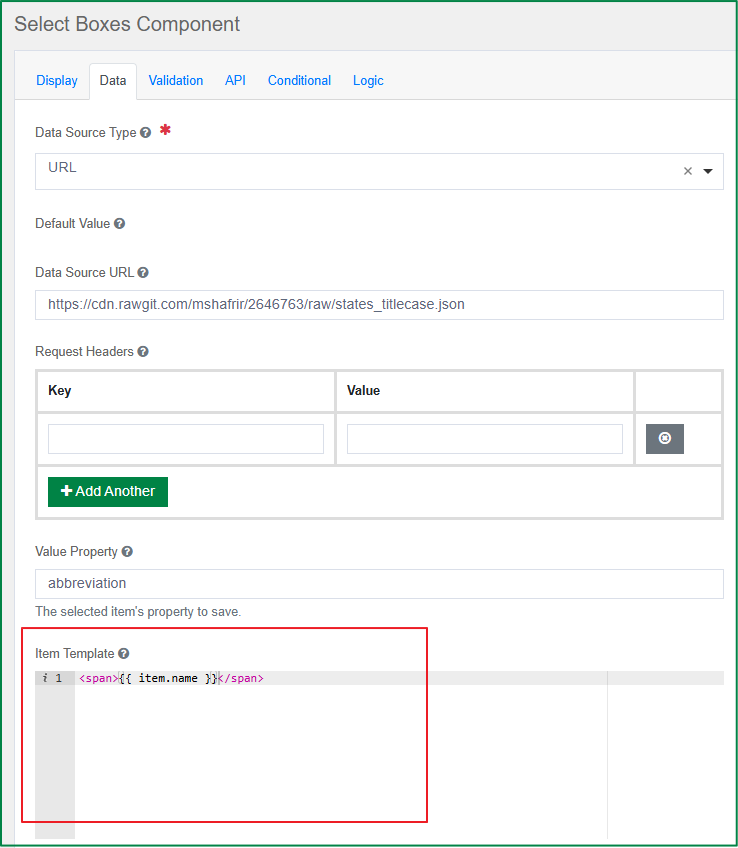
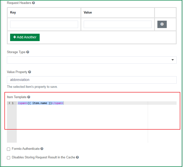
Item Template
This option is displayed in the Data tab and is only enabled if the Data Source Type is URL. You can enter the HTML template for the result data items.
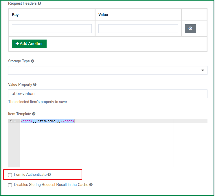
Formio Authenticate
This option is displayed in the Data tab and is only enabled if the Data Source Type is URL. Tick this checkbox if you want to use Formio Authentication with the request.
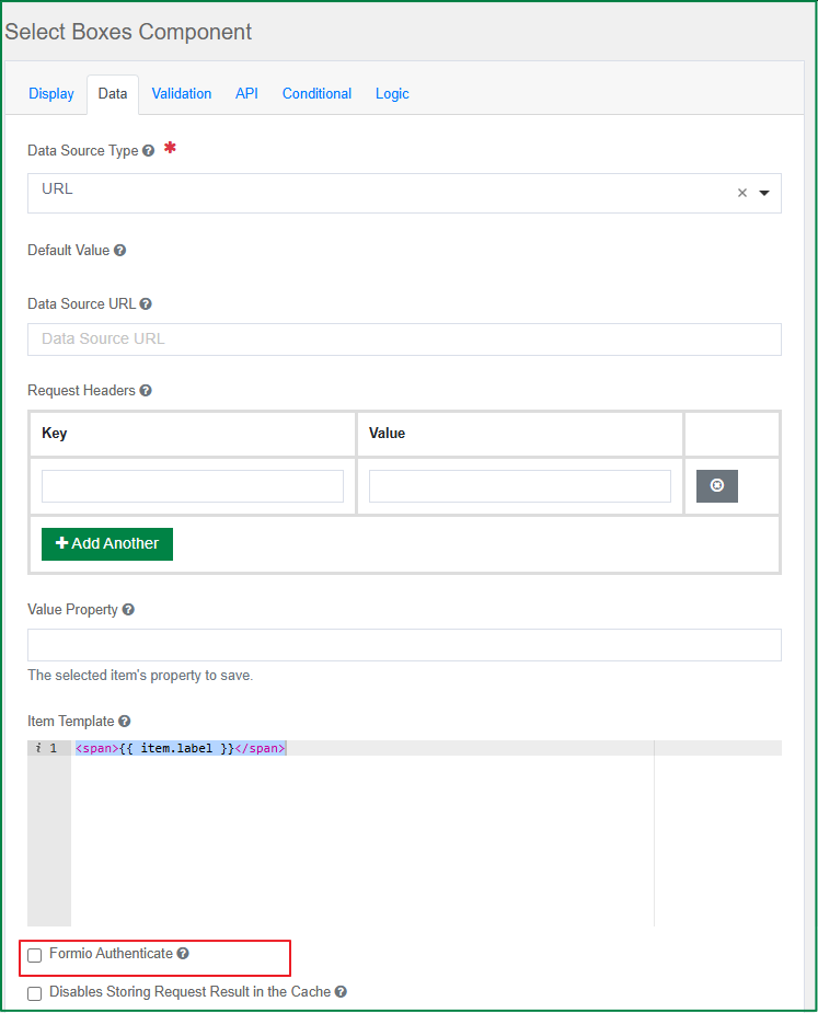
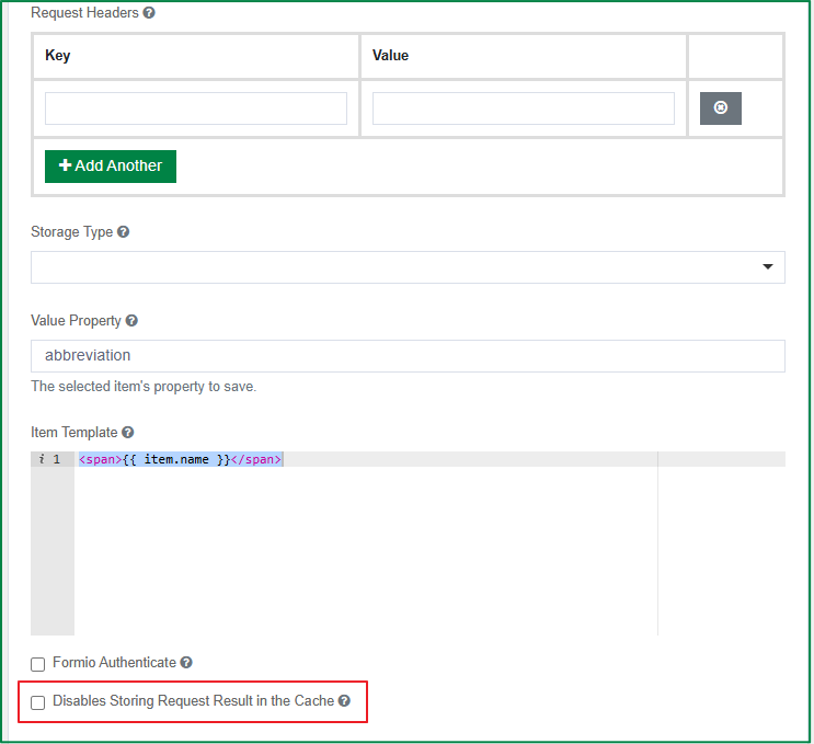
Disables Storing Request Result in the Cache
This option is displayed in the Data tab and is only enabled if the Data Source Type is URL. Tick this checkbox if you don't want the requests and their results to be stored in the cache.
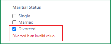
Allow only available values
This option is displayed in the Validation tab. Tick this checkbox if you want the selected value to be validated for availability before submission.
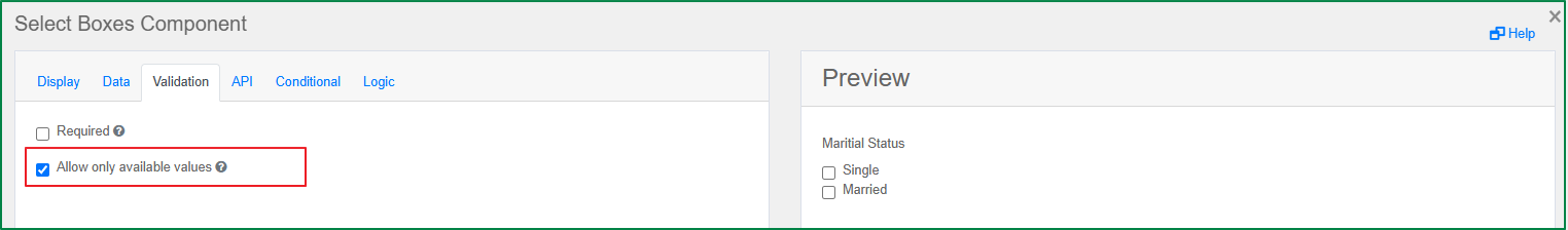
For example, the end-user opens a previous version of the registration form that includes a value of the select box component. This value is no longer available in the latest version of the form. When the user selects the unavailable value and submits the form, the validation will be triggered, the submission will be prevented, and the unavailable-value error message will be displayed.
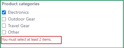
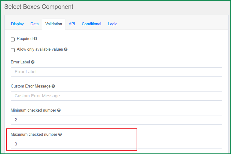
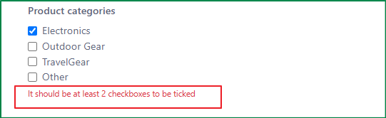
Minimum checked number
This option is displayed in the Validation tab. With this option, you can define the minimum number of checkboxes that must be ticked.
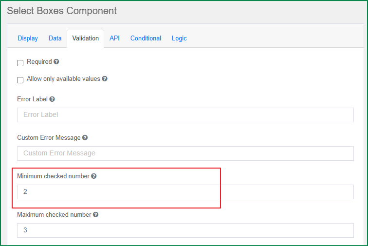
On the rendered form, if the number of ticked checkboxes is smaller than the defined minimum number, the validation will be triggered, the message about the required number of ticked checkboxes will be displayed, and the end-user cannot submit the form.
Maximum checked number
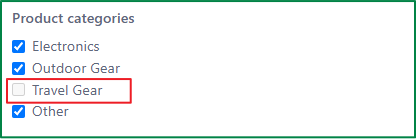
This option is displayed in the Validation tab. With this option, you can define the maximum number of checkboxes that can be ticked.
On the rendered form, if the number of ticked checkboxes is equal to the defined maximum number, the validation will be triggered, and the remaining unticked checkboxes will be disabled.
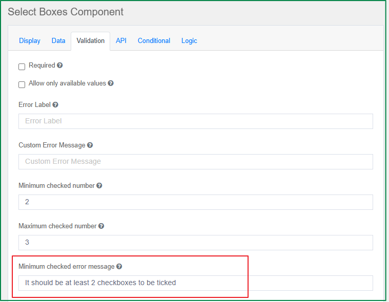
Minimum checked error message
This option is displayed in the Validation tab. With this option, you can define the validation message related to the Minimum checked number setting above. If this message is not defined, the default message will be shown.
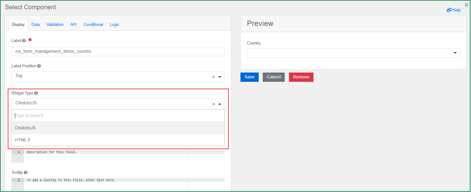
Select
The Select component displays a list of values in a dropdown where users can select one or multiple values. It also offers a wide range of settings that provide different ways of filtering, querying, and loading data values.
Widget Type
This option is displayed in the Display tab. You can select whether the widget type is ChoiceJS or HTML 5.
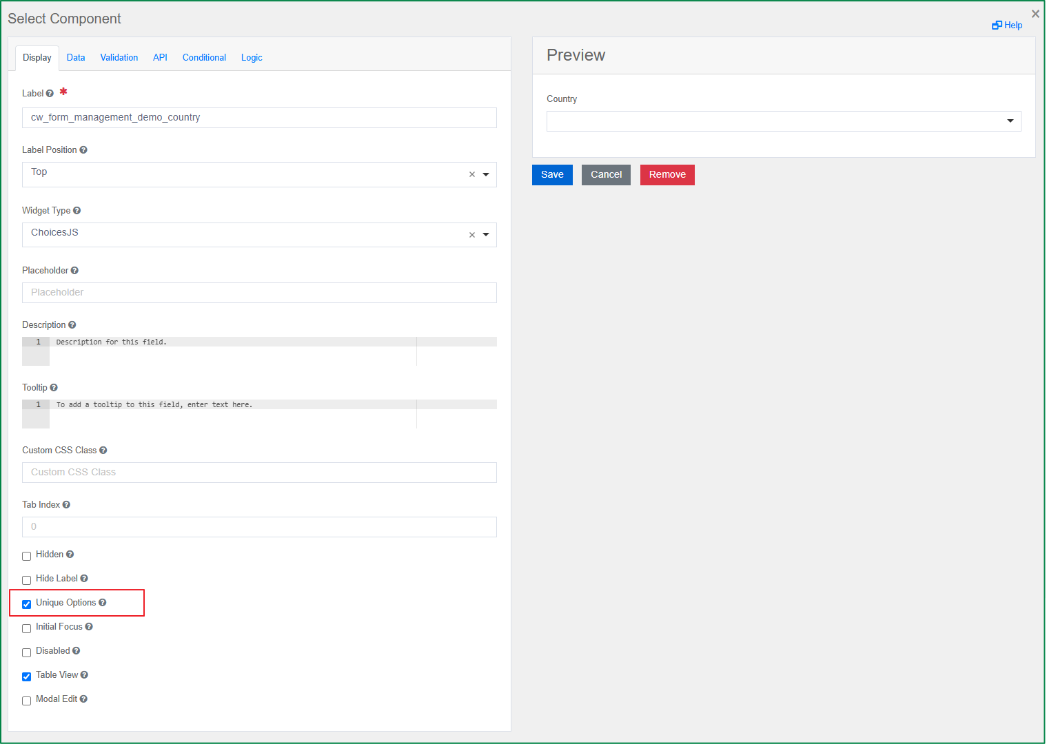
Unique Options
This option is displayed in the Display tab. Tick this checkbox if you want the dropdown list to show only unique options and not display duplicates.
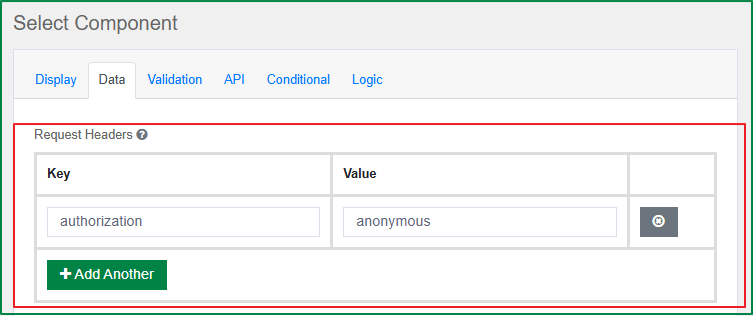
Request Headers
This option is displayed in the Data tab. You can set the headers that should be sent along with the request to the URL. This setting is useful for authentication.
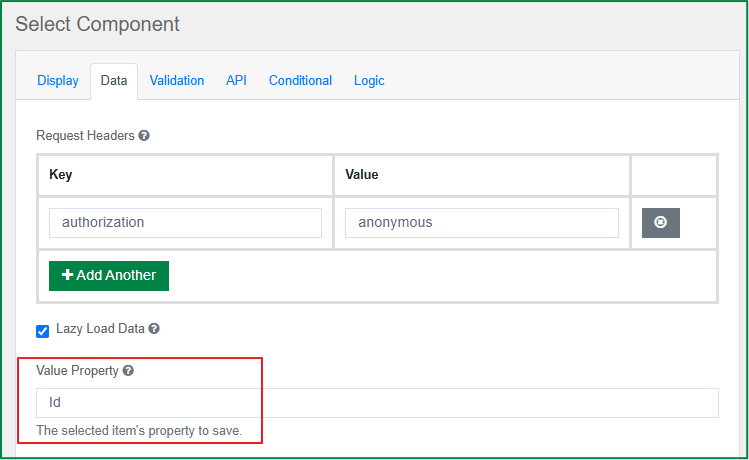
Lazy Load Data
This option is displayed in the Data tab. Tick this option to improve performance if you have many Select dropdowns on your form; the APIs will only fire when the field is activated.
Value Property
This option is displayed in the Data tab. You can specify the property of each item in the data source to use as the select value. If the value is not specified, the item itself will be used.
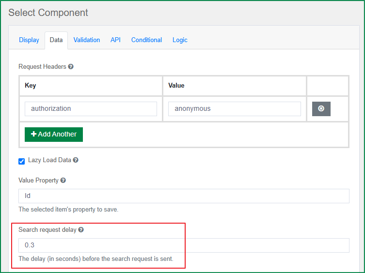
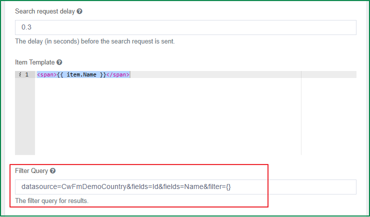
Search request delay
This option is displayed in the Data tab. You can enter the delay, in seconds, before the search request is sent, measured from the last character entered in the search field. The default is 0.3.
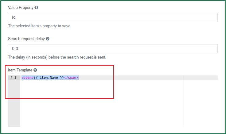
Item Template
This option is displayed in the Data tab. You can enter an HTML template that determines how the select options are displayed within the dropdown. You can use the item variable to access the current object in the array.
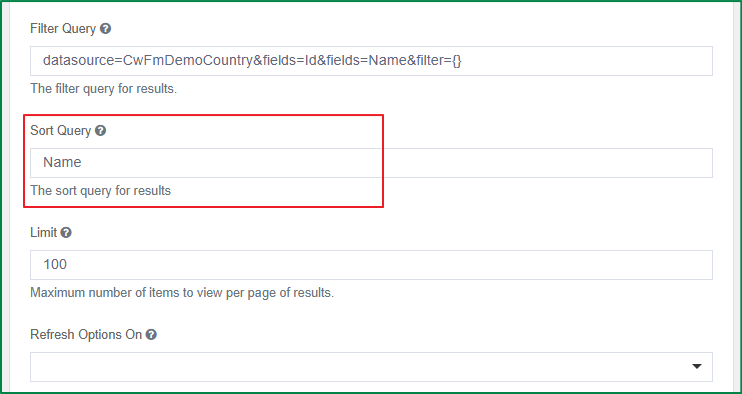
Filter Query
This option is displayed in the Data tab. You can use this to provide additional filtering within the dropdown using query parameters.
Sort Query
This option is displayed in the Data tab. You can use this to provide additional sorting using query parameters.
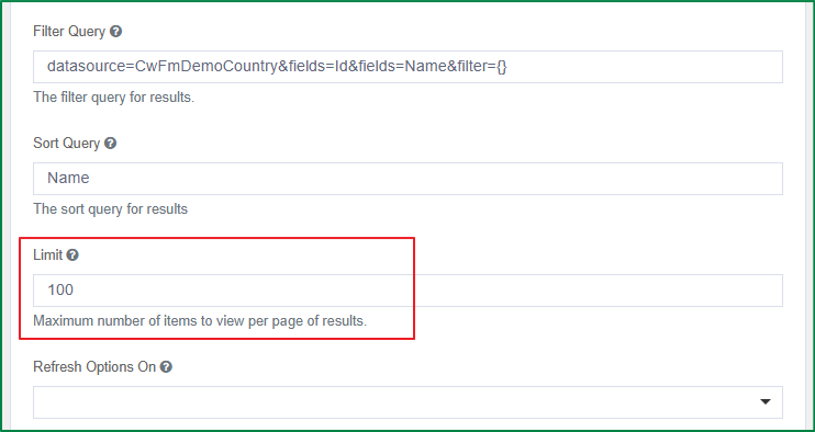
Limit
This option is displayed in the Data tab. You can enter the limit on the number of items to request or view within the select field dropdown.
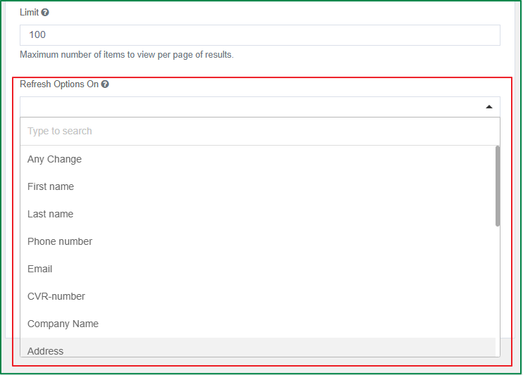
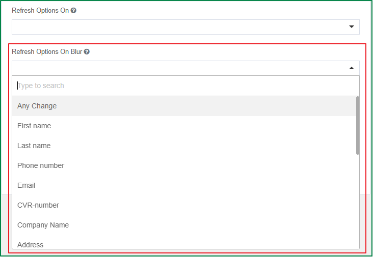
Refresh Options On
This option is displayed in the Data tab. You can select a field so that, when its value changes, the options of the Select field will be refreshed. You can also select Any Change, so that the options of the Select field will be refreshed on any change on the form. This option is helpful when dealing with dynamic values.
Refresh Options On Blur
This option is displayed in the Data tab. You can select a field so that, when it is blurred, the options of the Select field will be refreshed. You can also select Any Change, so that the options of the Select field will be refreshed when any field on the form is blurred.
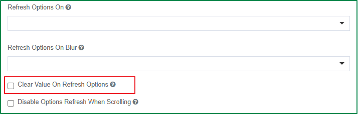
Clear Value On Refresh Options
This option is displayed in the Data tab. Tick this checkbox if you want to clear any selected value of the Select field when it is reset by the Refresh Options On setting.
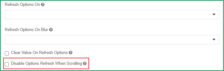
Disable Options Refresh When Scrolling
This option is displayed in the Data tab. Tick this checkbox if you do not want the options of the Select field to be refreshed when the end-user scrolls through the list of options.
Radio
The radio component allows users to select a single option from a list of options displayed in radio-style format. Users can click a selected option to deselect it, returning the field to its original state. The following are the specific settings of the radio component.
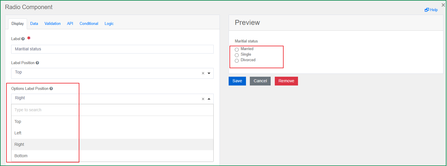
Options Label Position
This option is displayed in the Display tab. You can select the position of the option label relative to the option bubble.
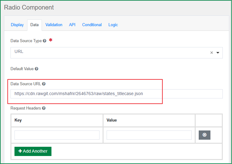
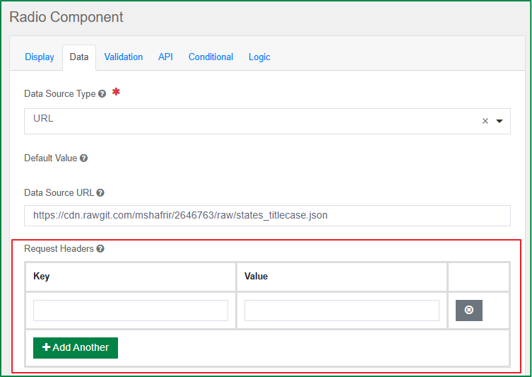
Data Source Type
This option is displayed in the Data tab. You can select the source to use for the select data. There are 2 data source types: Values and URL. Additional setting options will be displayed according to the selected data source type.
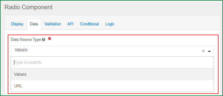
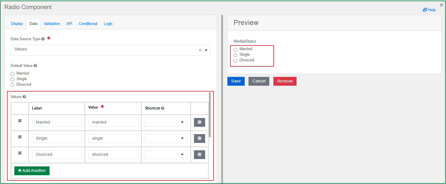
Values
This option is displayed in the Data tab and is only enabled if the Data Source Type is Values. You can define the list of radio options; each value will be displayed as a radio option. There are 3 related settings for the value: Label, Value, and Shortcut.
Label is the front-end identifier for the end-user.
Value is the back-end identifier for the option and is what is saved to the database. Only String or Numeric values should be set for the Value.
Shortcut is the key used to tick or untick the corresponding checkbox of the value on the rendered form. To use the shortcut, press the key combination Ctrl + the selected key.
Data Source URL
This option is displayed in the Data tab and is only enabled if the Data Source Type is URL. You can enter the URL that returns a JSON array to use as the data source.
Request Headers
This option is displayed in the Data tab and is only enabled if the Data Source Type is URL. You can set the headers that should be sent along with the request to the URL. This setting is useful for authentication.
Value Property
This option is displayed in the Data tab and is only enabled if the Data Source Type is URL. You can specify the value that corresponds to the desired property within each object, which is set in the Item Template. If the value is not specified, the item itself will be used.
Item Template
This option is displayed in the Data tab and is only enabled if the Data Source Type is URL. You can enter the HTML template for the result data items.
Formio Authenticate
This option is displayed in the Data tab and is only enabled if the Data Source Type is URL. Tick this checkbox if you want to use Formio Authentication with the request.
Disables Storing Request Result in the Cache
This option is displayed in the Data tab and is only enabled if the Data Source Type is URL. Tick this checkbox if you don't want the requests and their results to be stored in the cache.
Storage Type
This option is displayed in the Data tab. You can select a type in which to store the data. If you select a type that is not Autotype, the data will be forced to the selected type.
Advanced form components
The Advanced form components are extensions of the Basic form components, designed to meet more complex requirements.
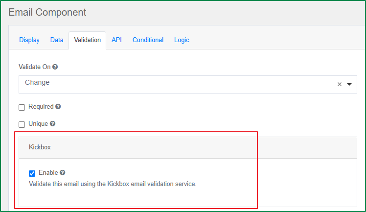
The Email component is a string field. This component has special validation that ensures the entered data is in a valid email format. A valid email address consists of an email prefix and an email domain, both in acceptable formats. The following are the specific settings of the email component.
Kickbox
This option is displayed in the Validation tab. Tick the checkbox to enable the Kickbox email validation service.
URL
The URL component is a string field. This component has special validation that ensures the entered data is in a valid URL format. This validation checks whether the entered data is at least in the correct format to potentially be a legitimate URL. There are no specific settings for this component.
Phone number
The Phone Number component is a string field. The component has a default input mask that forces the user to enter the field data in Phone Number format. There are no specific settings for this component.
Date/Time
The Date/Time component offers many options for validation, date ranges, and calculations using Moment.js. The following are the specific settings of the Date/Time component.
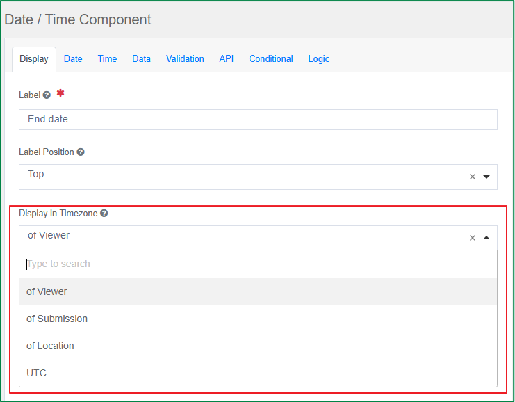
Display in Timezone
This option is displayed in the Display tab. You can select whether the display of the captured date and time should follow the timezone of the viewer, the submission, the location, or UTC.
Use Locale Settings
This option is displayed in the Display tab. Tick this checkbox if you want to use the Date/Time settings of your local machine.
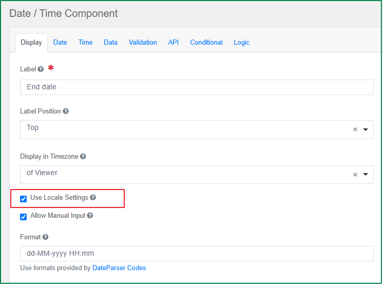
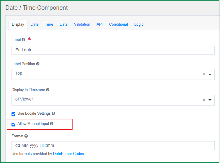
Allow Manual Input
This option is displayed in the Display tab. Tick this checkbox if you want to allow the end-user to enter the value manually from the keyboard, in addition to selecting the date and time from the calendar widget. If the checkbox is unticked, the end-user can only select the date and time from the calendar widget.
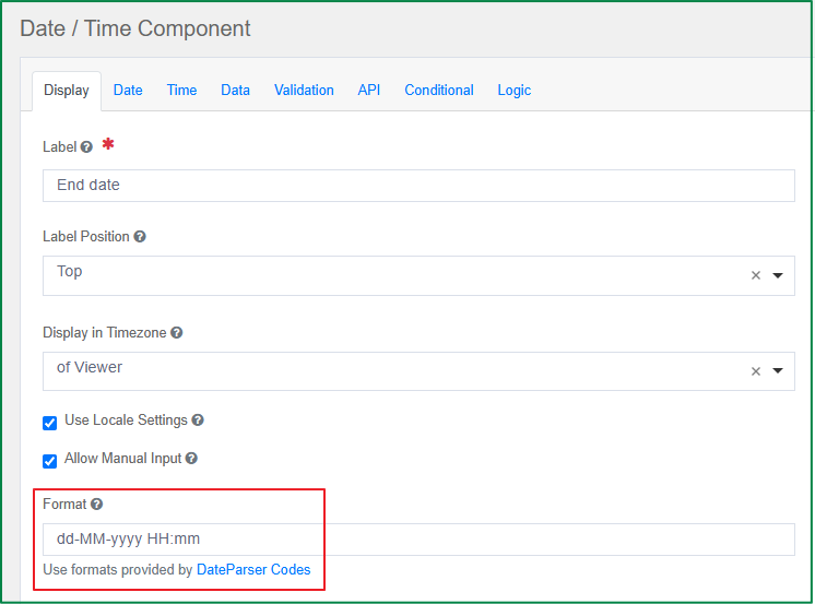
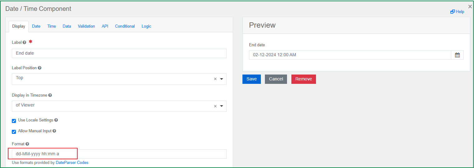
Format
This option is displayed in the Display tab. You can configure the format that the Date/Time value will be displayed in. If the time input is enabled, the format value must include hh:mm a (for 12-hour time format with AM/PM) or HH:mm (for 24-hour time format).
Enable Date Input
This option is displayed in the Date tab. This checkbox is ticked by default. If this option is enabled, the end-user can select the date from the calendar widget and can enter the date from the keyboard (if the Allow Manual Input option is enabled).
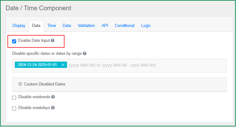
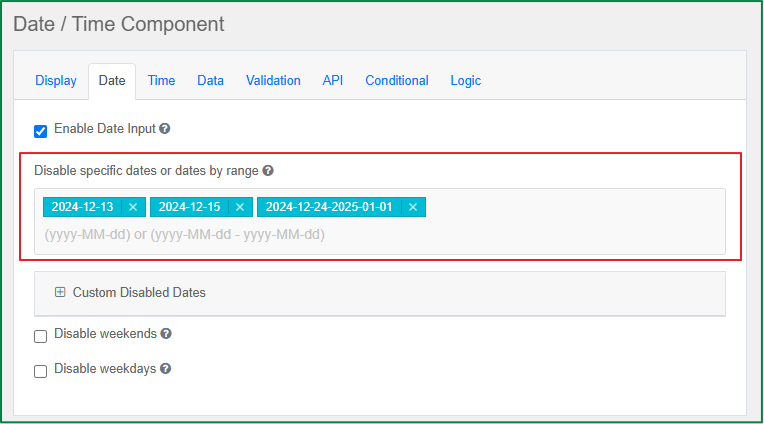
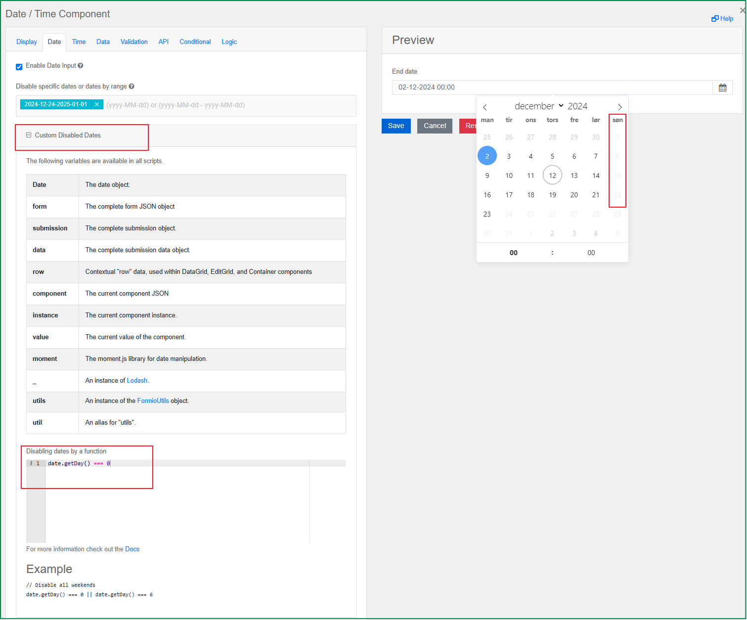
Disable specific dates or dates by range
This option is displayed in the Date tab. You can add one or multiple blacklisted dates or date ranges. The end-user cannot enter or select a blacklisted date or date range from the calendar widget. You must provide the blacklisted date or date range in the format yyyy-MM-dd or yyyy-MM-dd - yyyy-MM-dd.
Custom Disabled Dates
This option is displayed in the Date tab. When you expand the option, you can write a Javascript function to customize the disabled dates in the Disabling dates by a function field. The following example is a function that disables all Sundays.
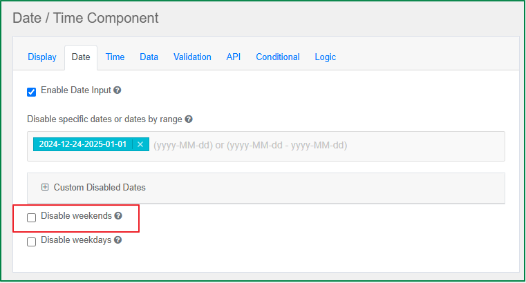
Disable weekends
This option is displayed in the Date tab. Tick this checkbox if you want weekends to be disabled from entry and selection in the calendar widget.
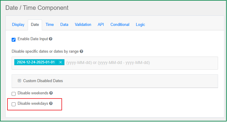
Disable weekdays
This option is displayed in the Date tab. Tick this checkbox if you want weekdays to be disabled from entry and selection in the calendar widget.
Enable Time Input
This option is displayed in the Time tab. This checkbox is ticked by default. If this option is enabled, the end-user can enter the time in the calendar widget, or in the input field if the Allow Manual Input option is enabled.
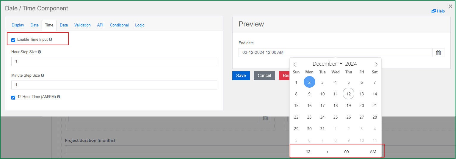
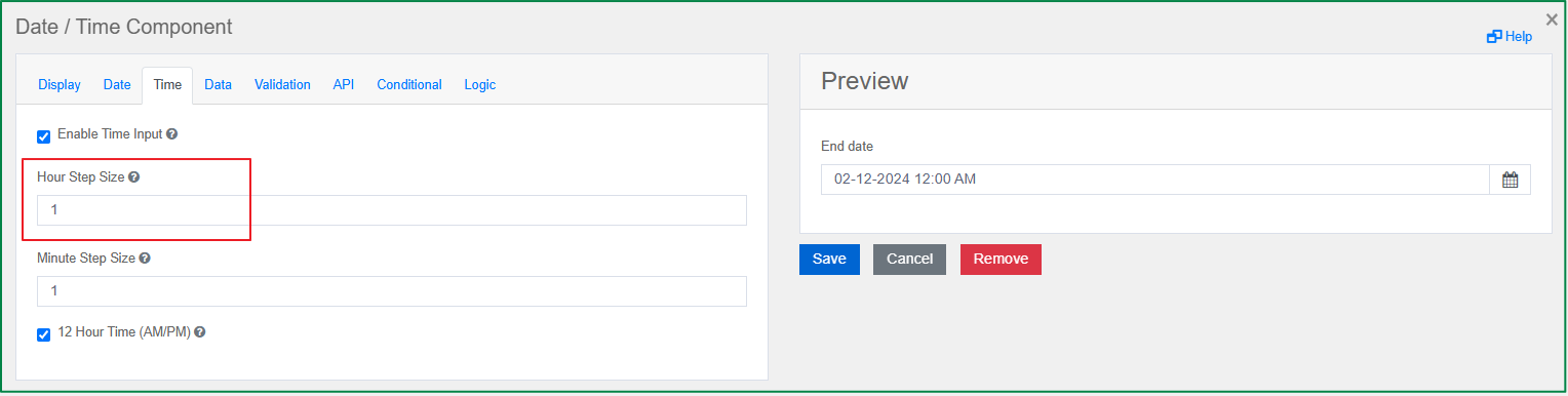
Hour Step Size
This option is displayed in the Time tab. You can provide the number of hours by which the time picker is incremented or decremented. The default hour step size is 1 hour.
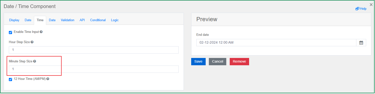
Minute Step Size
This option is displayed in the Time tab. You can provide the number of minutes by which the time picker is incremented or decremented. The default minute step size is 1 minute.
12 Hour Time (AM/PM)
This option is displayed in the Time tab. Tick this checkbox if you want the time to be displayed in 12-hour format with AM/PM in the time picker. If the checkbox is unticked, the time will be displayed in 24-hour format.
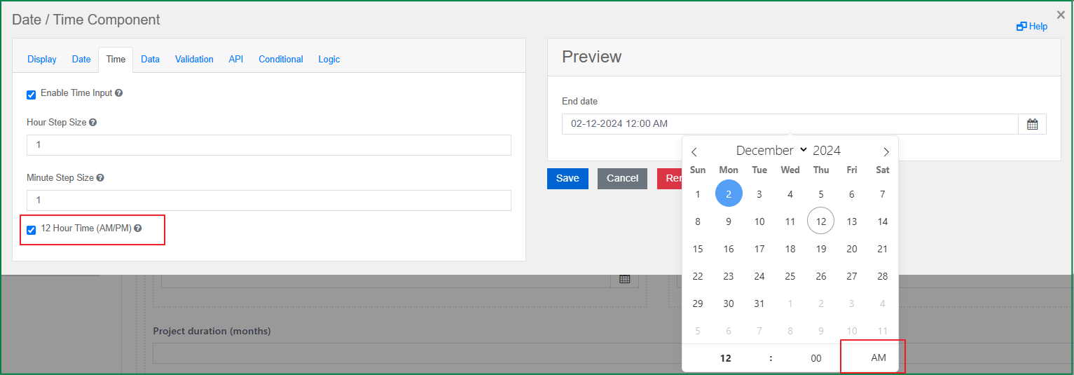
When you tick or untick the checkbox but the defined format in the Display tab is inconsistent with it, the defined format in the Display tab will be updated automatically. For example, if the defined format is dd-mm-yyyy hh:mm a and you tick this option, then after you save the change, the defined format will be updated to dd-mm-yyyy HH:mm automatically.
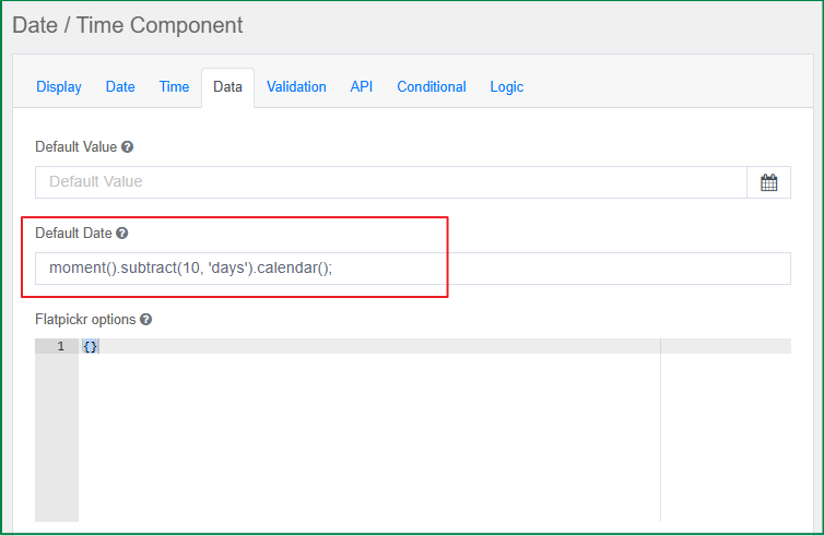
Default Date
This option is displayed in the Data tab. You can set a default value to a specific date by using the Moment.js function.
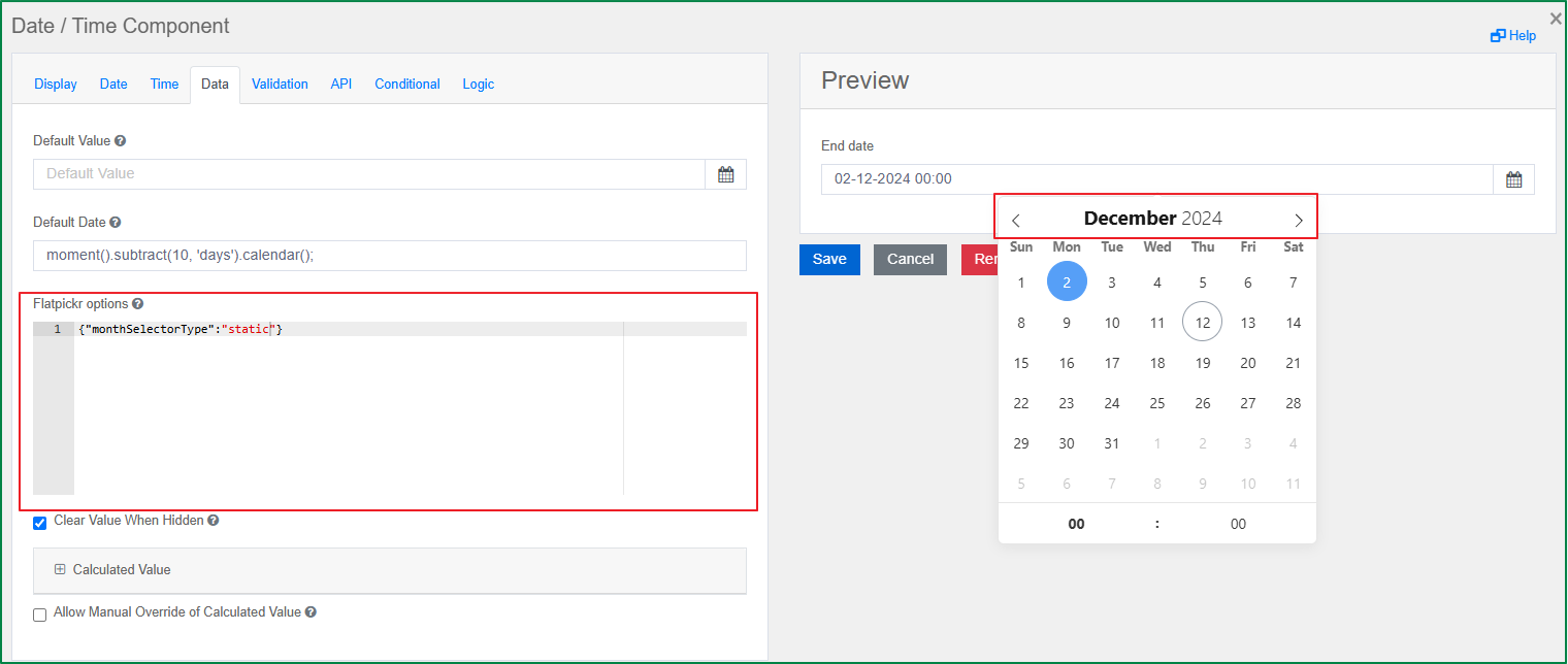
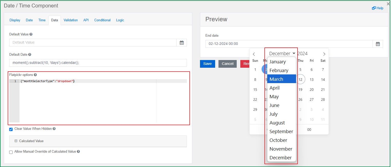
Flatpickr options
This option is displayed in the Data tab. You can enter raw JSON to set the options of the Flatpickr library, which is used to create the datepicker widget. For example, you can set the selector type of the month to static or dropdown as follows.
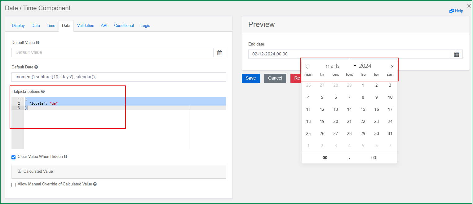
In addition, you can use this option to set the translation for the date picker by providing a value for the locale variable. The following example translates the date picker to Danish.
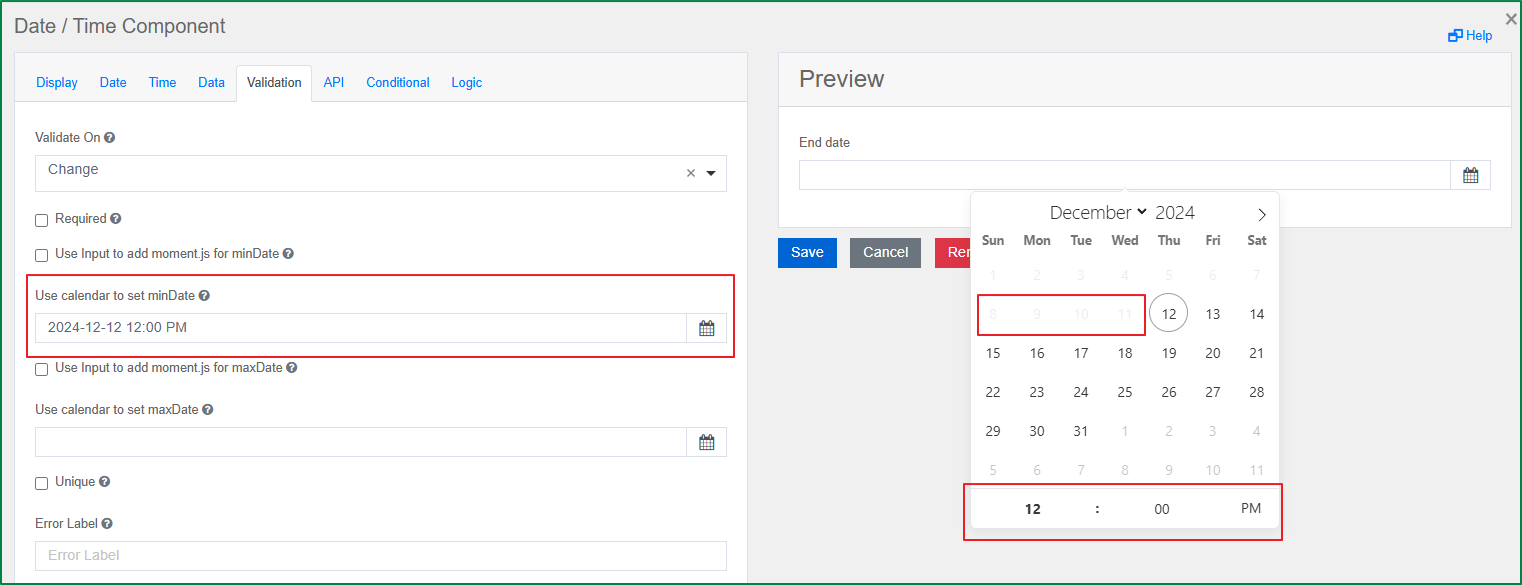
Use calendar to set minDate
This option is displayed in the Validation tab. This option is a calendar widget; you can set the minimum date (time) by selecting a date from the calendar widget. Once the minimum date (time) is set, the end-user cannot select a date (time) earlier than the defined minimum date (time).
This option will be hidden if the Use Input to add moment.js for minDate checkbox is ticked.
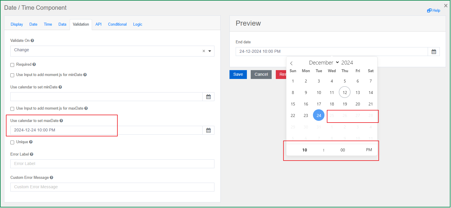
Use calendar to set maxDate
This option is displayed in the Validation tab. This option is a calendar widget; you can set the maximum date (time) by selecting a date from the calendar widget. Once the maximum date (time) is set, the end-user cannot select a date (time) later than the defined maximum date (time).
This option will be hidden if the Use Input to add moment.js for maxDate checkbox is ticked.
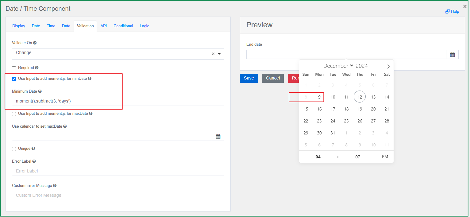
Use Input to add moment.js for minDate
This option is displayed in the Validation tab. Similar to the Use calendar to set minDate option, this option is used to set the minimum date that the end-user can select. The difference is that with this option, you can use Moment.js instead of picking a specific date.
When you tick the checkbox, the Minimum Date input field will be displayed, and you can enter a Moment.js function in the field to set the minimum date.
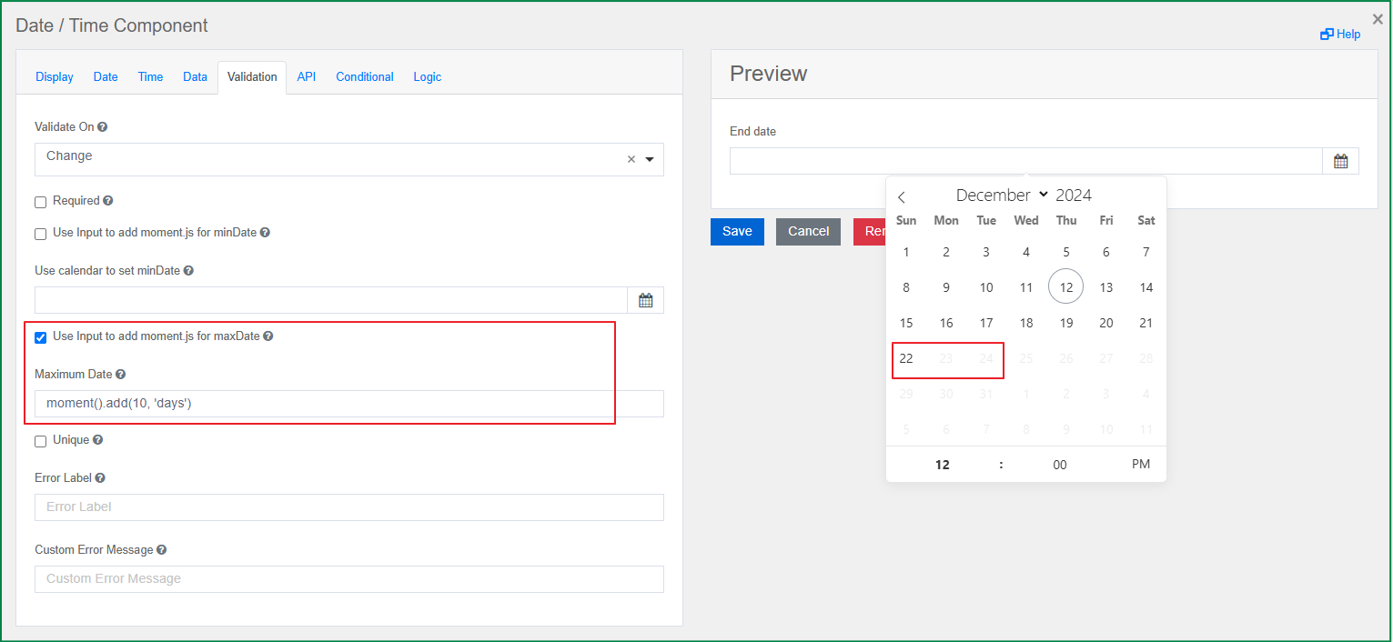
Use Input to add moment.js for maxDate
This option is displayed in the Validation tab. Similar to the Use calendar to set maxDate option, this option is used to set the maximum date that the end-user can select. With this option, instead of picking a specific date, you can use Moment.js.
When you tick the checkbox, the Maximum Date input field will be displayed, and you can enter a Moment.js function in the field to set the maximum date.
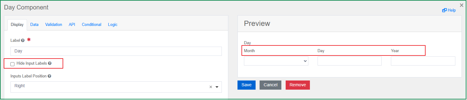
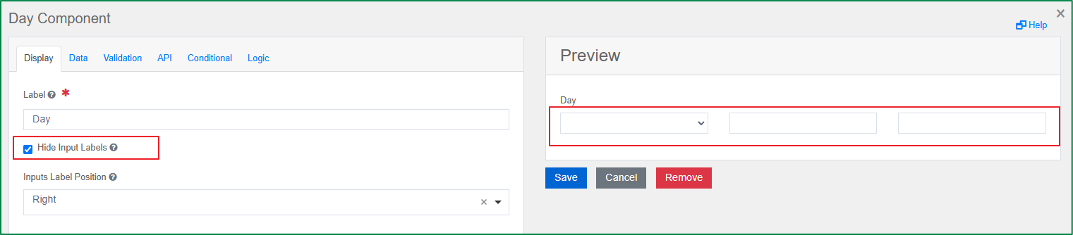
Day
The Day component is used to enter values for the Day, Month, and Year using a number or select type of field. The following are the specific settings of the component.
Hide Input Labels
This option is displayed in the Display tab. It is used to show or hide the input labels such as Month, Day, and Year. Tick the checkbox if you want the input labels to be hidden.
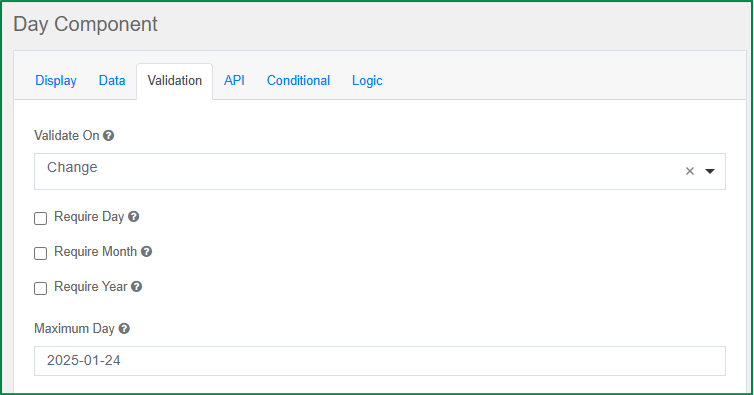
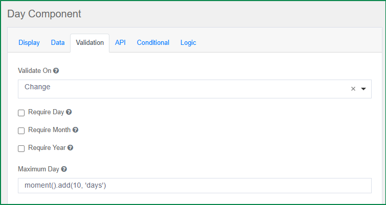
Maximum Day
This option is displayed in the Validation tab. With this option, you can define the maximum date that the end-user can set. You can enter a specific date or use Moment.js.
When the maximum day is set, if the end-user selects a date later than the set maximum day, an error message will be displayed as follows and the end-user cannot submit the form.

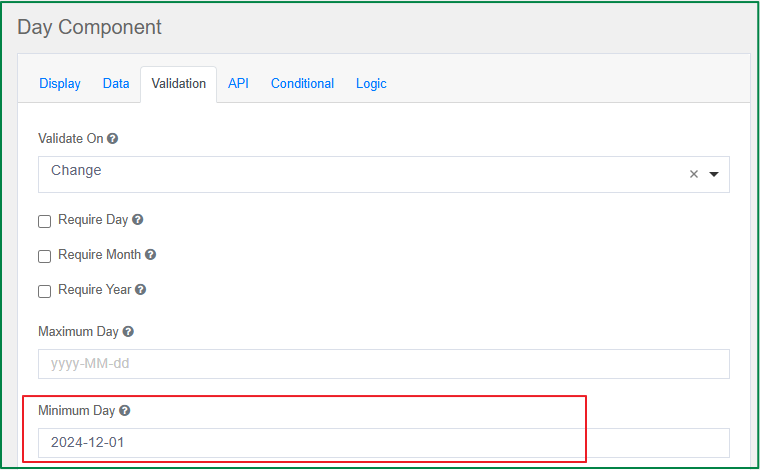
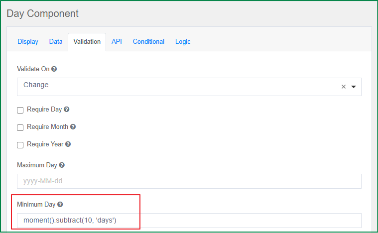
Minimum Day
This option is displayed in the Validation tab. With this option, you can define the minimum date that the end-user can set. You can enter a specific date or use Moment.js.
When the minimum day is set, if the end-user selects a date earlier than the set minimum day, an error message will be displayed as follows and the end-user cannot submit the form.

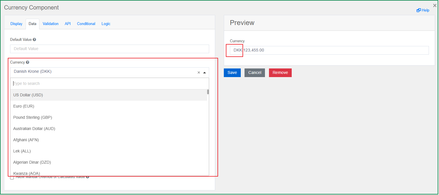
Currency
The Currency component should be used when a field needs to display monetary amounts. This component has a numeric input mask that allows two decimal places and automatically adds commas as a user enters a currency amount. The specific setting of this component is the selection of the currency type, which changes the prefix currency symbol as follows.
Currency
This option is displayed in the Data tab. It includes a list of currency types, and you can select one of them. The prefix of the value will change according to the selected currency type.
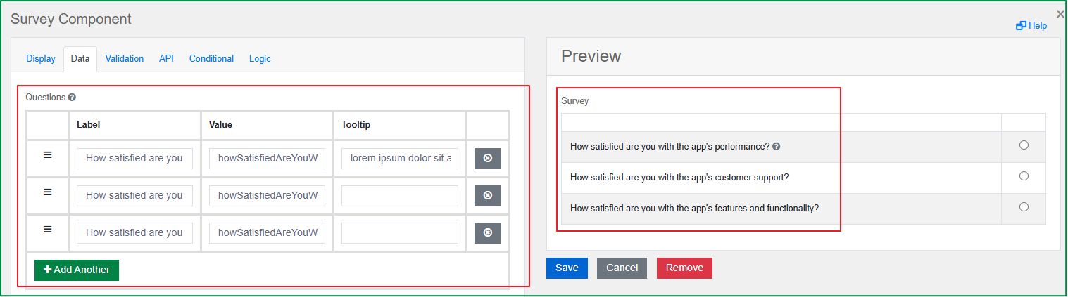
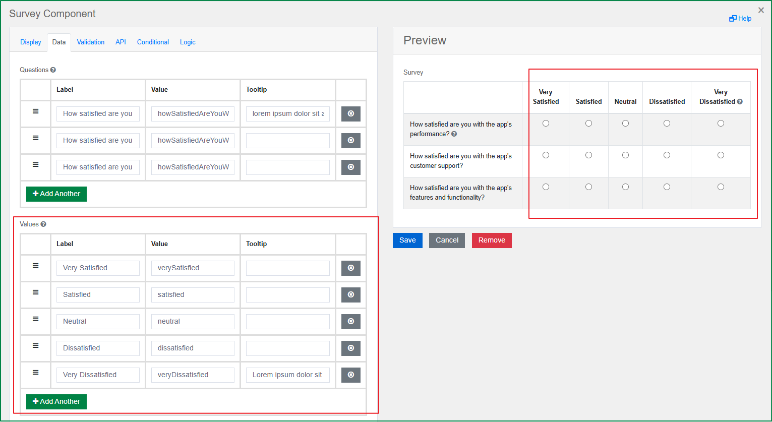
Survey
The Survey component should be used when you want to display a list of radio button questions. Survey is a great component to use when asking multiple questions that share the same set of answers or values. With this component, you can configure the questions and answers within the component settings as follows.
Questions
This option is displayed in the Data tab. You can enter the questions that you would like to ask in the survey. The questions will be displayed vertically in the left-hand column. A question includes 3 parts: Label, Value, and Tooltip.
Label is the front-end identifier for the end-user.
Value is the back-end identifier for the option and is what is saved to the database.
Tooltip is used as an explanation for the end-user. In the end-user's view, a question mark icon will be displayed to the right of the question label if the tooltip was filled in. When the end-user hovers over the icon, the tooltip value will be displayed.
Values
This option is displayed in the Data tab. You can enter the answers for all the questions added above. The answer options will be the same for all questions. Each answer will be displayed as a column with the label at the top and the radio buttons under the label. All answer columns are displayed horizontally to the right of the question column. The order of the answer columns from left to right is based on the order of the answers from top to bottom in the component setting.
Similar to a question, an answer includes 3 parts: Label, Value, and Tooltip.
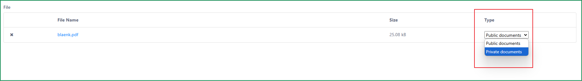
File
The File component allows form users to upload and download files on a form. The following are the specific settings of this component.
File Types
This option is displayed in the File tab. With this option, you can define a list of file types that the end-user can use to classify the uploaded files. For example, an uploaded file can be classified as a Public document or a Private document.
This option includes 2 parts: Label and Value.
Label is the front-end identifier for the end-user.
Value is the back-end identifier for the option and is what is saved to the database.
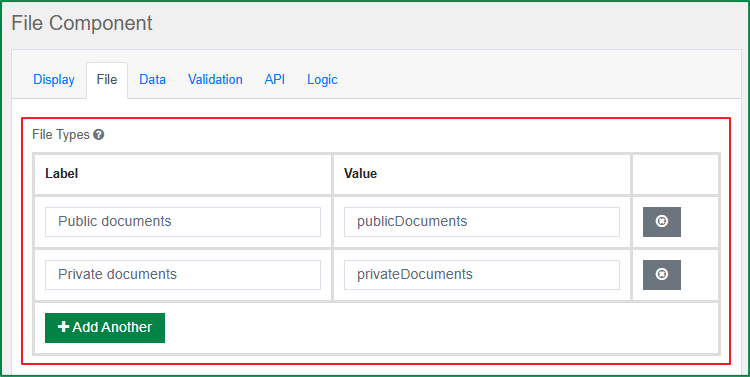
In the end-user's view, after uploading a file, the end-user can select a file type from the list of file types in the Type field.
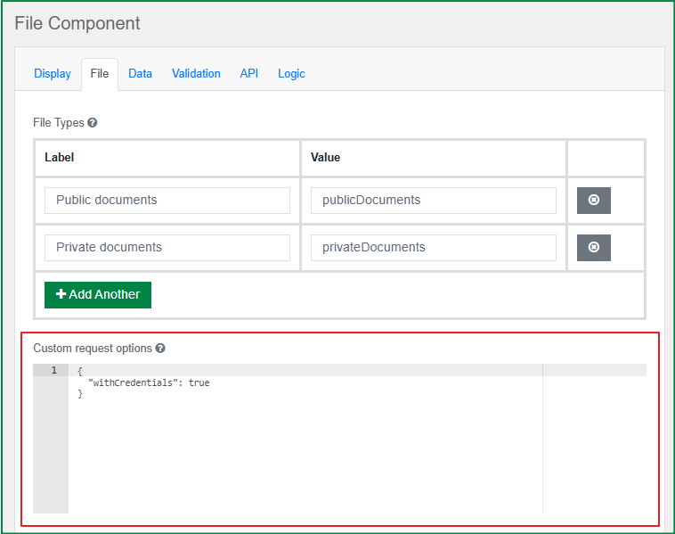
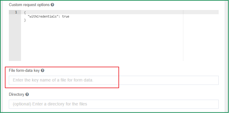
Custom request options
This option is displayed in the File tab. This option allows passing the custom xhr options.
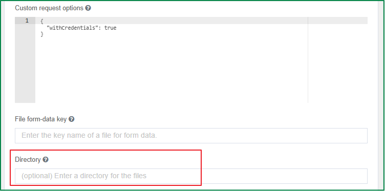
File form-data key
This option is displayed in the File tab. You can enter a key name that is used for the file when making an API request.
Directory
This option is displayed in the File tab. You can enter a directory in which to place all the files uploaded in the File field.
File Name Template
This option is displayed in the File tab. You can define a template for the name of the uploaded files. Regular template variables are available (data, component, user, value, moment, etc.). The variables fileName and guid are also available. The guid part must be present and will be added automatically if not found in the template.
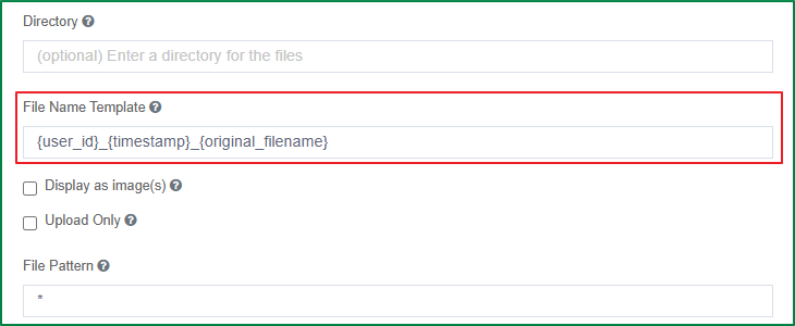
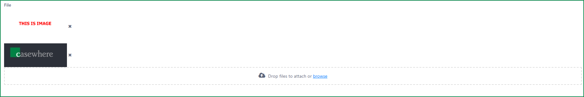
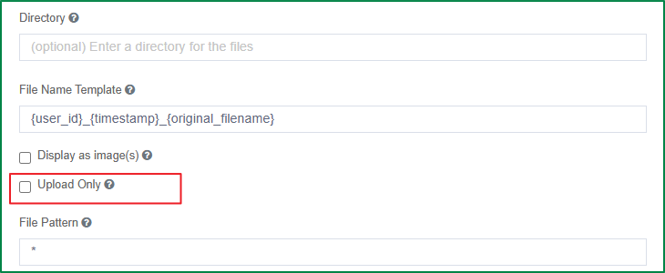
Display as image(s)
This option is displayed in the File tab. Tick this checkbox if you want the uploaded files to be displayed as images in the end-user's view instead of as a link. When this option is ticked, the end-user can only upload image files.
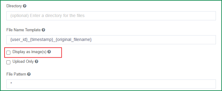
The following shows the display of the uploaded images in the end-user's view.
Upload Only
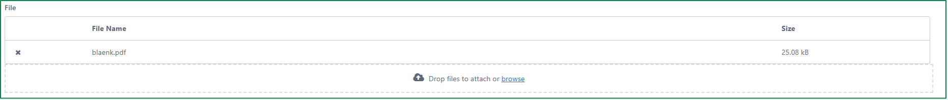
This option is displayed in the File tab. Tick this option if you want the end-user to be able to upload files only. If this option is ticked, the name of the uploaded file will be displayed as plain text instead of a link, and the end-user cannot download the uploaded files.
The following is an example of a File field that disallows downloading.
File Pattern
This option is displayed in the File tab. You can define the whitelisted file extensions. Only files whose extension is included in the list can be uploaded. A file whose extension is not defined in this field cannot be uploaded. Enter ***** if you want to allow files with any extension to be uploaded.
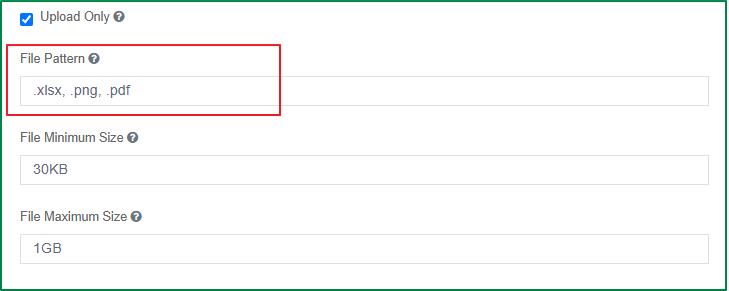
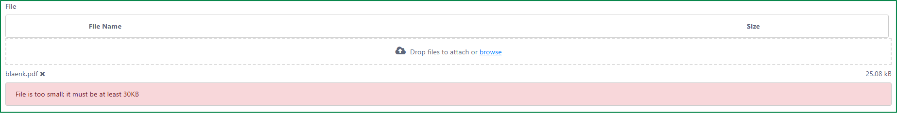
File Minimum Size
This option is displayed in the File tab. You can define the minimum size of the uploaded file.
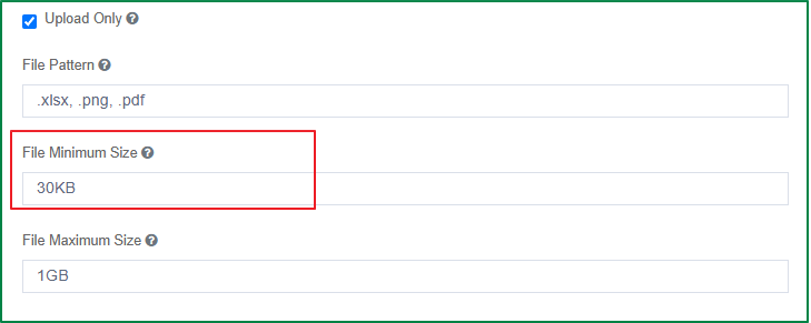
In the end-user's view, if the uploaded file size is smaller than the minimum size, the file will not be uploaded and an error message about the file being too small will be displayed.
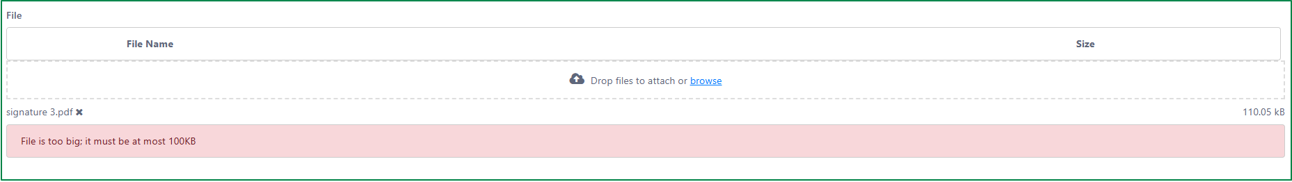
File Maximum Size
This option is displayed in the File tab. You can define the maximum size of the uploaded file.
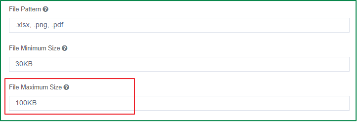
In the end-user's view, if the uploaded file size is greater than the maximum size, the file will not be uploaded and an error message about the file being too big will be displayed.
Custom component
Read here
Data components
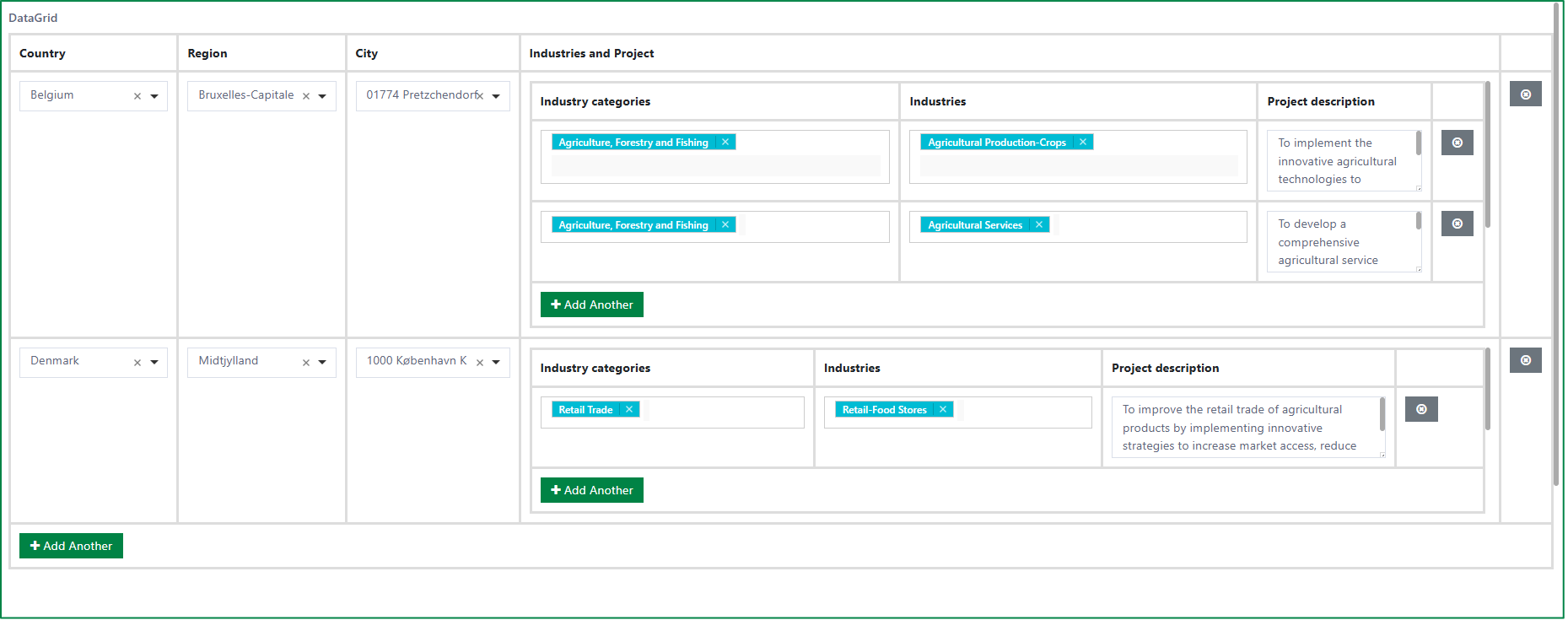
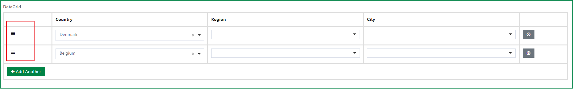
Data Grid
The Data Grid component supports adding a group of components in a line-item grid. After adding the Data Grid component to the form, you can drag and drop other form components into the grid. Each component will be displayed as a column in the grid. You can also add other data grid components into the grid. It is especially useful when you need the ability to add or duplicate multiple field sets.
Here is an example, in the end-user's view, of a Data Grid component that includes other components and another Data Grid component:
The following are the specific settings of the Data grid component.
Disable Adding / Removing Rows
This option is displayed in the Display tab. Tick this checkbox if you want to hide the Add Another button and the Remove Row button.
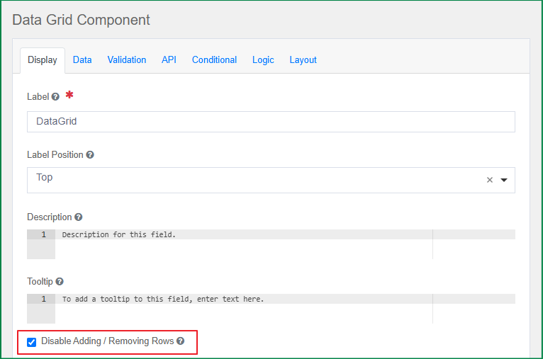
When this option is turned on, the data grid will include only 1 row, and the end-user cannot add a new row or remove any row.

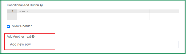
Conditional Add Button
This option is displayed in the Display tab. You can define the condition under which the Add Another button should be displayed.
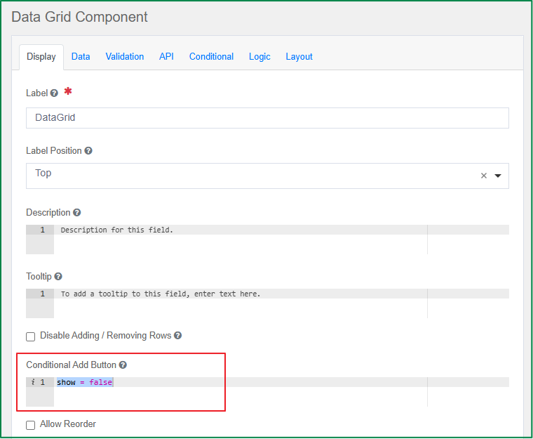
Allow Reorder
This option is displayed in the Display tab. Tick this checkbox if you want to allow the end-user to change the order of the rows in the grid.
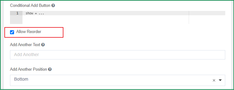
In the end-user's view, the Reorder button will be displayed if this option is turned on.
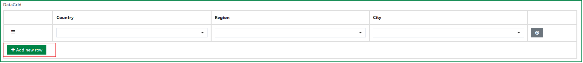
Add Another Text
This option is displayed in the Display tab. It is used to define the label for the button that adds a row to the grid. By default, the button label is Add Another; you can define a different label for this button.
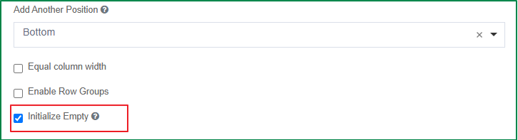
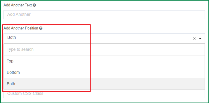
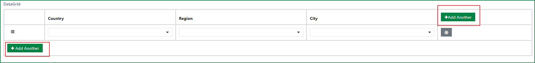
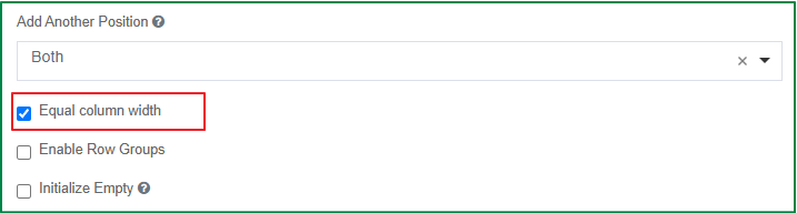
Add Another Position
This option is displayed in the Display tab. You can select the position of the button Add Another on the grid. It includes 3 positions: Top, Bottom, Both.
Top: the button will be displayed at the top-right corner of the grid.
Bottom: the button will be displayed at the bottom-left corner of the grid.
Both: 2 buttons will be displayed, one at the top-right corner, and another at the bottom-left corner of the grid.
The following is an example of the display of the Add Another button in the grid when the selected position is Both.
Equal column width
This option is displayed in the Display tab. Tick this checkbox if you want all columns in the grid to have equal width.
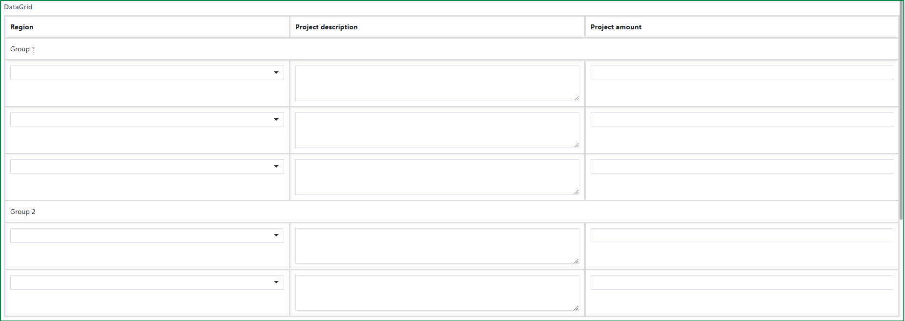
Enable Row Groups
This option is displayed in the Display tab. Tick this checkbox if you want to separate the grid into groups of rows. When the checkbox is ticked, the Group field will be displayed, and you can define the label of the groups and the number of rows in each group.
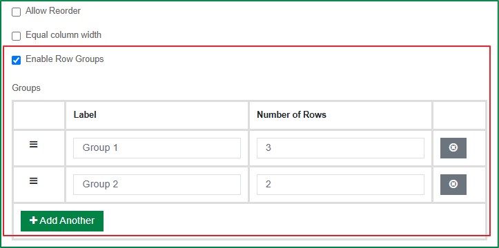
If this option is turned on, the Add Another and Remove Row buttons will be disabled automatically; this means the number of rows is fixed, and the end-user cannot add or remove any row.
Initialize Empty
This option is displayed in the Display tab. Tick this checkbox if you want the Data grid to be displayed without any rows initially.